Vote on The Cover of My Next Book
Today I’m working on the third, and likely final, draft of my next book. For this project I’m again working with designer Tim Kordik (see our previous work together for the Mindfire cover). He does great work and I love his approach to creativity and design.
The book is titled The Ghost of My Father. It’s a memoir about the most difficult relationship of my life. It’s a departure from previous books and I hope you’ll follow my lead. You can read previous posts about the project if you missed them. Please join the special email list for the book to be first to know when it will be available (and get early excerpts and other insider surprises). It will be a self-funded independent production and I can use all the support I can get.
Today I was thrilled to discover Kordik sent along his first round of concepts. While these are not final designs, I’m happy to let you have an early look and give your opinion. Just vote for the design direction you think is most promising (again, these are first rounds, not final designs). Leave a comment if you’re so inspired and I’ll read them all.
(For fun, you can see all the previous covers and titles readers have voted on)
Concept E
Concept D
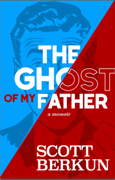
Concept A
Concept B
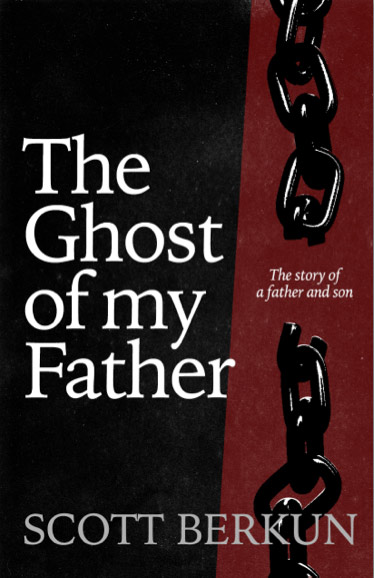
Concept C
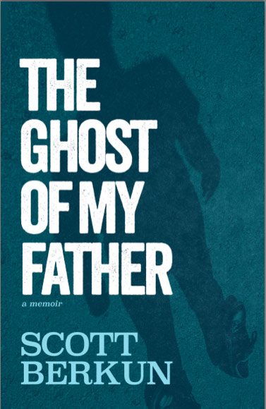
Come on! The first 4 covers look like cheap paperback fiction!
Regarding Concept E, I like the general idea — just what I’d imagine a Scott book could be like. While both the background “face” image and the texts might need further work to somehow reflect the quality/sense of “ghost” or “shadow” — to me it’s really NOT about the concept of “ghost”, but about “shadow”, “memories”, “dark side of experiences”, etc. something along that stream.
Easy tiger – as I made clear, this is a rough first round. As a maker yourself I’d think you’d give more room in your critique.
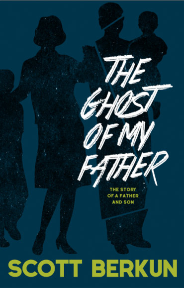
Scott – a number of these look more like crime fiction covers than a traditional memoir – is that the angle you are hoping/aiming for? Not necessarily a bad thing, just an observation. They are all pretty good but D got my vote. As a father and son, I am looking forward to reading it.
Hi Warwick: Not directly – it’s just when you’re after dark themes involving men it’s hard to wander into that visual territory. I like D too, certainly in this round it’s one of the more finished ones. Thanks for voting.
Well you should not judge the book by its cover ;) But agree, A & B speaks fiction to me. Mostly because of the font used, I like the background. C with the chains give me ideas around slavery.. E will certainly be eye catching on the bookshelf in the store with the colors – and also feels “easier to read”. The darker ones seems heavier and more dramatic.
D will have my vote right now, maybe play around with the backgrounds of A & B.
concept C is the best it catches the eye quicker
I tried to vote for D but the form isn’t working (I’m on Firefox and I do have some kind of privacy software installed).
Wow, I’m amazed you’ve been able to write this so quickly!
The reason I (would have) voted for D is that it’s the most generic. The others have an atmosphere — thriller or jokey retro — that I suspect don’t match your content. I think B might also work with a different font. The font is what conveys “scary,” which I suspect is not the kind of ghost you mean.
Likewise vote icon not working for iPad…..Vote D
I voted for C. As mentioned, the font selection might need more thought, but it seemed to best communicate the theme. My understanding (based on some of what you’ve said about the book) is that the book revolves around a relationship with a flawed father, and the word ghost is communicating the lasting presence and impact of that relationship. While some of the covers focus on an interpretation of “ghost,” the residual nature of the impact, C focuses on the father and his flaws, the impact itself.
E attempts to include both but ends up too subtle to strongly communicate either.
I just realized I meant to vote for B – I mistakenly associated the label for the next one with the image above it. You can take one vote off for C and add one to B.
I think the reason I like B is because no man is an island—we affect others
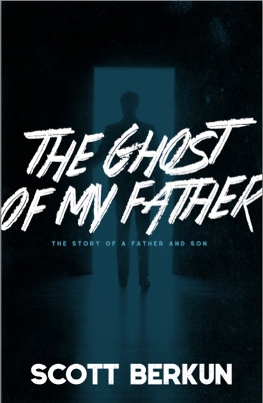
For what it’s worth, I chose concept A because the Image is very powerful with a figure either walking away or entering the doorway. In some respect this could represent the thought of a father figure leaving the family in the past or returning into the writer’s mind today. I could be all wrong and you think it is all BS, but that is what struck me first.
Concept B strikes me as too happy family-can’t really see the tear lines.
Concept C reminds me of Marley in a Christmas Carol. Concept D looks like a serial killer and the last one (E) strikes me as a cross between Ronald Reagan and the Dad from Ozzie and Harriet. My two cents.
The first impression was that the bold typography creates a very loud and distant voice. When it comes to a memoir about a father and son relationship, I’d like to see a more sensitive and delicate (even a touch of mystery) approach in design and typography that reflects the subject matter in a more profound way. Hope this helps!
Thanks Pery!
Hi Scott. Not sure I like any of them. Some have mixed metaphors (ghost/shadow), in one the whole family is equally ghostly (but the book is supposed to be about the father). The last one has a little bit of a clownesque effect. Maybe the image needs not to try to represent the ghost of the father? Because obviously it can’t be represented and then you necessarily go for a metaphor (shadow, blurry guy in the door frame) — while the title/concept is already a metaphor (unless your father’s ghost is really visiting you, which I hope is not the case). Have you considered using a photo of your father? Or not using any image at all, just tipography? I’m afraid this isn’t terribly helpful… Best of luck!
I voted for A because I like the doorway and backlighting. The father’s shadow looms large and he is in the doorway presumably in between you and the light / whatever else is beyond the room you are currently in.
One vote, two concepts: image + font.
I absolutely love the image of A but I think the font is all wrong … makes it look like a 1950s horror story.
I’m uncertain about the whole “ghost” thing too. Also sounds like a horror story, like he’s haunting you (not emotionally, but for real). I like “shadow” better if mysteriousness is de riguer.
I like the one with the broken chain — I think it’s wonderfully symbolic.
The others either look very 1950s or too much like murder thrillers.
I preferred C, because it seemed the most apt for your style. Also, I believe it’s not a fiction-oriented book, which cuts out all others. But, I’m a little surprised it has gathered the least votes yet!
Put me down for C as well only because I liked it better than the other covers and also because it signifies something broken. However, but if it were up to me, I would rather do a 2nd round with a different set of covers taking into account the feedback that folks have given, especially Pery’s feedback.
I was actually going to give None because I wasn’t happy with the comic art especially after hearing the name of the book and guessing the partial contents based on the one liner provided. “E” is closest among these options for me because it provides a sort of context unlike the others. “C” does give a message but visually it isn’t strong enough. “E” has very clearly defined colors ( so has “A” but that one is an easy No ). So I was actually going to recommend having more options if possible:)
I thought C was clearly the best but was surprised to find it in last place. But then I wondered if the vote wasn’t screwed up because the order was E, D, A, B, C – at least on my screen. So anyone assuming order was alphabetical would choose the wrong letter.
All different and interesting!
I voted for D even though I prefer the concept of E a little bit more, just the colors should be more subtile in my eyes.
B is a very good and not so crime-looking concept. But the mother is standing out too much. Just the shadows of the father and son will suit the title more.
You’ll definitely create the perfect one and I am looking forward to the next round of covers!