UI critique: seattlechildrens.org
Sadly these critiques (in honor of world usability day) were delayed due to someone hacking the forums on my site. I’ll be getting to these queries over the next week as I recover some time.
Summary: Nails the basics. It’s clear that most decisions made were done with care. The design has a clear audience in mind and carries through a consistent set of design concepts and elements, however there are some lapses and gaps here and there. Overall score: 7 out of 10 (just shy of an 8).
Core tasks:
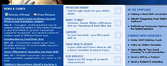
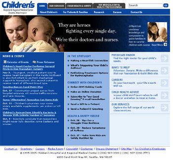
- The good and the bad. It’s impossible to critique a design without some understanding of what it’s supposed to do, and who it’s for: especially a large site like this one. But this design does what good designs do: the front page tells me what the designer thinks the core tasks are. The right most column lists (what appear to be) some of the most frequent tasks people have. However, why are they on the right? The U.S. crowd reads left to right. Making this change breaks up the composition, so it doesn’t look great with my 5 second photoshop treatment, but that’s a direction I would go with (Among other things you’d have to change that arrow glyph to something else).

- Physician finder easy to use. I dug in here and poked around. Piece of cake. It was easy to pick a location and a specialization and get a list of docs. Search results pages were clean. My only gripe is that that no medical site in the universe has reviews from patients: referals being the most important thing for many parents in picking doctors.
- Donations and Gift shop. The interior leaf pages are nice and clean: easy to find my way and fill out the forms. The gift shop UI was good: I could pick gifts to send to guests. The only downside is that once inside the gift shop, the main navigation goes away. I have to hit the logo in the top left to return to the top: no other way to get back to the navigation (-5 points for that).
- What are the key needs? I spent some time in the health care advice and services sections, but if this were a critique for hire I’d be spend more time thinking about core/frequent behavior. There are clearly other core tasks worthy of exploration, but it’s time to move on.
Navigation:
- Mostly consistent hot track. Most navigation items, such as links and buttons hot track (mouseover) to white. But some don’t. The primary navigation at the top doesn’t have any mouseover behavior at all. This should be consistent. The impact is minor though: so many sites jumble up mouseover & link behavior that most people can figure it out.
- Tabs + breadcrumbs? I wasn’t sure the breadcrumbs were needed, given how clean and simple the tab navigation is. It seemed redundant, especially when pages had a graphic underneath the tabs.
- Section colors don’t unify the site. It’s clear that the colors for each sub-section of the site were chosen with care: they’re equally saturated tones. But the change between each subsite is strong enough that for a moment it feels like you’re gone to a different site altogether. Those colors should come through into the main navigation on the home page: either those are the colors for those sections or they’re not.


- Here’s a quick mock up of the main nav with consistent colors:

Aesthetics / Layout:
 Other comments and nitpicks:
- Title is not the place for marketing. The site title is “World class pediatric health care from…”. Not good. This title string is what will appear in user’s bookmarks. It should be like a phone listing: terse. “Seattle Children’s hospital” is perfect.
- Title lengths. The titles grow on sub pages: even one level down they grow to more than 80 characters long. Who is going to read this? There’s no need to track the site hierarchy in the titles. All you need are two things: A short tile for the page and a short slug for the the site itself (and in that order).


Scott, thanks for the review. Your comments will be very helpful in our ongoing work on the site. I really appreciate the time and effort you’ve gone to.