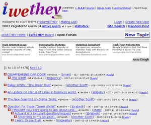
Usability review: iwethey.org
I got hit with a case of the lazies, and didn’t get to my promised free usability reviews until now. These will be high speed reviews: 10 minutes of analysis, and the rest of my time (30-45 minutes per site) spent explaining the issues and offering alternatives.
Drew Kime submitted this homemade forum software, used by iwethey.org, which is cool since my own forums are still locked in search of a forums package that doesn’t suck.
Summary:
- The core design is *ok*. The basic threaded forum UI is familiar to many, and most of the problems this site has are ignorable, not fatal. However there is a general lack of basic UI knowledge here, as layout and prioritization are mostly ignored, wasting everyone’s time.
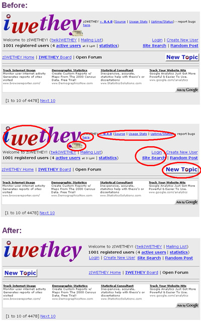
- Basic layout issues. The top 10% of the screen is what people will see first, and on every page. But this design is a scramble: there are no easy columns for eyes to follow, important links wrap around lines, and the logo itself forces people’s eyes to do much too much work (never cover part of a letter with an image). Basic layout should always follow a grid: all left edges align, and any new columns align (See Before and After below).
- Lack of prioritization. There are nearly 25 links in the top area of the screen, and no attempt is made to prioritize them. What percentage of users will need the source code for the forum? I’d say less than 2%. How about a list of changes to the source? I’d say less than 1%. Then why have these two links as the first ones on *every* page? The most frequently used links should be the easiest and fastest to find. Move info about the software to the footer.


Someone just pointed me toward this comment above using my name. One of the “twits” mentioned is an alias for a user with a long history of running multiple sock puppets and spoofing other users’ identities.
That comment is not from me. I did request the review, so saying “we really don’t need your help” is pretty transparently trolling.
No prob – comment removed.