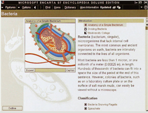
The end of Encarta
Microsoft recently announced the end of the product known as Encarata. Way back in the day Encarta was cool. It was one of the few things made in the CD-ROM era that, looking backwards, made sense (Yes, I owned a copy of both Art Gallery and Microsoft Dogs, and as idiotic as it seems now, the later actually got good reviews) – and was actually designed quite well.
It’ was also a curiously successful work of innovation by Microsoft on several counts. Few people remember, but Microsoft bet big on CD-ROMs and consumer software, and of those efforts, many of which flopped, Encarta was a gem. In 1994 it demonstrated many of the things people had been promising PCs would be good for (multimedia, education, instant access to information, etc.). There were other encyclopedias, but (I don’t think) anyone else invested as much in the design and technology as Microsoft did.
Many forget, or were still in diapers, but in 1994, years before web design would be something you could say at a bar without people thinking you were into spiders, Encarta demonstrated much of what we call information architecture, interaction design and consumer aesthetics, all in one high profile consumer product. Many, many companies and software teams used Encarta as a reference for not only what was possible, but for what a good experience should be like. Microsoft didn’t invent many of the technologies involved, but the encapsulation of so many into a well designed experience is similar in some ways to the success of the i-pod. Both are examples of innovation through superior user experience and integration of various technologies made mostly by other folks.
And most importantly, when Netscape and Internet Explorer began the browser wars, many of us looked at Encarta as an approximation of what a great web experience should feel like, with rich media, consumer appliance simplicity, and great search and navigation. In the hallways on the Internet Explorer team we had screenshots of some of the Encarta team’s work, among various other bits of software inspiration, up on the wall. It was definitely a reference used in designing features like Explorer bars, Favorites & History.
Kudos to Bill Flora, Adrienne Odonnell, and Sheila Carter (who are listed here as the design team) and other folks who worked on this thing over the years.
Encarta also was one of the best product names Microsoft has ever had. Sure, that’s not saying much given how notorious MSFT is for lousy names, but like Excel (also a good name, at least it was in 1985, compared to Lotus 1-2-3) it somehow fit the vibe of the kind of thing the product was.
Can’t say I miss loading CDs into my PC (I can’t remember the last time I did that), but Encarta definitely deserves a notable place in the history of software design. They helped raise a bar many people still use today.


I purchased Encarta for my computer. I can’t say that I ever opened it once. They never got the integration with the operating system actually working, and the app kept bugging me about paying for a subscription–even though I had paid a nice chunk of money up front! And they wanted additional money for web access.
I always wonder what their numbers looked like – I bet 95/96/97 were their best years, but as soon as the web rose they had to try to find ways charge and whatnot, which I think most people knew could never really work. What version was it? Any idea?
I want to inform the team that there are names of places that are not correct. I wish that i have the opportunity to submit that Mongu is called by its native name Halle while Mongu Arna is a derogatory name(mongu infidels) it’s name is Mangu