Usability review #5: Freetheslaves.net
#5 on the free review list is a site that has a purpose that’s hard to top: Freeing slaves.
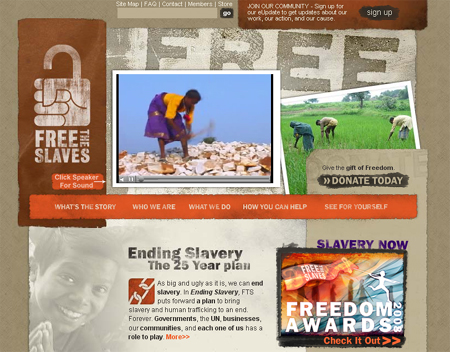
This site was tricky to work with. The visuals are strong, but way too strong. And the site is trying way too hard to grab attention that it defeats it’s own purpose. With a cause this good the site doesn’t need to do very much: just explain the situation and then tell the viewer what they should do.
Problems
- Visual overkill. Every element is asking for extra attention. It’s visual a deathmatch, and the viewer is the loser. Compare freetheslaves.net with similiarly themed site, Darfur wall. Will messages this powerful, the cause can speak for itself.
- Confused message. There are so many stories presented, but only one or two are needed. Too many choices. What am I supposed to read first? Second? What is the most important action this organization wants me to take?
- Too much navigation. There are at least 3 layers of navigation for what should be a simple experience.
- Kill the movie. First, if you need a special caption saying “Click here for volume” you’re acknowledging the movie UI is confusing. Get rid of it. We all know what slaves are, and any of the great photos you have are more powerful than video anyway. Also, the site is slow and video ain’t helpin’.
What to do?
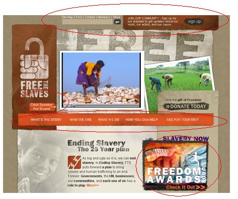
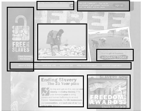
It’s hard to work with finished pages, so I made a reverse-wireframe. It helps visualize the elmements and see how they match up with a grid. A clean design respects some kind of visual grid, meaning there are a minimal number of left edges: every left edge should line up with another left edge.
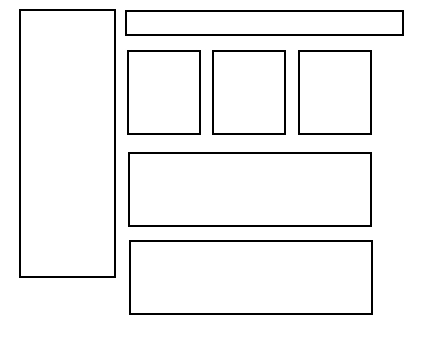
A proper wireframe for the same website, should look something like this. The exercise for the reader, or the designer, is to eliminate elements and make stronger decisions to fit this kind of design. This will force more decisions to be made (e.g. we only have room for 3 things, but had 5. Which 2 should go?) but that’s good.
The other major issue is unnecessary visual flares. These elements make the layout a battlefield, where they’re fighting for attention. By simplifying the design and respecting the wireframe, the layout is cleaner, easier to read, and simpler to understand.
Here’s one before and after example, showing how to clean the visuals.
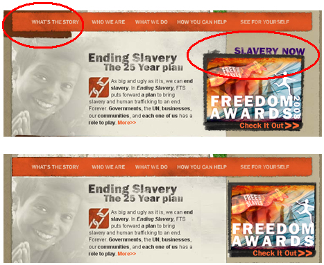
By sliding the freedom awards into the right column, the element no longer screams “Look at me!”. Instead it’s in its respectful place in the right column. If the freedom awards are really so important, than fit them elsewhere in the grid, but don’t violate your own design by breaking the grid.
Is this more boring? Perhaps, but the goal of this site isn’t visual excitement is it? It’s (I assume) to present a serious problem and compel people to donate time or money to the cause. The design has to get out of the way. The above cleanup can be repeated in dozens of places on the homepage alone and will make a big difference.
If any folks at freetheslaves.net are reading and find this useful, I’m happy to do more work for you. Just let me know.