Firefox 2.0 Beta 1 – short review
 It’s been months since I’ve commented on Firefox, IE and the state of web browser design. I’m back: I recently installed Beta 1 of FF 2.0 and here’s a short review.
Beta 1 releases are tricky strategically: you wan’t to hold back on some big features so competitors have less time to recover, but you do want mileage and feedback on big changes. As beta releases go, this one is conceptually conservative. Especially since IE7 is late in the game, with a recent beta 3 release.
Highlights
- Easy install. Three screens and you’re in. Smoother than many final release installs.
- Auto spell checking in text boxes! A feature I tried to get into IE for years – stupid reasons prevented it, so I’m happy to see it now. (But it does hyperventilate on HTML editing (e.g. blogs) – and needs to get smarter, or have an optional toolbar button for toggling it off).
- Edge case experience improvements. FF remembers your session set up, tabs and all, on crash, and can recover. A sweet safety net.
- Beta Stable. You never know what beta means, but its held up ok. A crash an hour or so in most sessions.
Lowlights
- It’s a low profile release. Most of the work appears to be infrastructure: phishing protection, Javascript 1.7, new installer, etc. It’s good they’re striking at the root of the tree, but it’s not a user experience release.
- Microsummaries are weak. The idea is odd but interesting – but its current design demands custom, browser specific work by content providers, so the feature ships in beta 1 in a functional coma (IE4/NSCP4 had dozens of good features die soon after this exact kind of birth). The docs suggest autosummaries, but doesn’t provide any. The big question is how dynamic titles impacts recall when looking at a list of bookmarks: will they re-alphabatize? Will they stop updating if I rename them? Questions abound. This seems like a solution in search of a problem and the spec is without a screenshot: a UI design red flag.
- Hard to discover what’s new. Any beta should offer a fun walkthrough of screenshots showing me what’s new and what i’m getting for rolling the dice with my computer. I looked for ten minutes, and the best approximation I found was over at Lifehacker. A checklist of unlinked features is lame -help me, as a beta tester, or blog reviewer, feel the love.
- Not much to play with. After twenty minutes I felt I’d seen what I needed to see. There just isn’t much to explore or tinker with (as a non FF-developer). So I’ll unistall and wait for Beta 2.
Some reviews I’ve read highlight the new History menu (replacing the idiotic Go menu – yay!) and its list of closed tabs. It’s a thoughtful gesture, but it’s a hacky, Microsoft-esque UI design, in that the real solution is a better tab close model, rather than a greasetrap that captures things after they’ve fallen.
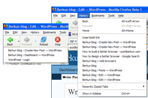
But there are other UI problems with the history menu: it still colides the history tree with the back tree. Take a look:

These two snapshots show two different histories: one for the back tree, one for the history list? Why two? Not sure – probably because back/forward follows a pruning algorithm and the history list doesn’t. But now that there’s a history menu, the conflict is more obvious (or then again, perhaps only browser UI weenies like myself catch these things). The back button is king here, so I’d rationalize in it favor of whatever it’s behavior is.
Here’s waiting for beta 2. Working on trying to get IE 7 Beta 3 installed, so stay tuned.

IE is playing catch-up to Firefox and Firefox is attempting to move the bar.
But Firefox is attempting to play catchup to Opera. Opera is blazingly fast, has all sorts of stuff built-in (torrents, for example) that need widgets (which need to be changed each release, it appears) in Firefox.
Opera already supports the Acid2 test — why don’t you reload the Firefox beta and check to see if Firefox can do that. In fact, I’d be interested in seeing if you can find much (well, anything at all) that Firefox can do better than Opera.
The usual put down for Opera is that it costs money or displays ads. Well, not for a year.