Interactionary 2001
By Scott Berkun, May 2001
At CHI 2001 in Seattle we performed the second interactionary, adding some new twists to last year’s format to keep it interesting. We reviewed all of the feedback from the first one, and improved the scoring and timing for the event. The same crew of Debbie Cargile, Sarah Zuberec, Chris Konrad and myself organized the event, with Sarah leading the way. Without Sarah, the event would not have taken place this year.
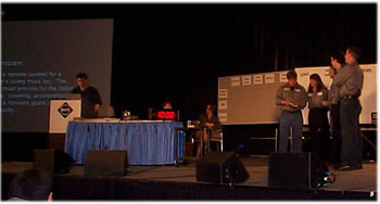
Like the first one last year, Interactionary is a pseudo game show type format that allows 4 teams to work on the same design problem, live on stage. Each team works one at a time, and are given ten minutes to work through the problem, while the other teams wait in a sound proof room. The goal is to expose the dynamic intangibles of design in progress, and allow an audience to listen in on four teams and observing how they work.
We wanted to show some of the essence of design work than can not be captured in papers, panel sessions or workshops. All team members wore microphones while onstage, and the whiteboard is shown on the video display so the audience can listen and watch.
We use a scoring system to give the format a framework, but the competition isn’t really the point. Human nature being what it is, competition helps to get people to go up on stage and do things.
Brenda Laurel, Bill Moggridge, and Andrew Dillon were our expert panelists, and they provided commentary and judging for the event. These panelists were on stage, with the best view of the action. The three teams this year were from Trilogy, IBM/Tivoli, and Cooper Design. (Teams from AOL and MonkeyMedia had to cancel and were unable to appear at the event). Every team member wore a live microphone, an the audience and the panelists were able to hear their conversations, and view their work as they did it.
Scoring and Judging
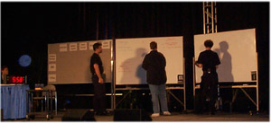
We used a system of four categories this year: teamwork, process, user focus, and final design. Each category was worth ten points, and each panelist scored every team. Teamwork considered how well the team worked together, and how they organized their time and approach. Process considered the “methodology” they used for evaluating the problem, using the whiteboards, and evaluating design alternatives. The final design considered the usability, feasibility and quality for their final solution.
We left the details of the scoring to the judges, giving them only basic instruction as to how to score within each category. Since each judge scored across all teams, their interpretations would be applied equally across all teams. We also felt that the fewer the rules, the better the experiment, and we viewed this format as a continuing experiment in design education. During the Q&A some members asked about providing more specific rules for the format. It’s a reasonable consideration, except for the hidden dimension of organizational cost: it takes significant time and energy to pull off live events like this. I also wonder about the spirit of the event – the more rules and details we add, the more we risk becoming rigid and structured, and frankly, less fun. My belief is that education requires engagement, and engagement comes more easily through things that are fun.
After each team was announced, and was ready on stage, we read the problem out loud to them and the audience. Then we started the clock, and gave the team two warnings, at five minutes and one minute remaining. We recommended that teams use their last minute to describe to the judges their final design idea.
The Problem
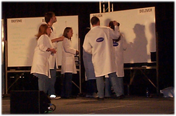
Before the event all of us organizers met to review the list of potential problems. We took ideas from all forms of interaction design (web design, software, architecture, industrial design, etc.). Many problems came from interview questions that I use when interviewing designers or UI project managers . The challenge was to find problems that were broad enough that they did not require much explanation, while simultaneously being challenging and tractable in only ten minutes.
The new challenge for 2001 was the following twist: An additional criteria for the problem was revealed to the team when there was 7 minutes left. We played trumpets to let people know it was the appointed time. In our continuing effort to pretend we’re Monty Python, we played real trumpets.
Design a remote control for a children’s dump truck toy. The remote must provide for the following features: steering, acceleration, reverse and forward gears and dump functionality.
The twist: design for a child with a broken right arm.
The action
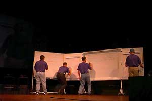
Teams this year benefited from reviewing the video tape from last year’s competition. This year, two teams used the audience to help with survey style questions (Trilogy), as well as impromptu interviews (IBM). Cooper Design used a more honest approach to brainstorming, focusing more on their own discussion, rather than worry about audience perception.
Both IBM and Trilogy divided the whiteboards into sections representing the different parts of the design process. They worked from left to right, and in some cases tried to time their movement across the whiteboard with their remaining time (In project management, this is called a schedule driven release)
In the post session Q&A, a point of discussion was how much influence a team’s showmanship played in their scoring. The category for teamwork could consider presentation skills, but mostly in terms of how it effected the outcome or process, and not.
The results
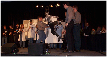
The final results were tabulated live on stage, while our M.C. Chris Konrad entertained the audience. Prizes this year included sets of fuzzy dice, colored glitter balls, and a life size cutout of Bruce Lee.
The final results are listed below:
1. Tivoli / IBM
3. Trilogy
3. Cooper Design
The Controversy
No Interactionary would be complete without some audience unrest. This year, the judges and organizers faced some questions about the overall merit of the format, and the final scoring. The point of contention was the validity of a format that emphasized process and teamwork on an equivalent level to the final design, given that outside of conferences, the ends matter more than the means.
I responded to the questions stating that the primary purpose of the format was to mix education, design and sport, and in order to prevent teams from working in ways that only they could understand, we balanced the scoring to force more of the process and teamwork to come through to the audience. The ten minute time limit acted as a forcing function as well, keeping things interesting, but giving just enough time to see how different groups of designers approached the same problem. More time would have been less interesting to observe, and less time would have been impossible for teams to accomplish anything.
Designing a good panel session or event is just like web design: everything is a tradeoff of one attribute for another. So while many modifications could be attempted, they all represent tradeoffs across the attributes of education, audience engagement, and design reality.
The teams, players and judges
This event required great courage from all of these folks. They all approached this with a professionalism and sense of humor that made it really fun to put together. My thanks go to them. All the organizers would also like to thank Eric Bergman and Marilyn Salzman from CHI for helping us to make this happen.
|
*Linda Carlin |
Pat Cox |
*Kim Goodwin |
* denotes team captains
Judges:
Brenda Laurel, Art Center College of Design
Bill Moggridge, IDEO
Andrew Dillon, Indiana University
More information and event pictures
There is a wonderful set of pictures from CHI 2001, including several dozen from Interactionary, at http://www.3eger.de/chi2001/.
There is now a summary report of all interactionary events, including information on how to organize and run an interactionary competition.
This is one of several techniques I’ve used in teaching design and usability in my work. If you’re interested in this kind of work, contact me.
