Conference materials (and more) done right – Webstock ’08
One highlight of webstock 08 was the fantastic design of their handouts, badges and bags. Most conferences, including design conferences, spend little effort on crafting the things they give attendees. The bags, swag, and badges are typically afterthoughts, rarely made with love, and infrequently reflecting any of the values espoused at the conference itself. Webstock kicked ass on all counts: an example for other conferences to follow. Here are some notes:
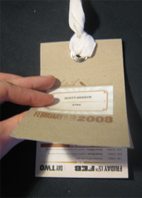
The badge

- The schedule is upside down. Since the badge hangs on your neck, the schedule, one day per page, is printed upside down so you can read it. Nice (first saw this at GEL).
- Not made of plastic . Is it just me, or is there too much laminated plastic at conferences? These badges are made of cardstock and heavy paper, with a natural hand-made feel. It has soft edges and fits comfortably in a shirt or back pocket.
- Cord made of fabric for easy reuse. Most conference materials have limited reuse and don’t recycle well: those plastic lanyards aren’t good for much. But since the cord isn’t the standard plastic clip-on cable, but a nice length of fabric, I can use it for something else.
- The only major design ding is the name is hard to read. I’ve yet to see a badge that was truly easy to read from conversation distance: they’re always crammed with affiliations and job titles making them not only ugly, but worthless (Here’s a good example for reference (scroll down to second picture)).
The bag

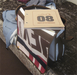
- Looks like a high-end hipster bag. Nothing says inauthentic faster than a design conference that gives 500 people ugly, black, generic, ’50-zillion compartment but none that fit the things you actually need when traveling’ conference bag, replete with a garish logo carelessly glued (yet impossible to remove) on the front cover. Well the webstock bag doesn’t look like a conference bag: it looked so good I had to ask twice to make sure it was the conference bag, and not some special prize.
- Is made of canvas! I’ve been to dozens of conferences, yet this is the first bag made of a sturdy, high-quality, non-synthetic material. It feels like a well made thing to hold and gives the vibe it’s meant to be used, not just a token gift to make you feel better about the fees you paid to get in.
The t-shirt

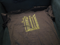
- Looks like something from threadless. The front has, I believe, some of the public art from the city of Wellington, with the words Webstock underneath. It’s a nice yellow on grey, soft tones, and looks good with a pair of jeans. Unlike the dozens of conference t-shirts I’ve given away to goodwill over the years, I’m keeping this one.
- Came in women’s and men’s versions. Why should I care as a man? Well, I confess: I like to look at women. Especially when they’re wearing clothes meant to fit their curvy figures. I always hear people complain about the low numbers of women at design and tech conferences. Well, maybe if they followed some of webstock’s ideas, more women would be interested in finding out about their conferences.
Other bits
- Did not dig the food. I’m a foodie, I cook for myself all the time, and the food here was a problem. I admit it was awesome to see an entire vegetarian table and other special diets accounted for, but the food I grazed at at the regular tables didn’t have me coming back for more. I didn’t see anyone else complaining and everyone seemed to be eating tons, so perhaps it was me. That said, I gave up on the conference food part way through as F Inc, just across the street from the venue in Wellington, was great. I had some of my best meals of my two weeks in the country here.
- An agenda that took risks. I missed most of the first day, but what I did at the conference included: powerpoint karaoke, where speakers had to talk for 5 minutes with someone else’s slides, and an 8×5 session, where 8 speakers had 5 minutes each. These things mix up the pace of a long conference, give people a different way to communicate, and make interesting mistakes possible. The social hours had awesome live music, craftstock was fun: it was clear, all over the place, that the organizers get what good experience design is all about.
- I didn’t use the conference program. You can see it in the photo above of the bag, but I didn’t refer to it much. I’d read the basic agenda online and had the badge program. I can’t say much about its design, though it certainly looked great. My only gripe was that it had a page per speaker, making the book quite big, yet I struggled to find the specific speaker I was looking to track down (Mark from the 8×5 session). Do we need these big program guides anymore? This one sure looked good, but I don’t think I saw a soul with one at the actual conference.
If you get a chance to speak at or attend Webstock, don’t miss it. You’ll feel the love if you go.

It’s good that there are women’s shirts, not because women like shirts that fit, but because you like looking at “their curvy figures”? That you enjoy looking at women is worse than irrelevant to the gender balance at conferences.
I doubt you meant to sound like a lech, but that really didn’t come out right.
Hi Peter. I see your point. But I have to doubt anyone is surprised than an average heterosexual man like myself likes to look at women, anymore than an average heterosexual woman likes to look at men.
If I’d requested, say, bikinis for women instead of t-shirts, I could totally see the perception of lechery or gender bias in my comments, but I don’t think I crossed the line of simple appreciation for gender appropriate shwag.
If I did actually offend anyone here, I’m sorry. Not my intention at all. I’m familiar with gender issues at tech conferences, and the last thing I’d want to do is give anyone good reasons for being uncomfortable.
And that saves me having to blog my thoughts as you’ve got ’em all – poifect
Hi Scot, I agree with your assessment of many conferences.
IDSA usally foes a great job with much of this experience design.
would like to say that this was a huge consideration at Interaction08 (ixda’s first conf.) and most importantly we nailed the food!
– dave
While reading your article, I remembered one ridiculous incident, after which I ordered myself another badge at https://vizinform.com, in case I lose the first one. Once I was at a conference and there was only with a badge to pass there. Unfortunately, there was no snack in the conference room and in the room we were in, but we were allowed to have lunch at the nearest cafe. Since I was very hungry, I only focused on this. When my long-awaited soup was brought to me, first of all I took off my badge so as not to smear it. The soup was so delicious that I finished it and completely forgot about leave my badge in a napkin, which I threw in the trash. Oh, how upset I was when the security at the entrance did not let me in without a badge, I tried to prove that I was really a conference participant, and that I just lost my badge at lunch. I had to figure it out, I missed half of the presentation of our curator, when everything was decided, they apologized to me, missed it, but this day became a lesson for me.