When visualizations go wrong, part 2
Here’s part 2 of my continuing series of visualizations gone wrong (part 1 was about a viz on web browser market share).
The idea of metaphor is a good one. It’s one of the oldest communication tools we have. It’s clever and wise to use something people understand to help explain something they don’t.
There’s even a good argument to be made that much of all learning is done through some kind of metaphor.
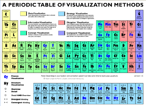
But using any metaphor at all, or a well known one from a context that is unknown or feared in another, doesn’t help. It’s bad news all around if you choose an obscure, complex unfondly remembered one such as the Periodic table, as these folks did.
They replaced the elements with, ironically enough, visualization methods.
The Perioidic table itself is just plain weird. Is it any wonder so few people understand, or care to understand, chemistry? I’ve had people explain to me why it’s organized the way it is, and there is a logic to it, but it must be one of the least visually elegant and hardest to learn or memorize tables I know of.
The fact that this thing was made, or at least promoted, by a site called Visual Literacy challenges the limits of oxymorons.
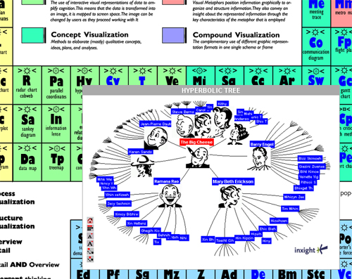
And if that weren’t enough, there’s more. Mouse over any of the elements and you get the visual wonderment that is the unexpected pop-up window:

One of the fundamental questions of all visualizations is this: How is this better than a flat, two or three column alphabetical list?
It’s surprisingly rare that in any expected kind of usage any visualization performs better on any task, from ease of discovery, to ease of use, to retention, that a flat alphabetical list.
In this case, a list of all methods, with a description and a picture, all appearing in the same table, on the same page, requiring no magic mouse-overs or comprehension of high school chemistry would be a big and easy win.
Of course, some people have tried to make improved versions of the periodic table, but going circular, as we talked about last time, has its problems.
Also see this version designed for kids (PDF) – has some advantages over the others.


There’s a trend here: The more ambitious a data-viz product is, the worse its design will be. I poked at a few brilliant concept-mapping programs – complete with ontologies and relationship mapping and 3D flyovers – and every single one of them looked like this chart. 1993 called, and it wants its design metaphors and EGA color schemes back.
It’s such a truism that I’ve begun to wonder if there’s a fundamental law here. Maybe the only people obsessive enough to build structured concept maps are too analytical to understand their design. That would be sad. It seems like there *should* be better options.
Scott, the periodic table makes immense sense for those who understand chemistry and atomic physics, or for those learning the subjects. Sure, it’s a terrible idea if what you want is just a list of the elements, say in the order they were discovered or sorted by abundance in nature.
Of course, if you really want to understand them, Tom Lehrer has the answer: http://www.privatehand.com/flash/elements.html
Steven: I understand the argument, but this is a classic one in UI design.
The question is do you simplify things so more people can learn and understand? Or do you insist on using a more accurate and precise model that will be needed later on?
In my case, and in the case of most people who take high school chemistry, I think it’s safe to say they won’t be Chemists. A design that easier to learn, easier to understand, even if not useful to scientists or chemists seems warranted.
I do understand there is an esoteric beauty to the Periodic Table. I am not saying it should be dumbed down for everyone, or never shown in high school textbooks. But there can be esoteric beauty to many things that most people will never become sophisticated to appreciate. And if we choose to inflict it on people who will never gain that appreciation, what problem is it we’re trying to solve? Largely it’s that some people want other people to see beauty in the same places they do, which is really a thin, and not very strong argument for how children should be taught about the world.
> Maybe the only people obsessive enough to
> build structured concept maps are too
> analytical to understand their design
This should be Levitt’s law of pseudo-expertise. It’s true in many things: people who get PhDs in teaching are often horrible teachers, people who become therapists often have major emotional issues… our intellects are often drawn to things that are simple for others but that we find fascinating, and since we can’t understand these things in simple terms we inflict out complex view (necessary for us) on others.
It’s a basic paradox of user interface design – “designers” think they are helping by designing for themselves, when often their users are often very different than they are.
“There
Scott,
Your problem with the periodic table is that you haven’t even attempted to get to grips with chemistry. This is clear from your phrase “esoteric beauty”. The periodic table uses layout and geometry to group related elements. Even the most cursory read of the Wikipedia article on it would reveal this to you.
For example, elements on the left are metals and elements to the right are non-metals. Group 1 are the reactive metals. Group 8 are the inert gases. And so on with lots of other properties that are common between related elements.
I find it interesting that you equate your inability to learn chemistry as being due to the periodic table being deficient! It’s a classic case of the the bad workman blaming his tools.
The periodic table doesn’t teach you chemistry. But once you have learnt and understood some basic chemistry then the table will help you navigate your way around the elements.
> I find it interesting that you equate your
> inability to learn chemistry as being due to
> the periodic table being deficient! It
“Grab me any 10 people off any city street, show them the periodic table, and I
“Grab me any 10 people off any city street, show them the periodic table, and I
Another good periodic table design (interactive):
EMD Chemicals Periodic Table
The Merck/EMD interactive table is indeed outstanding. Note, however, that it maintains the identical arrangement as the standard table, except for one view that offers a sortable list of the elements.
Most of the info on the interactive view is available in small print on the wall-sized charts you probably grew up with. There may have been a problem if your HS chemistry had you focus on the small print rather than the relationships — why are Argon and Neon all the way on the right? Why does each row have more elements than the preceding row? Why does the atomic number increase by one for each element but the atomic weight increases randomly? Why is table salt NaCl and not, say, NaCl2? It’s these questions for which the periodic table is highly suited to its purpose.
(My 9th-grade daughter is currently taking biology, and I went through a week of helping her understand the table and basic chemistry a few months back. I wish I’d known about the interactive version, but we did fine using a simplified version that had only the element symbol, the atomic number, and the atomic weight in each box in the table. Once the penny dropped on why things were arranged the way they were, she breezed through the rest of the module.)
Hi,
As a Ph.D. chemist and a chemistry professor, I feel the need to dive in to this conversation. While there are dozens of alternative representations of the list of the chemical elements (see: http://www.meta-synthesis.com/webbook/35_pt/pt_database.php?Button=post-2000%20Formulations)the vast majority of textbooks go to the standard form. It is indeed the easiest to show the various interrelationships. I teach a course in advanced inorganic chemistry to upper level chem majors that goes into the history of the Periodic Table and its representations. While many of these are striking and emphasize the developer’s particular focus or agenda, few come close to the clarity of the standard table. I agree with Mr. Hefferman that your man on the street reaction might be more of a knee-jerk reaction to a bad experience with high-school chemistry than a problem with the table itself. FWIW.
Scott Berkun: “I am saying that if your primary goal is to make the majority of people
The periodic table of honey (thx @cwodtke):
http://www.eblong.com/zarf/periodic/
When I first saw the periodic table in high school, it was a near religious experience. I was blown away by the logic, beauty and elegance. But then…I was a dweeb (!) so this reaction makes perfection sense. By dumbing down the periodic table and bringing it to the lowest common denominator, the experience of learning chemistry would have been cheapened for those of us who were actually interested in science and wanted to pursue post-secondary studies in that field. I went on to study engineering and I am guessing that most of the people who commented here in defense of the periodic table have a similar profile.
Which brings me to an ironic observation: in making your point about visualizations going wrong, you might have been better off to choose another metaphor. This metaphor, which is based on the crappiness of the periodic table, might have worked better with an audience comprised of, for example, graphic designers.