Browser review: IE 7 & Firefox 2.0
Something’s wrong if, after 5 and 2 years respectively, the two most popular web browsers deliver mutually low-key major releases. All the talk of how Firefox has revitalized competition in web browsers, the most used PC applications, has had little impact on this round of browser design. Everyone (Opera and others aside) is shoring up, not taking new ground.
Any review of these two browsers, efforts so similar in functionality and core design, has to be about details. There are differences, primarily in interface design, but also in fit, finish, and vibe.
IE7
Five years since the last major release, IE7 delivers on most of the innovations Firefox popularized: Browser tabs & RSS feed support the most notable. Kudos to the IE7 team for picking up the design baton and making some visible changes, and for those who criticize them, you have to catch up before you can get ahead.
But within moments of taking IE7 out for its trial run, there are noticeable visual mis-steps: the shiny polish of the grayed out back/forward buttons. The weird background gradient behind the tabs. The empty tab all the way to the right (its the new tab creator, but it looks more like a birth defect, given it has no icon, text or anything).
These are the kinds of details only UI designers would call out – but they add up in the minds of users. Its the details that create feel and vibe, and that’s where IE7 leaves me cold. I know many people worked hard to ship this thing, but their love and passion was hard to feel when using what they made. I live in a web browser all day, and like my living room, the details matter. My guess is the visual designers were tasked with being midway between Vista and XP (explaining the elimination of the command menus), a difficult middle ground to hold.
However, in the days I’ve used IE7 as my primary browser I found its workman like charms. It does what it needs to do – stays out of your way, and seems to have filled in, lack of polishes aside, the major functional gaps between IE6 and Firefox.
Innovators note: the quick tabs feature is interesting but mostly a lark. Thumbnails of web pages, as much as i tried, never seemed to help me do anything except demo IE7. The Zoom feature was nice, given my aging eyes, and improved phishing detection (which was hard to demo) and other security improvements seem to be a large part of their marketing message, but I had few comments on these anti-features.
Firefox 2.0
I did a short, underwhelmed review on their beta2, and the final release held few surprises. This is entirely a polish and plumbing release. They invested in infrastructure (installer, JavaScript 1.7, etc.) and some minor UI enhancements. The addition of spell-checking (a la MS Office red squiggles) seems minor, but is easily the underdog champion for best low hanging fruit feature in this wave of browser updates (Despite its clear value I have to lament: it’s 2006, the age of the blog, and all browsers don’t spell & grammar checking? Yikes).
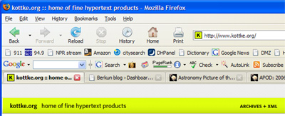
While Firefox’s toolbar design is more conventional, it’s also more polished. The side gradient shading in the icons (look closely at the Reload and Back buttons) give it a warm, friendly feel. Notice how their tabs are easy to scan, uncluttered by text on blue gradients. They shifted all non-active tabs to black on gray, a simple way to make large tab sets less oppressive (though scanning non-active tabs is slightly harder now).
The summary
I’m still a dedicated Firefox user. While 2.0 is a conservative release, the product does a better job delivering on core ease of use and functionality: its an easy recommendation. Despite being a browser designer, I have mostly simple browser needs, and would recommend FF to just about anyone. If you factor in the vibrancy of their add-on community, it’s also a winning choice for power users.
IE7 is much improved – but visual design mis-steps, some awkward design choices, and lack of any compelling feature advantage makes it impossible to recommend it to anyone currently using Firefox. I’d recommend the upgrade to any IE6 user for the security improvements alone, but also for the benefits of tabs.
In general I’m left hoping hoping that both camps have their eyes on what browser user experiences could and should be like. There’s so much more user experience ground browsers need to cover. Lets hope IE8 and FF 3.0 build on their current foundations and take up the charge.
IE7 Download / FireFox Download
And don’t miss my review of Opera 9.02 – you’ll be surprised.


What did you think of Opera 9?
You read my mind – here’s my Opera 9.02 review.
i saw your Opera 9.02 review for a second on the rss feed but its gone and the blog link is failing with “Sorry, no posts matched your criteria.”
Sorry about that – not sure what the problem was. Looks to be a-ok now.