UI makeover: del.icio.us
Back at the Emerging technology conference I presented a quick and dirty makeover of several popular web 2.0 sites and UI idioms (See slides for my talk: data vs. design). The fun and much loved Del.icio.us was one and here’s a makeover recap.
Step 1. The popular page
Del.icio.us is a social bookmarking site, and the /popular page shows which bookmarks in the del.icio.us system are most popular – but the layout uses open flow, blue on pink text (eek), and sloppy columns which all contribute to making the page hard to scan.
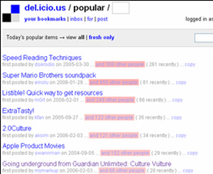
Step 2. Make a grid
The most basic layout trick in the world is the grid – throw down some columns and check how the stuff in the design lines up. The more things that don’t line up, the more work people’s eyes have to do. In this first photo, look at how the del.icio.us design compares against a simple 3 column layout. Not well.
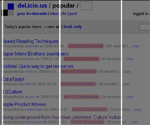
In the next screen I’ve marked every visual column that the existing layout creates – each one of these lines is a point in horizontal space people’s eyes are forced to track to each time they try to read the next line – that’s a lot of wasted energy (and time).
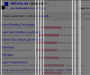
Step 3. First pass
As a first pass, I’ve aligned all text into 3 columns. I killed the blue on pink, switching to black. I’ve also trimmed all the extra text from the pink brick, trimming its size by half.
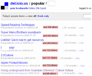
Step 4. Second pass
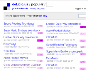
After 15 minutes of experimentation, I was able to pull the data down into two complete, easily scannable columns. I brough back slim color bricks, but forced them into three buckets (light pink = low, pink = medium, intense pink= high) as that’s enough to indicate how popular they are, but keeping them easily distinguishable (And yes, there are better color choices to go with blue/black but I’m lazy in no-frills makeovers).
Step 5. Side by side comparison
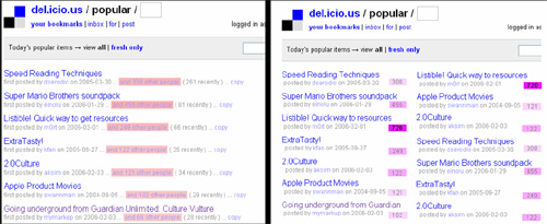
Here are the two designs side by side, original on left and my quick makeover on right. My makeover fits more data into the same space, is faster to scan, easier to read, and slightly more attractive. It’s both easier to scan titles and which items are most popular.
Summary
- If you’re a data centric site, be fast, clean and lean.
- Use a grid or basic columns to frame the layout, and speed user eye movement.
- Trim extra text – especially if you’re repeating things every line.
- Use colors to signify and speed understanding, grouping data together (high / medium / low) to speed comprehension.
- (And yes I cheated in some screenshots as the examples don’t match perfectly – but you got the idea, didn’t you?)
What’s next?
Have a popular site you’d like me to throw some design mojo at? Name it.

Hiya Scott,
Interesting work, but is it really a good idea, design-wise, to have two columns for text? I’m all for it in news papers and such, but on the web and when we’re talking lists, not body text?
I always get confused as to if I’m supposed to read the lists downwards or across. Yes, I know that I’m supposed to read them downwards in this case, but it always seem to take me a couple of seconds to figure this out when I come across a new list.
It can be fine to go two columns – It’s faster to skim two columns on the screen, than it is to scroll down a list. Eyes are faster than hands. It also depends on the total number of items: in this case the popular screen only lists 20 items, which almost all fit on one 800×600 screen in the two column version.
I like it – it’s a lot easier on the eyes than the original/current. Now all I need is a Greasemonkey script for this… :)
OK, proof certain that its needed. How do we apply this now?
Is this something that could be achieved using Dapper?