Usability review #3: Ginablack.net
#3 on the free review list is a site for the writer Gina Black. It’s a simple site and does many of the basics well, but the home page makes some fundamental mistakes.
Issue Summary:
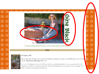
- Border pattern distracts from the page. Like ParkingFriend, this isn’t a poster and there’s no need to draw attention to the page. Patterns in the page gutter, unless they are sublte (e.g. grey on white), ask people’s eyes to look at them.
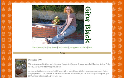
- The picture, and page header, is way too big. Any header item appears on every page, which means it should earn it’s keep. A big photo of Gina takes up almost half of the screen, forcing me to only get about half the page to see whatever it is I clicked on.
- Vertical text is hard to read. There’s a reason newspapers run text left to right – written language is designed for horizontal scanning, not vertical. You can get away with it now and then as it can create interesting visual patterns, but if the site is designed to promote a person I’d keep it simple.
Before, with issues flagged:
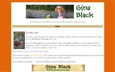
After
What else I’d do:
- Find a new picture. I just cropped the existing one to fit, but I’d find a picture that has a natural horizontal composition.
Wow. My name definitely pops when it’s tilted in the proper direction.
As far as the header image, it’s different on some of the pages, so that would have to be coordinated. For a horizontal image, I suppose I could always lay down. ;)
Thank you SO much. I appreciate your taking a look and analyzing my site!
Hey – you’re welcome.
And I confess at being a tad embarrassed as usability daywas more than a month ago. However, notice my PM skills in action – I never promised when I’d get to these things. If you never commit to a date, you can never be late :)