Usability review #4: Simplygoogle
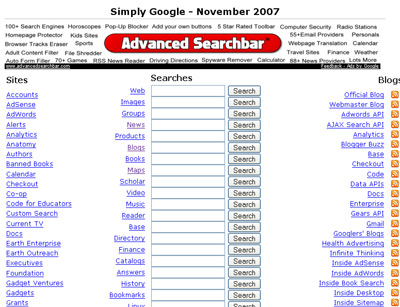
#4 on the free review list is SimplyGoogle a utility page, exploding out many of the google options onto a single page. Since there aren’t that many user tasks here, there wasn’t much to work with. The core problem with the page is layout – it’s an endless series of command buttons running down the middle of the page.
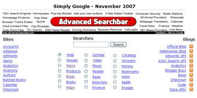
The easy remedy is the ever handy radio button: as a rule of thumb, if you can get away with one command button instead of ten, you’re making an improvement. You get tons of real estate back, and it’s easier to scan the list of options.
Before:

After:


In the “before” picture, you just type in the value and hit Search.
In the “after” picture, you have to also perform the action of selecting a radio button, which means leaving your keyboard and using a mouse.
How is usability improved?
Why do you have aligned labels for radio buttons (Web, Groups etc.) to the right?
Isnt it quite harder to associate radio button with text if they are aligned to the right?
Krishna: That’s not quite a fair comparison. In the “before”, you have to select the correct edit box to type into.
But you are right: My design assumes that selecting a radio button is an easier task than selecting an edit box. Two reasons:
1) It saves space. By switching to radio buttons they all fit on one screen, in about 10 lines and are easier to scan.
2) Radio buttons are designed for selecting one from many – that’s the single reason radio buttons exist in any UI system anywhere (Macintosh/X-Windows/etc). A long list of edit boxes doesn’t make as clear how the UI is supposed to work as a simple use of radio buttons does.
Maxim:
Good point – was just laziness on my part. Fixed.