Google’s web browser (Chrome): early review
I’ve written often about web browser design, so I happily downloaded Chrome, Google’s new web browser (download), a few hours ago. Although I’ve been running it through its paces, this is an early review, as its over days and weeks of use that some features shine, or disappoint. Disclosure: I worked on IE 1 to 5 for Microsoft in the 1990s, and currently use Firefox 3.0.1.
Summary: Chrome is a low-frills, light-weight, stable (for me) beta quality release. High points are the simple design, easy import of FF/IE bookmarks, and (promise of) greater performance. Low points are beta level completeness in UI, and few of the familiar frills from IE or Firefox. There are big bets in here that challenge existing browsers, but will take several versions to fulfill.

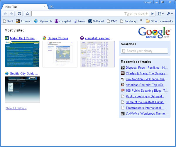
UI: The most notable move is starting with a thumbnail view of most recently visited pages. I’ve advocated for this in the past: anything a browser does to use past user behavior to accelerate future behavior is a win. Showing the choice of the ten most frequent places I go as the first place is downright basic UI design goodness. Otherwise there isn’t much UI to speak of. The the actual browser chrome is thin, making the name ironic. No menus. No home button (option to turn it back on). Dropdowns to the right of the address bar provide access to tools and options, much like IE7/Vista. Bookmarks, in a generic scrolling list, are accessed via “other bookmarks” in the lower right corner.
One clever perk is an improved find. Hitting Cntr-F extends the top right of the toolbar into an edit box, with a up/down arrow combo for moving through hits on the page.

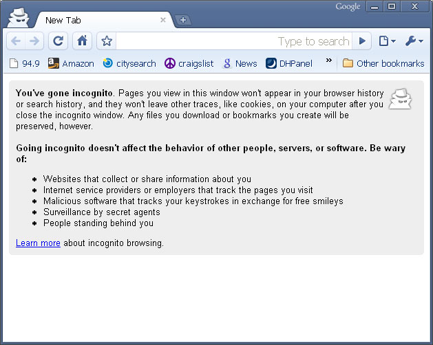
Features: The big news is Incognito mode. You can open a window with maximum privacy: no cookies, no history, no nothing. Gripe is this can’t be a tab: it forces a new window. I was intrigued by this until I realized realized previous cookies still worked. So its not an entirely anonymous browser mode – it’s anonymous from the moment you create the window forward (either that, or I experienced a bug). History search is provided through the Most frequently used home page – it’s simple and worked well, and runs full screen (unlike FF or IE).
Another big move is task monitoring by tab. You can look at each tab as a separate process and kill individual tabs. Right click on the title bar, hit task manager, and there you go. In a couple of hours I didn’t get a chance to use this, but if it works as promised whole-browser shutdowns should be uncommon.
Performance: There doesn’t seem to be an easy way to test javascript perf – no stanard test suite i could find. Across the board of 3 different (kane, WD, SunSpider) test suites i ran, Chrome won. Margins ran between 20% to 100% improvement over FF or IE7. For subjective measures I spent a good half hour on Jay Is Games, as flash games tend to push browser & system perf to its limits, but didn’t notice significant differences. This is an ad-hoc perf analysis, and focused purely on Chrome’s strength (javascript), but it was nearly all in Chrome’s favor.
Platform . Much of the promise described in the Book about Google Chrome (Charmingly cartooned by Scott McCloud, but a 2 page doc would have been an easier read) is about the platform. Improved security, enhanced performance, and an architecture that makes plugins and extensions easier. It’s hard to test or evaluate these things in an afternoon. I definitely liked their story for what they’re doing and why, but platform plays require getting FireFox and IE developers to take advantage: a long and slow process, no matter how amazing the new kid on the block is.
Bugs/Gripes:

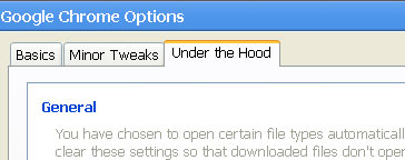
- Tools.Options. There should never be consumer facing UI with labels “Minor tweaks” and “under the hood”. Anything in Tools.Options is under the hood. Call the different groups something that helps me pick which grouping I need: Browser Preferences, Network Settings is easy split. This UI is a conceptual mess, which is fine for a beta and common for the UI ghetto that is often Tools.Options, but a proper UI designer should get in here and sanitize.
- Wrong Shortcuts. Rule #1 of being the new browser: make it easy for people from old browsers to switch. At best even early adopters will be switching back and forth between Chrome and something else for months. Most of the IE7/Firefox shortcut keys do not work in Chrome. Easy to fix, and hope to see this in the final release. It’s easy code. Why not have a FF or IE user mode that swaps in the right shortcuts (Firefox is guilty of this too)?

The under the hood is sweet, normal people know they dont want to open the hood, thats for mechanics. Also nerd statistics, are for nerds, so they are well labeled. If they labeled them helpful stats people would click on them and assume that they would help them.
A ver interesting feature for Chrome is the reports and stadistics (about:memory) You can have detailed statistics of the resource usage for the browser and it’s individual processes. I think is a very nice move by Google, for sure a future standard browser. Watch out IE7/8 & FF
[correction]
Google Chrome breaks by obeying alternate style rules as if active.
Basics here:
http://jeremyjarratt.com/2008/09/03/google-chrome-obeys-alternate-css/
Basically, avoid style conflicts, and list your alternate links BEFORE your active ones.
James: I like the idea of calling something “under the hood”, so we agree there. My point is that if you made a list of all the stuff they have in tools options, all of it belongs under the hood for an average person.
And the thing is that no average person will be using Chrome v 1.0 (which also makes the McCloud comic thing a beautiful oddity: its written for a layperson, yet is 30 pages long, and will be read, at least the first few pages, almost entirely by mostly the tech crowd).
Different shortcut modes would be very useful, most people hate to learn new shortcuts when switching browsers. IIRC, Opera changed some of its shortcuts in version 9 to make the switch easier for Firefox users.
Scott, I can’t agree with you on the “no average person will be using Chrome v 1.0” point.
People are talking about it all over the place.
It was even discussed on our local radio station in Israel.
I think one of the big reasons it has such exposure is because of the Google VS. Microsoft story behind it, Google becoming Microsoft by trying to control the internet etc.
I think the comic was actually written for journalists; at least, that’s whom copies were sent out to. Thus the layperson level explanation.
> No menus. No home button (option to turn it back on).
Omg, who need these? The most pointless button in any browser is “Home”.
caustic: if the only way to get to history and your most frequently used pages is home, then you need the button. I couldn’t find any other way to get back to that page.
Shmuel: There’s a difference between people hearing about a thing and actually using it. The fact that it’s in the news has much more to do with the Google vs. Microsoft story than it does with what the average user is going to do. Chrome’s install numbers over the next month wont even be close to Firefox 3.0’s install numbers (which are a fraction of IE’s install numbers).
Found additional perf stats comparing Chrome, FF and IE.
Press the + symbol to the right of the tabs to bring up the nine-thumbnail MFU start page.
Thanks JDC: Missed that.
It would be nice to have a constant status bar at the bottom, so we know the happenings on the page, if its still loading or done and shows the destination of links before actually clicking.
Whether it makes sense or not, I’m running as a sole user in XP (also same in OpenSUSE 10.3), and installed Chrome in Admin. mode. Have been struggling to try to set up permissions and whatever else is needed to run in user mode, because I try not to do routine stuff as Admin.
Either User Mode is not yet set up in Chrome, or it takes an über geek to do it. After all, it’s only beta.
[All’s fain in love, war, and alpha testing.]
Note to moderator:
Recent post, bracketed statement at end, “fain” should be “fair”; sorry — Dvorak-layout typo.
Please delete as you see fit.
Regards,
nicabod
Further thoughts about User Mode: The sandboxing scheme in Chrome, assuming it’s reliable, should make Chrome’s use in Admin. mode safe. As it is, considering that it’s beta, one is risking system corruption in Admin. mode, not a happy thought.
Constant status bar rather than a popup that covers the actual page’s content would be nice.
Better bookmark displaying and handling for those of us with huge bookmark collections. At least let us relocate the “Other Bookmarks” drop down and maybe let us dock it somewhere.
I could not access my company email system from chrome it was use less for me.I am trying out safari and Firefox now,I already had explorer.I have found Safari’s presentation very appealing!!
It seems like Google Chrome is the first browser on the market designed with productivity in mind.
Here is link for a review of 10 best productivity features in the browser: http://productivity-science.com/blogen/post/Top-10-Google-Chrome-features-to-boost-your-productivity.aspx
It is really nice review. Some other review can be found at http://raiyaraj.wordpress.com/2008/09/04/first-experience-with-google-chrome/
well, in the longer run the google chrome may outpace the firefox, and picasa, but it is still early time to comment tht it may punch out IE
First of all, Google Chrome Beta (yes, it’s still in beta) which was released not long ago should not be compared with any browser because it has been released for a short while and this is there first browser and it’s just a Beta (not the completed version) unlike Firefox, and yet it still manages to challenge Firefox. Wait until Google releases 1-3 more updates/upgrades/newer versions to Google chrome and then try it again and most of you would like it (or since i’m now posting this, try the latest version of Google Chrome) but if you want add-ons/extensions that don’t slow down your browser or cause other issues like with Firefox, give Google 5 months – 1 year. Also, Google Chrome, believe it or not, is much faster, has a cleaner interface, uses less memory, crashes less than Firefox (with me) and is more secure and Google releases 10-30 nightly builds of Google Chrome everyday and also has a Developers/Testers channel which has newer versions of Google Chrome every 1-2 weeks (with a change log and new features etc) which are tested before they are publicly released. Google Chrome’s EULA was changed the day it was released when an error was found in it.