How to show time during a presentation
João Adolfo Lutz asked me recently about noting time progressed / remaining in slides:
I’d like to know what do you think about printing kind of a “timeline” in the slides, lightening the topic that is being shown at the particularly moment. One teacher of mine says it’s very important for the crowd to know WHERE they are in the presentation, but none of the writers i read about (Nancy Duarte and Garr Reynolds) spoke about this particular topic.
The short answer is no. A good speaker shouldn’t need them.
Here are five ways to solve this problem. One good, four questionable.
1. The speaker marks time.
Time is important. There is a entire chapter on managing time in Confessions of a Public Speaker. However it doesn’t have to be in the slides themselves. A good speaker can remind the audience, in passing, when they are 1/3rd and 2/3rds of the way through their presentation. This implicit way is simple and easy.
However, I’ve experimented with different time marker techniques, mostly for Ignite, as the spirit of the format is that you do everything in 15 second units. I think explicitly putting time markers in slides can work if done with care. It’s all too easy to make it a distraction.
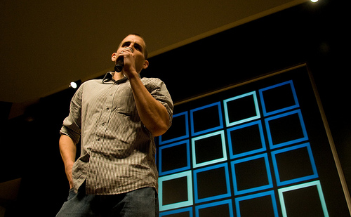
2. Gentle boxes – I divided the screen into 20 boxes, each box representing 1/20th of my total time. Each box slowly faded in. The light blue boxes represented 1/5th of the total time. I used no actual slides for the talk itself.

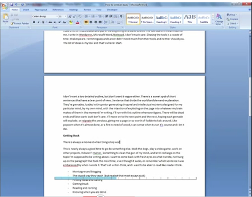
3. Progress bar – many people have done this. For my ignite talk on how to write 1000 words, we made a small progress bar on the bottom of the video, marking time. Its subtle enough not to be a distraction from the main event.

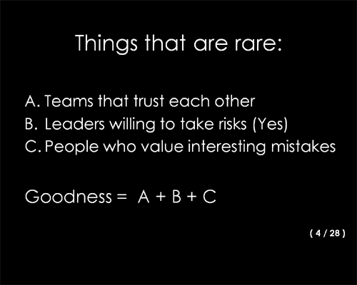
4. Numbers – The simplest way to go is to simply number slides, putting 4/28 in the lower right corner to indicate the 4th slide of 28. Three problems. First, a slide is not a measure of time. Second small text (e.g. subtle) is hard to read, and defeats the purpose of being a gentle reminder. Third, unless you have a slide footer, a number floating in space is a visual turd – it spoils basic composition.

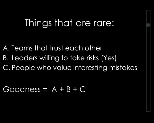
5. Vertical bar – I’ve never done this, but I’ve seen it (picture is a quick mockup). You put a visual indicator on the right most part of a slide, that moves down vertically for each slide. This is easier to do in a subtle fashion than numbers, but has the same problem of slides != time, and it has to walk the fine line of being visible, but not distracting. It also causes composition problems.

Summary
Keep it simple. Practice enough to know your basic timings. Then the timeline comes through naturally in the lecture, or because you mention to the crowd when you are 1/3 and 2/3rds done. It’s less work and a better experience.
Have you seen other ways to mark time? I’d love to know about them – please leave a comment.

I feel the urge to leap out the window when the speaker uses an agenda slide, telling the audience they’re only on point 3 of 11 (usually after you’ve been there for an hour…)
What’s a presetation?
A sinister rabid alien monkey changed my title when I wasn’t looking. I changed it back.
Was what João asked more about knowing what is being talked about at the moment, and what is coming up so the listener can pay attention to what interests them; rather than knowing how much time is left?
This post and the Confessions of a Public Speaker book are packed full of precious recommendations for those whose job depends on public speaking, be it at the conference, or, in the smaller group of people. Timing your thoughts gets your audience’s attention by providing them a feeling of accomplishment in real-time. It makes your speech less boring / monotonic, helps you articulate and emphasize on important points. It reduces the audience’s attention span and helps presenting the information in (virtually) manageable chunks allowing people to remember and learn more. Of course same may apply to those talks that have no slides. Thank you, Scott, as usual.
I wonder if you should really let people know about time. It just makes me feel that if you do it, you will give the audience a reason to keep track of how long there is to go and make them anxious.
What do you think, do you think it is recommendable to include time reference for a presentation?
This article is much more interesting for me ,i really enjoy thorough out the article.
Sam, the question serves for both purposes :-) But if someone really needs to know what you are talking about in the middle of the presentation, you have bigger problems than the time…
Scott, I think that in events where presentation time is fixed, like Ignite for example, it’s really unnecessary the timeline. But suppose a lecture, which can vary from 30 minutes to 2 hours, maybe would be nice for some of the listeners to know when it’s going to end.
Finally, I totally agree the best way is the speaker telling the audience how much time is left…
Thanks Scott!
Also, if there’s been an overview at the outset or if the outline is manifest in the presentation (“There are three reasons … (1) ….”) then the audience can implicitly feel where they are in the presentation and how much is still to come.
My recommendation: mark how much time should have left on the key slide handouts which you print for yourself. Then have a timer next to your handouts. So you can glimpse at the handouts time marks and the timer to know if you are on time. Of course, the first key to success is rehearsal.
P.S. I also dedicated one full chapter in my book The One Minute Presenter on “Finishing on Time”. For a glimpse, please see here: http://www.oneminutepresenter.com/2009/11/do-you-hate-rehearsing/