The final cover is here, plus a sneak peek
Thanks to everyone who voted through all three rounds of cover designs. For the last round, it proved to be too hard to find the right mix of symbols to use above the fire, and compose them well without overpowering the rest of the design. We chose to simplify and let the central image dominate.
Unlike the first two rounds of voting where I went against the majority, in this I case I chose the direction that got the most votes:

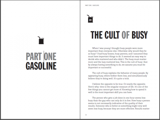
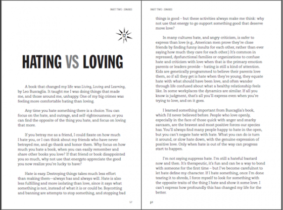
And as sneak peek, here’s the interior design, which we’re finishing up now. The book is divided into three parts: Gasoline, Sparks and Fire, each comprised of a different set of essays.


More details soon. Thanks to everyone who voted and offered opinions. Hope you’re happy with the results.
Right now I’m working with Tim to finish up the final proofreading and design tweaks, and soon we’ll be starting the actual publishing process.
Considering pre-ordering the book? Head over to the kickstarter page, where you can read more about the book, and pre-order the kindle edition, or try to nag me into making more pre-orders for the print edition available.

Looks awesome Scott.
Using both vertical space between paragraphs and indenting the first line of each paragraph avoids making a choice but punishes the reader. It looks amateurish. Please consider choosing one or the other.
Nice quote on the cover. Beats Bono’s wisdom! :))
I agree. One or the other.
I too am not sure about the both-indent-and-spacing for new paragraphs, but otherwise think the interior look is awesome. I think the blurb quote on the cover will sell more books than an endorsement by anyone short of Lady Gaga.
Unlike other readers, I like the vertical space + indenting choice for the paragraphs. Overall, I consider the current design a very neat-looking and excellent choice.