What I learned going back to UX school
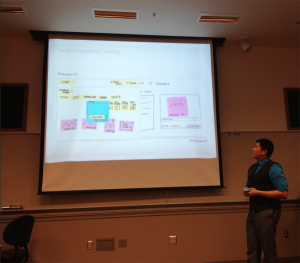 Last week I was on an expert panel, giving feedback to final project presentations at the HCDE 518 User Centered Design course at the University of Washington, taught by Douglas Pyle (syllabus here). Its always fun to see what students are doing. They are the future after all. My fellow experts were Matt Shobe, Larry Sisson and Marcos Nunes-Ueno.
7 teams each has 12 minutes to present. Our job was to ask tough questions and critique their presentations from a professional context.
The project was: Apply user research to a major cloud service and redesign it (Dropbox, SkyDrive, iCloud)
Things I learned:
- Students have fresh eyes. While many of the students in the program are not undergraduates, because the project is in the school environment their take on things is different, and there are always surprises. It’s really enjoyable to listen to student projects talk about their assumptions, ideas and designs. I was supposed to be there providing “real world” commentary, and I did, but I learned a few things and heard quite a few surprises. If ever you get the chance to do something like this in your field, I recommend it.
- Group presentations are hard. There were 7 teams, with 4 or 5 people each. Everyone was required to participate, and making a single, clear, coherent presentation when you have to divide it into 5 parts for 5 people is just hard. Part of the challenge of giving feedback was separating artifacts of the presentations from the research and designs themselves.
- Generative vs. Evaluative. While I’ve known there are dozens of different methods, I’d never heard them divided into two piles: one for coming up with ideas (generative) and one for evaluating ideas (guess what that pile is called). Nice.
- Technology moves in spirals. Many of the teams were ambitious, adding major new functionality. Being an old dog, I can recall when the web was often sold on the promise of simplicity and single purpose designs, a huge relief from the heavy all-in-one collaboration tools of Lotus Notes and SharePoint. But the cloud is maturing and, according to these students, the need for collaboration at work will push complexity back in. Setting up of course the next wave of simple tools to poke holes in it all over again.
Cool things I saw
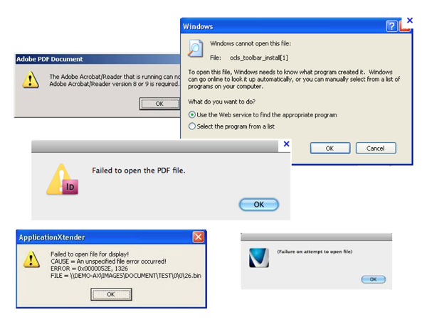
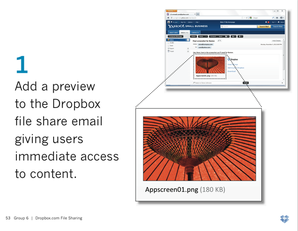
Team 6, Matina Fresenius, Allan Luik, Ashley Saleeba, Don Wesley and Jessie Xue, focused on the challenges of sharing files through DropBox.
- They surveyed DropBox users through Social Media and Craigslist.
- 73% used dropbox through the web portal
- Wide range of content file types
- 92% wanted preview before downloading shared files from others (it had been requested on dropbox forums in 2009)
- They observed 11 real users and recorded the key places they struggled.
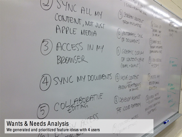
Group 3 took on iCloud. They were one of the most ambitious redesigns, and had the bad luck of going last. Their good luck was picking iCloud, which no one else had taken. They were Sarah Emerson, Andrea LarsenBronwyn McNutt and Zulka Ramirez.
Among the research they did was a Wants & Needs analysis, where they work with users to prioritize possible improvements to the existing design.
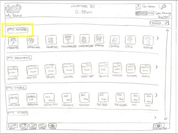
Then they built a paper prototype (I so wish more people used this awesome and fast method), using a “Netflix style” view of all of your content.
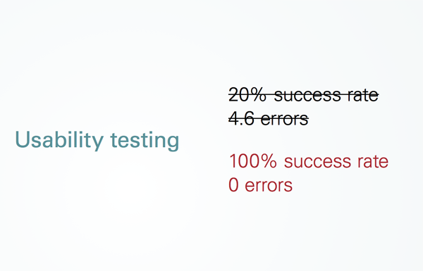
Group 7 (Brian Espinosa, Royal Stuart, Lori Tompkins, Adrienne Trudeau, Dasha Valchonak) was one of the few teams that reported on before and after results for their redesign. In a briefing, it’s data like this that tells most of the story.
People throw around sayings like “Easy to Use” or “Intuitive” but without some data those are merely opinions. When it comes to measuring ease of use, there are well established things to track:
- Success rate: What percent of users can even do the thing its supposed to let them do. Often this is well below 100%.
- Time on task: how long does it take users to do the thing it supposed to do. Better designs take users less time.
- Error rates: how many mistakes or confusions does the user have.
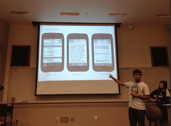
While many of the redesigns were ambitious (as Shobe said “making a bit tent”), one of my favorites focused sharply on one scenario: how to improve collaboration as simply as possible. This team was comprised of Ajay Alfred, Sue Boivin, Jeanie DuMont, Alicia Lee, & Pat Matrich. Based on research, they decided the most valuable feature to add to Dropbox was the ability to add comments to Dropbox files. This would allow someone updating a document to leave a short note about what the change was, or ask/answer a question without having to open the document. And they focused on the mobile design for the feature first, with a design that seemed simple and slick.
Sloppy claims in User Research
I’m always cranky about how anyone in any field uses ‘research’ to justify things. Of course these were students and they were being graded primarily on their redesigns and presentations, not the details of their research. However I kept track of sayings and statements that had this been a professional situation, I would might have challenged.
Many people in the professional world BS their way through talking about research – particularly with the bias of “the research magically says the thing I wanted it to say before I started doing the research”. Everyone is guilty here. But if you call yourself a reseracher its fair to expect more in the way of research ethics. Its not hard not to be sloppy. Sloppy sayings include things like:
- “Our research said…” – research never ‘says’ anything
- “Our study indicated people want X” (Couldn’t an evil person design a study to get people to say they want X or Y or Z?)
- “We had compelling evidence…” What does compelling mean?
- “Our findings proved…” – What does proof mean? Could it have been used to prove other conclusions?
- “It was obvious…”
- “The redesign had great success…” – by what standard? What metrics were used?
- “Many..” – Is that 1 or 2, 3 of 5, 5 of 20?
- “We found that users…” How many of them? All? 4 of 7? 2 of 7?
- “Intuitive…” – should be a banned word. Better off talking about tasks and usability measures.
- “Most cited…” – maybe only one thing was cited.
- Naming a percentage without mention of quantity (e.g. 100% of 1 user doesn’t mean much)
- “Users want… ” – this is always speculative data, as what users want and need are often different
- Anecdotal vs. Substantive data (e.g. “What we heard in the usability study” – is that one person? More? What?)
- “They wanted…”
Sloppy use of phrases like these sets off alarm bells for my BS detector. Even if there is nothing sketchy going on, its the researchers job to ensure there is no room for doubt. All researchers should assume they have to earn the trust of their audience. As a result, I have a list of questions I often ask people who claim their design decision is right based on research:
- How many participants were there? Was that enough to have high confidence in the data?
- How did you compensate for recruitment bias? (all participant recruiting has bias)
- Do you have specific criteria for ‘success’? If not, how do you know it was better?
- How do you know your questions and methods didn’t lead participants to the answers you wanted? (Did you counter-balance, etc.)
- What questions can not be answered by your research?
It was unfair to poke hard at this in a student presentation – and I tried to clarify the point and not beat them up much about it. But here on the blog I can ramble on and on about it, assuming anyone is still reading.
The best recommendation was to have a couple of slides hidden at the end of the slide deck with detailed summaries of the research (# of participants, methods used, specific data on results, etc.) in reserve, to pull up if you have a hard-ass like me in the audience, which the more UX work you do, will happen sooner or later.
Thanks to Doug Pyle for inviting me, and all the students for letting me hear their presentations.

This is will always be one of my favorite courses in the HCDE Masters program, and was a great way to start off when I began it a year ago. Sounds like it’s still the great class I remember, despite me keeping my group mates from killing each other, and Doug is an excellent teacher.
Which I have always wanted to ask someone in the HCDE profession- what are some ways to keep a usability group focused when strife or personality conflict comes up? I think I did a good job keeping things together if grades were used as an indicator, but there will always be clashes in personality. Are there any situations you have encountered where you struggled to keep a group together, or have you mostly worked solo?
Thanks!
Good read – I miss you guys! I used to share an office with Doug!
Scott, you were the perfect panelist!
We missed you this year, but I’ll hit you up again in 2014 ;)
Owing to your article, I learn a lot about how to make the redesign project presentation in a proper way. The way to present, the way to organize materials, and what implies a audience when doing such design work. You gave detailed and great suggestions! Hope to see you in 2015 at HCDE class!