Feedback wanted: redesign sketches for scottberkun.com
For the last two weeks I’ve been working with designer/developer Ryan Sommers on a redesign for scottberkun.com. I asked you readers for feedback on the current design a few weeks ago, and wanted to post again with an update.
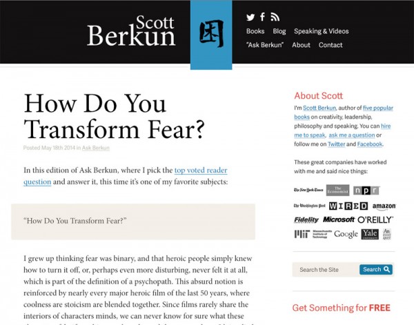
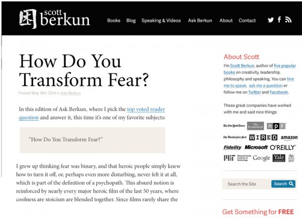
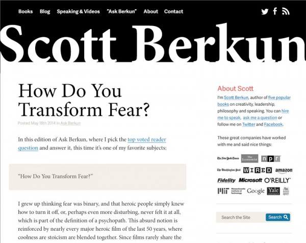
Here are three concepts we’re working with. Have a favorite? I want your input since it’s you folks who will be looking at this new design for the next few years :)
The redesign goals included:
- Make the visual styles coherent and cleaner
- Make first choices for visitors easier
- Prioritize interactivity through Ask Berkun and comments
- Emphasize conversions to the mailing list
These concept sketches just show the basic design choices – the details, copy, sidebar, etc. haven’t been decided yet.
Concept C

Concept A

Concept B

You can vote for your favorite, but leave a comment if you have suggestions or commentary. Thanks:

Your writing is great, compelling, and thought-provoking. So I love the large article headline, but went for C, which didn’t put your name or stamp first but led with the content.
The stamp is deeply meaningful for you, I’d wonder about including it at the conclusion, stamping each article instead of in the nav.
Two cents, and armchair quarterbacking – it’s going to be a nice update.
Design C.
– name is prominent but not distracting like in design B.
– ‘logo’ is stronger visually but not first in hierarchy as in design A.
– sidebar in all designs is too cluttered
Improvements:
– reduce number of menu items, 3 or 4 or 1 line.
– remove social icons from menu. This type of header needs space for the menu to get noticed (and used)
Tips:
– reduce reliance on ‘main menu’ by weaving navigation into the fabric of your content.
I went with A-think it is pretty clean looking.
Scott, you’re selling your name and your commentary, rather than your tattoo, which is why I like #2 of these three – big name turned into a design element, large post title. However, I’m not sure how the head would work on a smartphone. I like Ravi’s suggestion of using the symbol as, say, the divider between articles. #2 also has easy to find menus across the top. I wonder, though, if all that stuff on the left eats away at the otherwise clean designed-for-reading look.
Dyslexia moment – all that stuff on the _right_. Or maybe your left, if you’re looking out at us from behind the screen. :-)
Something has to go in that upper left! The tattoo was just pulled from my current twitter image. I don’t have a logo, but if I did that’s where it would go.
Your question “which design is the strongest?” would probably be option B for me. But there, the strong feeling is mostly repulsive – I feel that your name there is just too bold and big.
From a usability point, I really prefer design A – all important things in one simple line…
Thanks Daniel.
I really don’t like the multi-line menu in C.
I voted for C. I like the stacked name, the “splash of color,” and the overall look.
Like Phil, I am less enamored with the double nav line.
And I’d like to see if you could play with the splash of color. Can it be directly above the break between your content and sidebar? Would it work if your name was on the right, rather than the left?
I like the splash of color in C, which is why it gets my vote, but I agree with Phil Simon that a two-line nav is unappealing. Also like the relationship between “Scott” and “Berkun” in C best of the three.
If you’re going to run this a while, consider changing the order of presentation, and the voting list, too of course.
Went with B because this is all about your special offering to the world. A and C seem too similar to countless general sites.
I don’t know if this was intentional, but the order of the letters on the options is C A B and the voting is A B C. Not sure people would notice so your results may be inaccurate.
I like the splash of blue but think the tattoo “logo” makes the site’s purpose confusing. Maybe if you had an “SB” logo like your favicon it would make more sense.
Not a fan of the two-line nav or right aligning your name, and I think your name being really huge is just a bit much. So I voted for concept A, layout wise. I’m assuming you may use color instead of black so my liking the color in concept C is moot.
I like voting!
Concept A. In B, the “logo” is too prominent and in C it’s the name that’s prominent.
B is the strongest, also in terms of showcasing the menu items for “Ask Scott” etc
But there is something about the sign on blue blackground in concept C that I really like.
I’d like to see a picture of you in the sidebar. Show us who that handsome Scott Berkun guy is!