New site design launches Monday
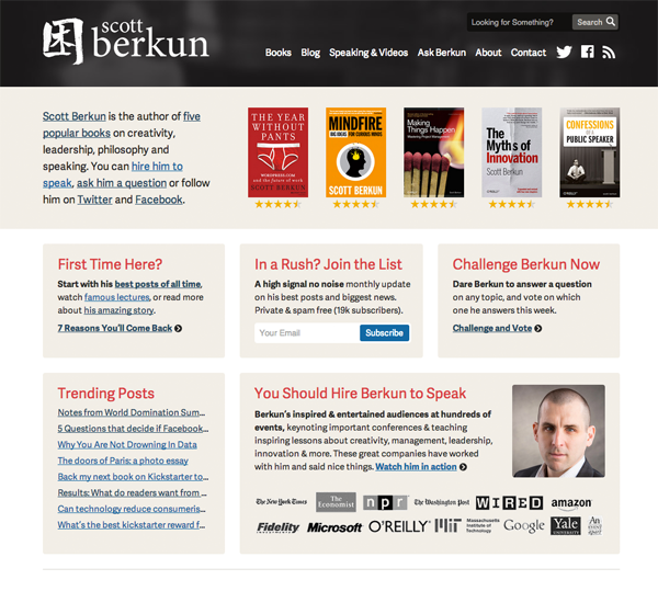
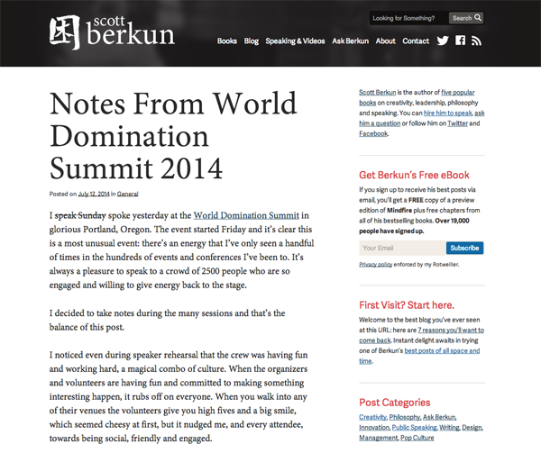
Ryan Sommers at Sevenbold and I have been working on a redesign of scottberkun.com for the last few weeks. We’ll be launching the new design Monday morning. Things should go smoothly, but this is a warning just in case. Here’s a preview of what’s coming.


In a Rush? Love. That. Word. I’d bold it and increase the font size 500%, but that’s me.
Quite refreshing! My quick comments: One, the logo and hence navigation too should move down by around 10px. Two, use the red color of headings as the search icon, to lend color balance in the header.
Thanks for the feedback Vinish. What browser/platform are you viewing on?
I use Chrome (Version 37.0.2062.120 m)
Looks very slick! What is the pictographic logo?
Test comment
Today’s comment test. Sorry if you see this.
Today’s second comment test. Wheee.
Take 3, for good measure and to verify there’s a problem.
Hi Ryan!
I bet this is the last test comment.