Recently two notable design advocates, Don Norman and Joel Spolsky, challenged the value of simplicity in design, and I’m here to offer a late defense.
Confusion
It’s easy to confuse success with quality, and both articles discount our secret inability to make satisfying choices. We are attracted to things with more features, that cost less, or come in larger quantities, despite our inner suspicions that we’re likely to complain about those purchases soon after. We date people, eat food, take jobs and buy products for superficial, misguided reasons all the time. We’re easily seduced, and every marketer knows we always have been and always will be.
But we shouldn’t confuse the success of feature-laden crap as a signal for the irrelevance of simplicity any more than the success of Rocky IV and Burger King signaled the irrelevance of good film-making or fine dining. It just means there are gaps between what we need, what we want, and why we buy, and that the masses are by definition less discriminating than the niches of people with refined tastes for a particular thing.
Joel points out that the i-pod’s success involves factors other than simplicity – but this is true for all products and all things, including failures, successes, complex and simple things. This isn’t an argument in support or against simplicity’s value: it’s just a sound statement of fact – many factors irrelevant to product quality impact success.
Counter-evidence
There are many things in the world that sell well on simplicity: they’re just rarely market leaders. You can find a quality brand that tends to simpler solutions in every market, and at various price points: Bang & Olfsen or Bose, IKEA or Crate & Barrel. These are not the revenue generators Panasonic or WalMart are, but there you go. They exist as viable businesses based on (the attempt at) simplicity. Musicians like Jack Johnson and The White stripes make straightforward, “here i am with my instruments” music, and have done well by avoiding the trappings of over production. They’re not top 20 stars like Brittany Spears or Justin Timberlake, but they deliberately chose not to be.
And then there’s food: what could be simpler than the experience of fast food? McDonalds and Taco Bell even make meal deals: a single number uttered from the comfort of your car, and a swipe of a credit card, brings warm food in minutes. We are convenience junkies and literally die for simplicity, as the thousands of people who find putting on seatbelts or going to the gym too complex or inconvenient to save their own lives.
We all desperately want simplicity. But we’re so well trained to consume that we impulsively expect to buy our way there. We believe to the point of faith that we’ll be complete, or have a simple life, if only we buy the right combination of products.
The trap of visible features
The real trap that consumers are in is that we want proof for what we’re paying for, and engineers and marketers know it. They sell ease of use and simplicity on the back of every box and in every ad: but they also sell it in the products themselves, trying to show ease of use in added buttons, options and the superficials of quality.
Great features do not require user interfaces. If the engineers are thoughtful, they can add code that eliminates the need for UI, instead of adding to it. This is much harder and requires smaller egos, but a great v3 needs less UI than v2: eliminating setup, configuration, simplifying designs, automating things successfully so that users don’t even need to know of them (not just automating my interaction with things). This is much harder and requires real innovation, but is too selfless and long term a philosophy for most to swallow.
 Instead designers and engineers are all too happy to stroke their egos by fighting for their little do-dad, the little button, the in-product advertised feature name, Auto-this, Intellii-that, a signifier to the world for what they worked on all year. And they’re encouraged to do so by marketers and sales, as those visible things make the release easier to sell. But it’s a suckers game and after we buy these things we know it and the the designers know it too. They know it when they hold a Zippo lighter or write in a Moleskine, well crafted things they desperately fetishize: they know they’ll never make something with that much design integrity in their entire lives.
Connoisseurs of anything discern between trash and class. They know that understatement is class’s hallmark: it’s a product, person or design that knows it has substance, and does not need to go far out of its way to prove itself: its core is good. This is part of what drives the lust for Apple’s aesthetics. The trash, the wanna-be, the knock-off has to parade distractions, buttons, gadgets, and modes to compensate for its lack of core design integrity.
But who has the time to become a connoisseur before making a purchase? How much cash is the average person willing to spend for quality for something they don’t know much about? Not most of us, not most of the time. Which explains why mass market leaders are often simplicity demons: they betray the idea of good design by relentlessly abusing our ease of seduction and shoving the pretenses of good design, the magic tricks not the substance, in our smiling faces. Until we’ve been burned by a kind of product, or have never seen the real thing, we don’t think we need to look carefully at the alternatives.
Stupid word semantics
Both articles use the words simple and complex in various ways. If it takes me 30 hours of preparation to make you a cupcake, is that complex or simple? The process of creation might be complex, but the result can still be simple, and vice-versa. The semantics get messy fast.
The way out is experience: if the consumer wants to experience something complex, say a jigsaw puzzle, then the ideal design is a puzzle that provides that experience in the simplest way possible. Any challenge that wouldn’t interest me, say fighting my way through bullet proof plastic wrapping, has been eliminated or reduced.
As Mark Hurst points out, complexity is often desirable if it’s the experience customers desire. Ask a software developer or an airline pilot if they want complex levels of control: of course they do. But they don’t want complexity that annoys, or that distracts them from the experience they want. Simple design doesn’t mean brain death: it means being being as simple as necessary to achieve a great experience for a group of people, but no simpler.
——————-
If this missive wasn’t simple enough for you, LukeW has a nice summary of all the recent simplicity blogging.
 I recently met Jonah Burke, one of the directors of the darfur foundation, to chat about innovation. I came across his project, darfurwall.org, at Ignite Seattle, a local tech-sector meetup.
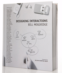

 Mysteries abound about how books become books. Unlike the
  My
My 

 Instead designers and engineers are all too happy to stroke their egos by fighting for their little do-dad, the little button, the in-product advertised feature name, Auto-this, Intellii-that, a signifier to the world for what they worked on all year. And they’re encouraged to do so by marketers and sales, as those visible things make the release easier to sell. But it’s a suckers game and after we buy these things we know it and the the designers know it too. They know it when they hold a


