The myth of discoverability
[First published August, 2003]
The myth of discoverability is the belief that in a design it’s possible to make everything equally easy to find. I’m here to tell you that you can’t. You have limited screen real estate, people have limited attention spans, and brains have limited abilities to perceive information. A designer is always forced to make tradeoffs and choose which things are worthy of more attention than others. Each time you add something new you are taking attention away from something else.
If the designer fails to prioritize, the result is a design where nothing is easy to discover or to use. Everything is emphasized, which means nothing is emphasized.
For example, compare this sentence:
- YOU CAN NOT MAKE EVERY SINGLE WORD STAND OUT.
To this one:
- You can not make every SINGLE word stand out.
Why everything can’t be discoverable
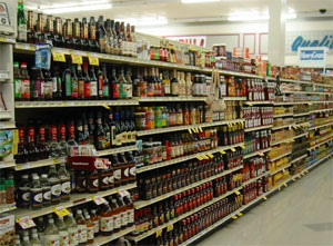
Imagine a car where every UI element was the same size. Replace the steering wheel and instead have dozens of other equally sized controls for the stereo, air conditioning, and everything else in a random order across the entire dashboard. Although the stereo and air conditioning might be easier to discover, the overall tradeoff is a disaster. Since the steering wheel is used every time a user drives, and is used in every moment while they are driving, it deserves the greatest real estate and convenience possible, even if it’s at the expense of the discoverability and convenience of nearly every other feature in the car (of course the windshield is the largest UI element in the car, and is nearly infinitely discoverable).
Everyone is glad the steering wheel in their automobile is easier to discover than the defroster button or glove box (oddly named since no one puts gloves there anymore). They expect that whoever designed the automobile, or web site, is making good basic choices in their interest, so that they don’t have to think too much about how to find the most frequently used interfaces in the car. In part, that’s what they’re paying for.
This means that anyone that builds things that people will use has to consider what things need to be discoverable first, and where the emphasis of a given design should be. This turns out to be difficult, and as a result, many designers and engineers do everything they can to avoid these kinds of considerations. Many mediocre designs are the result of the avoidance of tough decisions on the part of the designer, rather than an inability to design well. Or worse, the design reflects decision by committee, where everything gets equal emphasis because no one designer was empowered to make the necessary tradeoff decisions.
Is discoverability the primary element of design?
Discoverability is one link in the chain of elements that make for good design. Of course if you can’t find the steering wheel or the gas pedal, you can’t even begin to do the long sequence of steps required to drive the car to the store. Given that it’s impossible to click on something you can’t locate, discoverability is certainly important.
However, discoverability does not guarantee success. It’s possible for a user to discover the correct item, but not know how to use it (e.g. grayed out commands in an application). It’s also possible for an item to be discoverable, but difficult to use. I may know exactly where the spare tire is in the trunk of my car, but that doesn’t make it any easier for me to successfully change a flat. Lastly, a user might be able to discover an item the first time, but have trouble locating the item a second or third time. So the fact that something can be discovered does not imply that their experience after the moment of discovery will be good.
How do you decide what to make discoverable?
 You have to prioritize. Whether you’re designing a toaster oven or an airplane cockpit, you must prioritize the tasks you believe users will do. Some designers call this scenario based design, where you create a list, preferably based on user research, for the typical things your users need to accomplish with the design. There are many different methods and it doesn’t matter which you use provided you’re using one.
To generate a prioritization for your design requires stepping away from the functional, engineering view and focus on the perspective most people who will use the thing will probably have.
Everyone thinks they can easily switch gears in their mind to obtain this perspective, but most fail. Usability studies, when done early, commonly show how different user expectations are than the designer’s. It takes hundreds of hours watching real people use real things to develop good instincts for what should be most discoverable and how to design to achieve it.
The golden rule for what to make discoverable
Here is the golden rule:
Things that most people do, most often, should be prioritized first. Things that some people do, somewhat often, should come second. Things that few people do, infrequently, should come last.
That’s it.
If you want more detail, here is a deeper prioritization of how to think about the relative importance of tasks and features:
1. Things most people do, most often.
2. Things most people do, somewhat often.
3. Things some people do, most often.
4. Things some people do, somewhat often.
5. Things few people do, most often.
6. Things few people do, somewhat often.
Depending on what you’re designing, and who you’re designing for, you might have different categories, and place them in a different order: that’s fine. The important point is that you are prioritizing the kinds of tasks and frequency of occurrence, and using that to drive how you allocate resources in your design.
Designing systems for expert use can bend the rule significantly. An airline pilot or air traffic controller is an expert doing expert tasks, and may need much more complexity than your average consumer design. There may be mandatory training that shifts the needs of the design towards optimizing for expert efficiency, rather than than initial ease of use.
Notable Exceptions to the rule:
- Start up tasks. You may have an important thing that people need to do only once, but it has to be done to enable everything else. (e.g. login, registration, application install, etc.). So even though this might not be done frequently, it may score high in the priority list.
- Some features might be needed only in emergencies. So while they aren’t used frequently, they need easy availability. (E.g. No pilot wants to use the eject button, but if ever they need it, they shouldn’t have to look for it. Car horns are another good example).
- Complex systems may require more complex considerations. Systems involving real time (air traffic control terminals), or intimate usage (development tools), make prioritization more difficult. The more complex the usage patterns, the more design thinking and iteration that may be required. This is more common in application design, than in web design.
- Diverse user groups. For sophisticated applications, there may be specific types of usage patterns associated with certain roles (administrator, user, teacher, student, etc.). It’s possible that the usage patterns are so different, that you might choose to optimize around those roles. You might want to invest in making different things discoverable for different types of users.
Applying the rule to designs
Once you’ve identified the things that are most important to the design, you can go and focus whatever design, engineering, and usability resources you have on those things first, and on making the important elements of your design discoverable. Perhaps the most flagrant mistake in design are websites or computer terminals that use the most important sections of screen real estate for things that are at the bottom of the priority list.
Progressive discoverability & Context
Another part of the myth of discoverability is that the home page or the toolbar are the only place where discoverability matters. Often top level discoverability is useless for features that are only used in a certain context. For example, when you go to the movie theatre, you don’t need to know about where the drinking straws are, until after you’ve purchased your soda. It’d be silly to have straws at the ticket counter, where they make no sense, but are arguably more discoverable, since the ticket counter is the first thing you see when you enter a theater.
It’s more sensible to worry about the discoverability of a given command or link in the places where it has a strong relationship to whatever the user is currently doing, or trying to accomplish.
Carefully choosing how and when to make commands or items discoverable could be described as designing for progressive discoverability. That you give users information on a need to know and useful to know basis, and disclose more depth as users progress deeper into your design, and can make use of those commands. (Note: don’t take this to the other extreme, where you restrict yourself to only showing one command or link on the screen a time. That’s just as silly as showing too many. As usual it’s all about balance).
The difference between discoverable and discovered
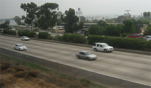 Think of the last time you saw someone on the highway drive past an exit, and at the last possible moment, realizing their mistake, cut back across the divider to get off the highway. You probably smiled or snickered, thinking how oblivious they must have been to miss it. Now, think about the last time you missed an exit. Not so funny anymore. When we’re honest with ourselves, we realize that some of the mistakes we make when interacting with systems are not entirely the designers fault.
It’s well documented that human perception is entirely fallible. We are sensitive to thousands of subtle variables and differences in what’s going on around us, and an individual’s performance in perception related tasks is at best unreliable, and at worst, difficult to accurately predict.
This means that simply making something discoverable, doesn’t guarantee it will be discovered. You could do everything in your power as a designer or a programmer, and still, some percentage of people that use what you made will miss certain things you thought were obvious. I don’t mention this to discourage anyone: it’s just a fact. And if you’re going to go about doing this stuff, you should understand that no matter how smart you are, or how much we’d like a smarter population, you just can’t circumvent the limits of the species.
This often means that smart designs account for human limitations. They’re forgiving, they make it easy to recover from mistakes, and sometimes allow for multiple ways to do something, without adding confusion. That’s a hallmark of master level work.
How do you actually make something discoverable?
As a designer, you have a handful of resources for emphasizing things, and trying to draw attention to them:
- Real estate: You get a certain amount of pixels to use however you want. Larger targets are likely to be located first, and easier to be found again. Big targets are easier targets.
- Order: You can place things in specific orders, from left to right, and top to bottom, that might form patterns people can learn to follow, depending on their language (some are left to right, some are right to left, etc.).
- Form: You can use color, font, shape, shadow, composition, and other graphic design constructions to help make use of the real estate you have.
- Expectation & Flow: Depending on how you use the above, you can put things into forms or patterns that are in some way familiar to people. The most obvious examples are printed newspapers, and how columns, line breaks, and headings are used. This might be achieved by emulating another design from another website, or from something in the real world.
- Consistency: If you use the screen in consistent ways, you can teach people to look for certain kinds of commands in certain places. By being predictable, you can score some extra discoverability points. This can often be assisted by using available conventions, and trying to make use of knowledge your users already have.
Every metaphor or paradigm you might be familiar with (GUI, Windows, Mac, amazon.com, etc.) makes use of real estate, order and form to achieve the results they do. Good systems provide some basic constructions for making elements discoverable that can easily be reused.
Does prioritizing discoverability eliminate user choice?
Yes and No. When the guy who designed the highway you drove to work today decided to space exits 5 miles apart from each other, he or she eliminated many possible choices from your driving options. You can’t leave the highway in the middle of those two exits (unless you drive an M-1 tank and have amazing insurance). But this can work to your advantage. The system of exits gives you a standard way to tell people how to get on and off the highway, and helps to maintain a regular pace of traffic. So while that one exit might be one mile out of your way, the holistic value of those kinds of choices works to your benefit.
So yes, you do give up some degree of freedom, but if the designer is a good one, you won’t mind. The overall benefits outweigh the limited sacrifices.
In other words, eliminating stupid, unnecessary or infrequent choices from the list of decisions people need to make, is almost always a good thing. They don’t care about what they don’t need to care about.
In many cases, we create self-fulfilling prophecies in our user interfaces. People trust us. They think we know what we’re doing. So when we create a link on the web page that says “Modify turbo overdrive optimization threshold” they think there’s a reason they might need to do that, when in reality, it’s probably only the programmer, and the programmers friend across the hall, the really even understand what this is, much less have a reason to ever use it. But by putting it there, we suggest to people that there is a good reason for it. Way too much of the time, there isn’t.
Also see: The myth of optimal design
[Note: revised for concision on 12/20/12]
I wish Microsoft had seen this in ’03 before anyone came up with The Ribbon. That’s my main Ribbon gripe: that it gives every single function equal footing.
Thank the goddess they left me one little customizable toolbar. It’s like they knew the Ribbon sucked hard and left an out for productive people. ;-)
Hi,
The exceptions to your rule for prioritization all seem to be centered around the importance of a task. So, I made my priority equation look like this:
(a)percentageOfUsers + (b)frequencyOfTask + (c)valueOfUsers + (d)valueOfTask = (x)levelOfPriority
For some businesses, this might translate to the following question:
How many of your users who pay the most money need to do the most important task the most often?
For a non-profit or government agency, the valueOfUser variable might be based on a user’s level of need or some other way to describe it. Thanks for the article!
Regards,
Benjamin W.
Interesting! Thanks for posting this.