The importance of simplicity
By Scott Berkun, July 1999
Web sites and software often compete with each other based on the features they provide. The popular assumption is that the more features a product has, the better it will be. The truth is that features improve a product only if they are actually used by the customer. In most cases the proliferation of features in products creates more complexity than value. Each feature gets an icon or a link on a Web site or toolbar, and is yet another item that the user needs to wade through before they can find the one that they need. Web sites are still young, but many Mac and MicrosoftÆ Windows applications show the carnage of years of feature wars with competing products. Over the years I’ve learned a few things about how to keep interfaces simple, and simultaneously keep the power intact for more sophisticated users.
The Best UI Is No UI
It is hard for user-interface designers to admit, but the best user interface is no user interface. UI implies that the user and the computer have to interact to make something happen. In the ideal case, no interaction is necessary. The computer programmer is smart enough to devise a way to accomplish the right thing without the user helping them out. It often requires more work for developers to figure out ways to avoid annoying the user, and that’s part of why it’s so rarely done. A good example of a no UI solution is setting the clock on a VCR. For years manufacturers tried all sorts of manual solutions, but the best answer was to automate this task completely. Some VCRs today check for a special time encoding in the broadcast signals and update themselves accordingly. A similar example is network detection in Microsoft Internet Explorer 5.0: Instead of asking the user to tell us which type of connection to use, we figured out a way to check for the active connection ourselves. From the user’s perspective, it just works. That’s the best kind of user experience you can hope for. If you can add a feature that safely removes a user interaction, you are making the user experience significantly better.
Less UI Is Better UI
In cases where there isn’t a way to remove UI completely, the less UI you can provide the better off the user will be. Do not take pride in multilevel tabbed dialogs, or twelve-step wizards. Figure out how to get things down to the essential common cases, and make everything else optional for those savvy enough to need them. Make sure that the five or ten tasks users need to do most often or most critically, are the ones that get the most prominence in your UI, either by highlighting them visually, or giving them more real estate. It’s okay to diminish other features to help promote the ones that are most important. Make sure when you add features in a new version that you don’t promote them just because they are new: Don’t confuse marketing with usability. Once the user has paid for the product, there is no need to advertise your product or parts of your product. Pushing a new feature is only justified if it replaces a popular old feature, or you have evidence that the new feature will be used more often than an older feature. To help users find new features in your product without torturing them, create a What’s New? item in the Help menu describing the changes that have occurred since the last version. You can also give advanced users ways to expose additional features if they want quicker access to more commands; just make sure this isn’t the default setup.
When You Add Something, Replace Something Else
Before you can add the super cool new idea you’ve come up with, you have to decide what features currently in the product you are willing to remove or improve to get the new one in. We call this the conservation of UI rule: If you add something, replace something else. The right answer for the user is often to take a concept they already understand, and make it better by merging your new ideas into it. If you can’t find a way to merge the idea in, or completely replace the old concept with the new concept, it’s not in the user’s interest to add the feature. The conservation rule forces you to think critically about your new idea by looking at the impact it has on the entire user experience. You have to evaluate its value relative to all of the other things you already have.
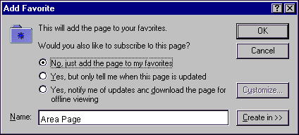 Figure 1. Internet Explorer 4.0 exposed more features than were used by most users.
 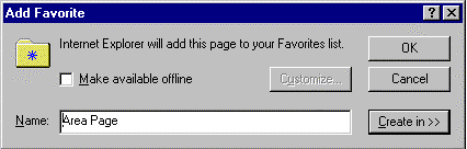 Figure 2. Internet Explorer 5.0 made the most common option easy to find, and gave advanced users a way to get to more advanced options through the Customize button. A good example of this is Favorites and Channels in Internet Explorer. For version 4 we had a cool new concept called Channels and we added it without deeply examining how it would relate to other concepts already in the product. It caused many problems because it was a new concept and shared many similarities with the existing Favorites feature. In Internet Explorer 5.0 we did what we should have done the first time: We took the valuable parts of the Channels feature and merged it together with the existing concept of Favorites. Users could then keep the benefits of what they had, and if they desired they could use the new functionality without having to learn another concept. Learn from our mistake and do it right the first time. You’ll find that many cool ideas just don’t fit into the product as a result of this rule because you’re not willing to completely reinvent an old feature, or you can’t easily merge the cool idea into the old ones. It hurts sometimes, but the product and the user are better off.
The User Is a Limited Resource
There are only so many things the user can comprehend at one time. Their resources for scanning the screen and reading text are limited. The more commands or features you expose at one time, the harder it is for users to find the specific command they’re looking for at any one time. Screen real estate is also limited, and should be used conservatively. Because these things are fixed resources, if you treat all features of your product as being equally important, you’ll make it very hard for users to find the features and commands they use most frequently. The right approach is to prioritize your UI. Conserve the amount of mental energy users need to apply to get things done. The fewer things you force them to remember, and the fewer concepts they need to understand, the more time they can spend actually getting their work done.
It’s Rude to Interrupt
You only interrupt another person if you have something important to say. It follows that computers should only interrupt people if there is no other way to help the user get a task done. When an application throws up a dialog box, or navigates to a Web page that serves the same purpose, it forces the user to stop whatever it was they were trying to do and pay attention to whatever it is that you, the developer, thinks is so important. Use dialog boxes or interruptive Web pages only when it truly is something urgent that prevents the user from doing the thing they want to do. If possible, remove the dialog box completely. Figure out some way to avoid the error case by disabling controls when they have no logical purpose, or be more creative with automating the handling of the choice you presented in the dialog box. Think of computer-activated dialog boxes as the last resort. You should only interrupt the user if you absolutely have to. As Steve Capps once said, the user interface should be like a soundtrack barely noticed by the user. They should be empowered by developers to focus on getting their work done, instead of trying to figure out how to operate the machinery.
Simple Can Be Powerful
Simplicity does not mean lack of functionality, it means a fast initial learning curve and consideration for the number of concepts the user needs to understand. Using a hammer is fairly simple to learn: Picking up a hammer and feeling its weight and shape tells even a novice what it’s basic purpose is. At the same time, the hammer is designed so that master carpenters and craftsmen can use them with expert-level proficiency. It’s the same tool, it’s just well designed enough that users can grow in skill over time. The goal for your designs should be easy to learn, but have a built-in path to higher proficiency. It’s often hard to achieve this kind of scaling for a design, but the closer you get the happier your users will be. One common solution is to allow customization of the workspace so the user can choose to expose more features if they want, but the default experience is optimized for more casual users. This places the user in control of how many things they need access to at once, and how much power they’re willing to trade for some additional complexity
Scott’s first book, the art of project management, will be published by O’Reilly in April of 2005.
Hey, how ’bout having your little flower sit it out for a year and do something that will give him some time to expand his view of the world and himself? And almost anything the pampered child of a university professor could do would serve that end. He could volunteer in hospitals and clinics; he could build houses with Habitat for Humanity; he could work for minimum wage at a fast food or a dollar store; he could drive a cab; he could backpack around the world; he could help rebuild Houston, Mexico City, Puerto Rico or Dominica; etc., etc., etc. And he could even take some intro courses on-line to get college credits, too.