#7 – UI that kills: Swords, craft and user interfaces
#7 – UI that kills: Swords, craft and user interfaces
ByScott Berkun, Jan 2000
 The greatest challenge in web or software design is creating a work of deep craft. That is, the presence of the designers and programmers coming through to make the user feel as though you were really trying to make them happy. For many products, I can point to specific parts that in isolation made me feel that way, but it’s rarely carried through consistently. Web sites always have rough edges: search results pages that are ugly and hard to read, error pages that are incomprehensible, JavaScript pop-up menus that appear and disappear awkwardly, with visible repainting and redrawing, home pages to well-known Web sites that are garish, cluttered, and cold.
Software products always have spots that clearly were underdeveloped, or error dialogs that were not reviewed carefully. In general, these things our industry builds always seem hastily made, with corners cut – technically proficient but mildly uninspired.
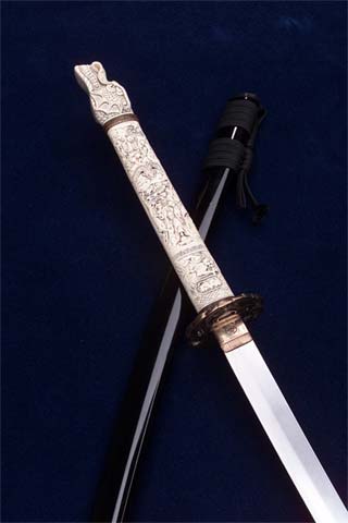
I once held a katana – a Japanese sword of the finest craftsmanship. Simply holding the weapon in my hand gave me a sense of its depth of quality. The weight was significant, but not too heavy. It felt balanced in my hand, and as I rotated my wrist the sword felt good, like it was made to be held. I looked at the detail of the edging of the blade, and it was perfectly smooth. The handle was refined, with a silver base and leather straps, each loop of the strap perfectly cut and rounded. There were etchings on the handle that formed a fine crosshatch pattern, and as I looked carefully I saw more levels of detail. Each line in the pattern had little etch marks every few millimeters. I immediately looked around the handle, looking for a seam, convinced it was some prefabrication, but there was no seam, no edges.
The handle alone must have taken days or weeks to get right. It was all refined, smooth, and looked and felt like something designed with great care. I loved holding that sword, not because I had an interest in weapons, or Japanese craft, but because I could feel the quality of the design, and could sense its impact on me. I didn’t want to put it down. Someone really cared about how the sword would be used and about the relationship between the sword and its owner.
There is something to be said about the intimacy of a weapon. If you owned a katana when they were made in the fifteenth century, it was the one thing that kept you alive. Intimacy with that sword is what got you from one day to the next. You wanted to feel really good while you were holding it, and using it. You probably even considered giving it a name. The design of the sword helped give its owner an emotional connection to an inanimate object. It made you feel something, something very good.
The technologies we work with today usually feel cold, distant, and removed. It’s not always intentional; often it happens without thinking on the part of the designers. These things are used and discarded so quickly that it’s difficult to achieve intimacy. They just don’t last very long before the next version comes out, rendering the old version as garbage for many users of a product. But since our industry broadens every day, with more consumers and home users using our Web sites and products, the expectations are higher. Technologies are closer to people, and the connections people make with technology are increasingly important and personal to them.
There is a Triple Crown of interface design: function, aesthetics, and performance. Most of what gets talked about with interfaces has to do with function. Is it usable? Can people complete tasks? It is critical, but it’s only a part of the story. The aesthetics are how things are shown and presented, and the style in which things are communicated to the user. Aesthetics are more subjective than function and a much harder value to measure. However, aesthetics are almost as important as function. The way a person feels about an object or a thing influences how successful they will be in using it.
A user forced to use something they don’t like because of how it looks or feels will be unhappy to some degree, no matter how well they do on usability tests. Aesthetics often come down to simple choices — it’s not the number of colors you have, it’s picking two or three complementary ones. It’s not pretty pictures, it’s using only the elements you need to convey your message. Designers, programmers, and technologists share at least one trait, in that they can easily be misled into believing their message is to convince the world how talented they are, rather than to help the user actually do something.
The last attribute in the trio is performance. This means more than speed, but also reliability. If the katana looked and felt great, and was easy to use, but broke into pieces during battle, you’d run out of users pretty quickly. The thing has to be solid, and give the user full confidence in its reliability. That’s a big part of the craft — building something that is durable and capable of conveying its constitution to the person that uses it.
Craft is about details. The rounded corners and smooth edges. Making sure the pixels line up and nothing is out of place. Getting the palettes just right so there is no flashing. Precision is what creates energy and movement in a design. Users may not notice in a conscious way, but they will feel the difference between getting the details right and having bits out of place. Error messages are always well considered. When pop-up windows appear, they are transitioned or blended in — not a rough jagged dance of pixels as the individual elements are painted. Transitions between screens or pages are smooth, and sound is used to reinforce the action and give subtle reinforcement about what’s happening. Craft is about deciding to do less, if it means the quality bar for what is in the product is outstanding.
If the katana were loaded up with dozens of rarely used features that the designer or “programmer” thought were cool (built-in compass, GPS locator, auto-sharpener, blood stain kit, and so on), it couldn’t possibly maintain the same level of quality, craft, and durability. Doing less facilitates greater focus, greater quality, and greater design. Our industry and culture doesn’t promote these things as much as it should, but your users will always notice and respond if you give it to them.
Before I close with a quote, here’s a request: Have you seen a Web site, software product, game, or other technological object that gave you a deep sense of craft, that was not only usable, but earned the Triple Crown? Contact Scott and tell me about it.
“To design something really well you have to get it. You have to really grok what it’s all about. It takes a passionate commitment to thoroughly understand something — chew it up, not just quickly swallow it. Most people don’t take the time to do that. Creativity is just connecting things. When you ask a creative person how they did something, they may feel a little guilty because they didn’t really do it, they just saw something. It seemed obvious to them after awhile. That’s because they were able to connect experiences they’ve had and synthesize new things. And the reason they were able to do that was that they’ve had more experiences or have thought more about their experiences than other people have. Unfortunately, that’s too rare a commodity. A lot of people in our industry haven’t had very diverse experiences. They don’t have enough dots to connect, and they end up with very linear solutions, without a broad perspective on the problem. The broader one’s understanding of the human experience, the better designs we will have.”
– Steve Jobs, Wired (March, 1996)
Scott’s first book, the art of project management, will be published by O’Reilly in April of 2005.
Katana is very beautiful.