How to design a great book cover (Behind the scenes)
The 1.1 edition of Mindfire: Big Ideas for Curious Minds, a collection of my best essays, was officially released. Here’s a behind the scenes story on how the cover was designed.
After vetting more than 30 designers who applied, I hired Tim Kordik. And I’m glad I did. I wanted not just a graphic designer, but someone who was interested in helping define the book end to end, from the interior design, to the title, the content and of course, the cover.
I wrote up a short design brief that’s good for any book cover:
- Bet big on one visual concept
- Title should be readable in thumbnail / 10 feet away
- Simplicity wins
- Be bold
We brainstormed for an hour and Kordik went off and put some early sketches together. I made clear I was comfortable working low-fidelity so we could try things quickly and throw aways ideas without sunk cost feelings. He was all for it.
Round one
Here was the first round of concept sketches:
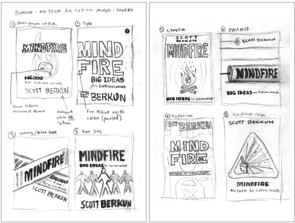
Tim paired each sketch with a brief description to help explain the idea, in case I missed it.
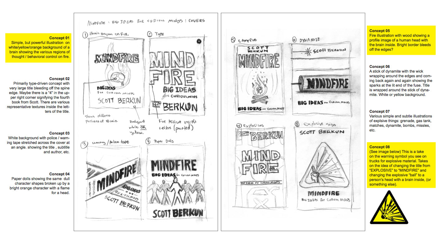
Round two
We discussed which directions we thought were strongest, and he did a second round. We killed some concepts and added a couple of new ones. The entire round was higher fidelity than last time:
We picked three of these concepts and let blog readers vote: over 300 people participated.
The vote was used to inform our thinking, but not to drive it. Many of the comments people left were useful and Kordik and I discussed them. We didn’t agree with some of it, but it did help us step back and look and what we’d done differently.
Round Three
We narrowed the field to one concept. We did a couple of one-off last attempts at other concepts, but they didn’t pan out so we killed those paths.
I loved the idea of a book’s central image being a warning label of some kind. But round three revealed the challenges of the triangle for the central element. It left too much trapped whitespace, and the top angle of the triangle always felt strange.
But I loved how playful Kordik was in trying out different options. It let us look at alternatives instead of trying to imagine them.

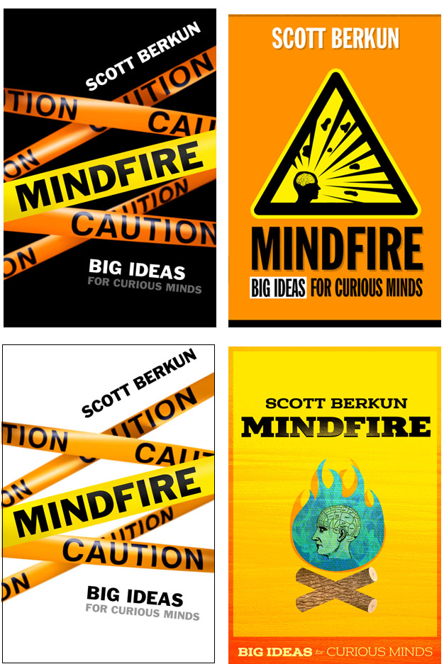
Round four
Moving to a circle, the simplest shape, made sense and we ran with it. Tim came up with the bullseye grey/white effect which is powerful and striking.
We moved on to the next level of detail down: the fire and the objects coming out of the fire. Kordik tried many different sets of images. We tried at first to pull images that matched the essays (life, death, time, inspiration, etc.), but it was hard to arrange them without it feeling cluttered. Kordik tried many variations and probably wanted to strangle me.

During one meeting, Kordik thought using my profile for the cover might work. I resisted at first: I hate books with pictures of authors in them. Why should readers care what the author looks like? But I figured I had nothing to lose by letting him take the photo.
Kordik did a great job, making it subtle enough that few would notice (I love books with secrets). It worked great and all future mockups had my profile as the silhouette. Here’s the picture the profile is from. He gratefully edited our the WordPress beard I had.

Round 5:
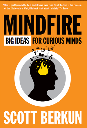
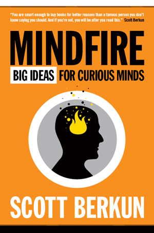
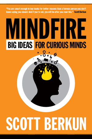
We did a final round of blog reader voting, and 300 people let their opinion be known. It came down to the details for the fire.
As much as I had pushed for all of the icons in the belief those little details mattered, the simple bubbles were cleaner, simpler and stronger, and gave more whitespace to the design.

We were close enough that Kordik finished up the full jacket design.
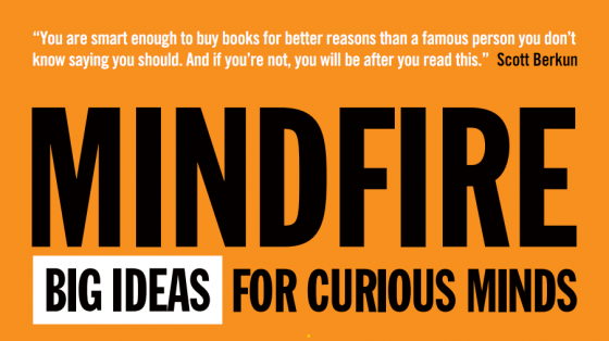
The blurb:
Blurbs are silly things (see the secret life of blurbs). Since I was self-publishing I decided to be honest and have some fun.
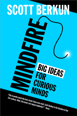
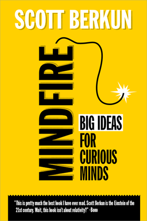
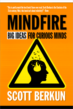
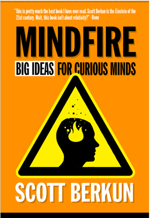
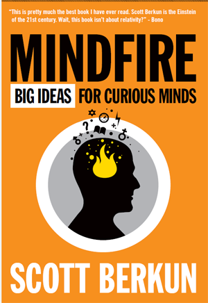
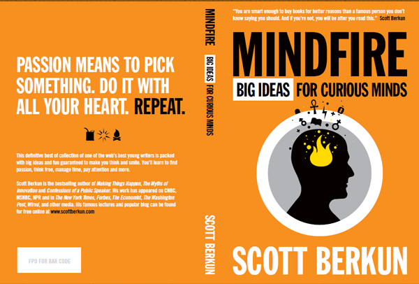
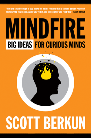
Final cover for First Edition:
After months of work, and dozens of itterations, we arrived at the final cover design. I loved it. It’s the strongest cover design of all of my books, and I’m convinced it’s because of Kordik’s willingness to experiment and not fear exploring alternatives.
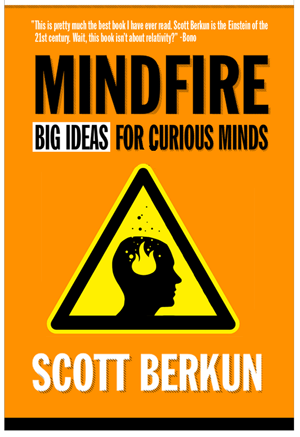
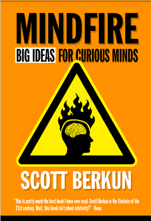
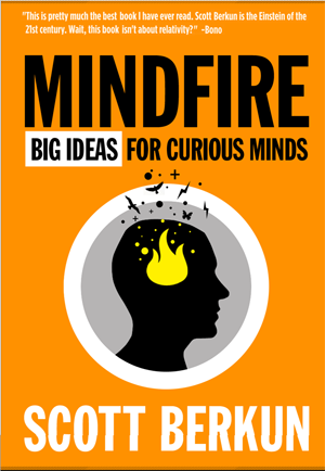
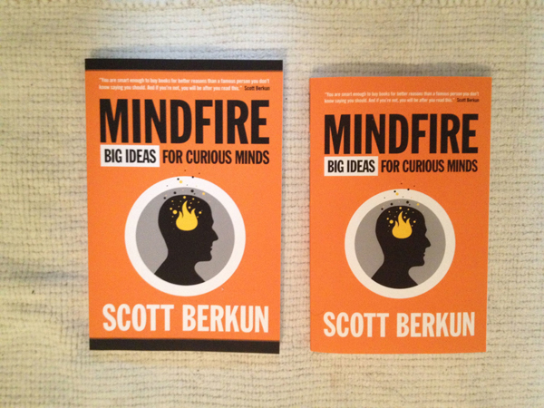
Final cover for 1.1 Edition:
For the upcoming 1.1 edition we made the book size smaller, down from 9×6 to 8×5. We simplified the cover by dropping the black/white strips on top and bottom.
Hope you found this behind the scenes post interesting, buy the book!
Related Posts:
- Similar “behind the scenes” for the design of The Ghost of My Father cover
- Similiar “behind the scenes” for The Year Without Pants cover
- If you want to know what I learned by self-publishing, here’s my rundown.
Thanks for sharing a cool “behind the scenes”– I’m curious if you can share how much a professional designer costs for a project of this size?
(I did a double-take when I saw where your photo was taken; the first third of my book was written in the coffee shop on whose sidewalk you’re standing. :-)
It’s hard to give a singular answer. For most creative roles the fee ranges are very wide. Also many freelancers charge by time and depending on their productivity the costs vary.
I’ve seen different ranges listed by from a few hundred to a few thousand dollars sounds right.
Thanks for the insights! You’re an inspiration to all of us self-publishers, and I’ve learnt a lot by reading your ongoing series of book writing essays :-)
In particular, I’ve been struck by the value of “writing in the open”, engaging with a passionate readership and community from the outset. (Rather than the typical book publishing process of “ta da! surprise! new book, available today!”.)
For my latest book, for example, I’ve setup an “Advisory Panel” of practitioners to provide as-I-go feedback and input. These represent real readers, not other consultants or writers:
http://www.steptwo.com.au/columntwo/would-you-like-to-be-on-the-advisory-panel-for-our-new-book/
Keep up the great work!
James
Thanks for your extra efforts to put this together. It demonstrates how much you care about good visual design, plus it credits Kordik and us creatives for what we often go through to please clients.
Thank you. (I finally got around to slowly reading it)
I learned a little but I don’t plan to ever self-publish.
I liked it, and thought it was worth it, because there are new babies being born every minute (as Strunk and White would say) who do not realize the time and effort that creative-types go through in the pursuit of excellence.
I’m pleased when some professional like yourself reminds them, for such reminders are all too few. “I could write a book, I could be a rock star—” no, not unless you take pains you won’t.
Since I don’t have a good place to put it, I just found wonderful set of cover designs:
http://jasonalejandro.com/portfolio/proposed-covers/
Great cover, glad to see you hired and worked with a professional designer rather than DIY or crowdsourcing!
great article. it was well worth sharing it and giving insight into the work of designers, developing in close cooperation with their clients. thanks for that extra effort.
This hole description was awesome, thank you so much Scott!!
Another good backstory – O’Reilly’s animal covers:
http://animals.oreilly.com/origin-of-species/
Great, informative post. We just briefly discussed cover design in our digital publishing class and when I googled “good book cover design ideas” your article was third on the list! So kudos to your SEO as well.
I loved this. Gives a great visual of designing a great book cover. I am a graphic designer and book covers are my specialty. It always amazes me how an author can put so much time and effort into writing their book, but give their cover little consideration. It should be done by a professional that knows the industry and honestly, should be given as much thought and effort as the story itself. Why? Because people really “do” judge a book by it’s cover. I’ve had authors whose books were a great read, but their sales were not very good. Most of them had taken it upon themselves to do their own covers to try and save money. I think this a major mistake. With so many books being self-published, it’s important that you give your book the best advantage it can have. The cover is the first impression. It’s what causes reader interest.
I love your cover and great job of showing the process. Kudos to you.
Wow, number three result on Google for the phrase “how to design a book cover”
Kudos Scott, especially since your not even selling book covers lol!
Just shows google likes a good story.
Nice job on the cover, I’ve just started my own and was fishing for inspiration!
Stay well
A superb article that really shows the hard work and effort which goes into the development and creation of a book cover. Thanks for a great post! Dave R at http://www.jdandj.com
I have got the storyline of my story, however, I am stuck on a front cover illustration idea as well as a title for my book. I came across this and so, because you have had experience as a published author, I was wondering if you had any ideas on my cover design and how to find a good title for my book.
Appreciate the behind-the-scenes write-up. The way you describe narrowing to a clear concept before polishing details is spot on—strong covers usually come from decisive editing, not adding more. Great insight into the thinking process.