How To Design A Book Cover (The Ghost of My Father)
Now that my sixth book, The Ghost of My Father is out, it’s time to share the process that led to the final design (I posted previously about how The Year Without Pants cover was created). This time I decided to work with Tim Kordik again, who worked with me on the excellent cover for Mindfire: Big Ideas For Curious Minds (see how Mindfire’s cover was designed here).
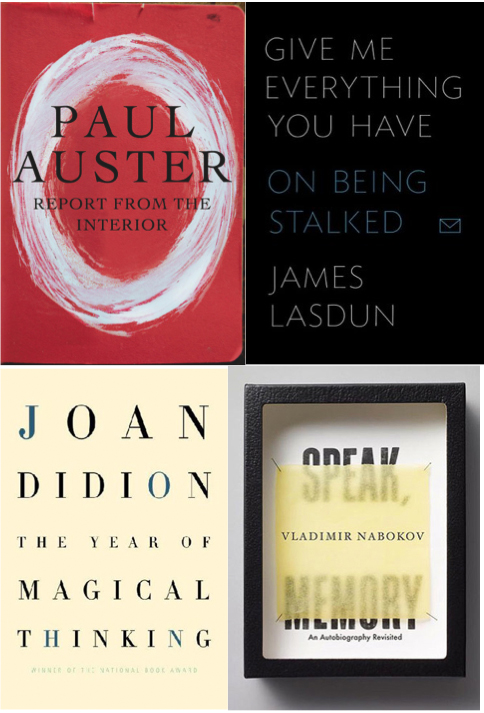
I always start with a one page design brief, explaining the goals for the cover. Since Ghost is a memoir, I spent much of the last year reading memoirs in preparing to write one. I picked some of the best memoir covers I found and shared them with Tim, and we talked about them over beers. We both liked the simple typography and the bold design choices (singular colors, simple imagery, etc).
Round 1
I like working with Tim because he understands the fun of the first round. Round one is the time to try widely different ideas and break rules. He put together more than a half-dozen initial concepts. Some were all out pop-art (upper left) and others felt more like thriller novels (bottom left) but I was pleasantly surprised by how different the concepts were: shadows and cut-outs were excellent metaphors for a book about a distant parent.
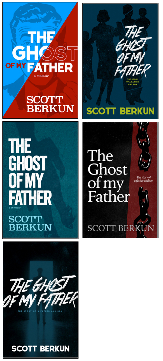
I asked readers to vote on the design, and 359 people kindly volunteered their choice. The 2nd option above, with the family in shadows, won with 33% of the vote. I never let votes make choices for me, but it generates discussion and helps me think about the design, even if I don’t necessarily agree with the winner.
Round 2
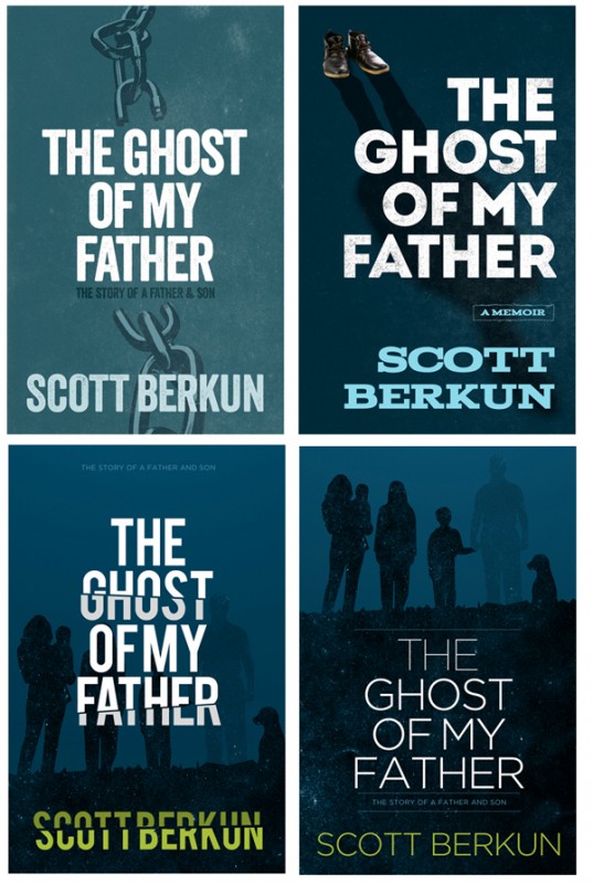
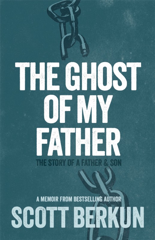
We talked about how strong the metaphor of the chain from the first round was, but not the style (too much like a literary novel from the 1970s) which led to one of my favorite concepts of round 2, with a vertical chain over a patchy blue background. It was my favorite design for round two and a front runner for the final design.
Round 3 – New Concept
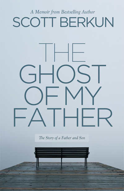
By chance a friend, Teresa Brazen, posted a photo of a hike she took on Facebook. It seemed a perfect theme: a place for contemplation, and perhaps sharing time with someone close, but that was obscured and uncertain (in much the way a difficult, but important relationship can be). It seemed worthy as a concept and I sent the photo to Tim with some brief thoughts. He liked it and ran with the idea.
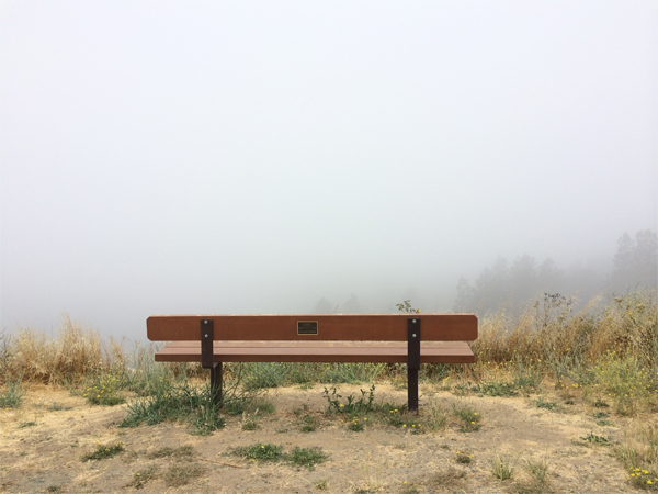
We kept my favorite design from round 2, as it was the strongest concept so far, but spent the round focusing on the new bench concept. Tim found stock photos that captured the spirit of Teresa’s photo (the rough, dense visuals of the landscape in Teresa’s photo made it hard to use for something like a book cover).
Round 4
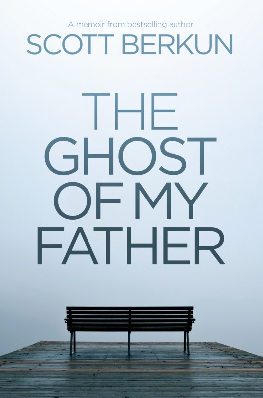
We finalized on the bench concept, and went with more abstract photo. Not being able to see where the ocean meets the sky suggested so many things about how, when you look closely, there is a surprising fuzziness to our memories and connections with some people we think are important in our lives, and the book is a head on exploration of this challenge. With most of the big decisions finalized, we got down to the graphic design details of spacing, font weight and composition. I still wasn’t sure if we’d have a subtitle or not, and after some advice from my kickstarter backers, I went dropped it. Simplicity wins.
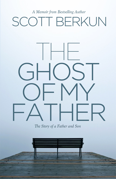
Final Design
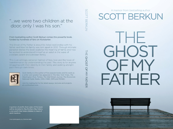
Here is the final design of The Ghost of My Father. Below you can see the full front, back and spine design.
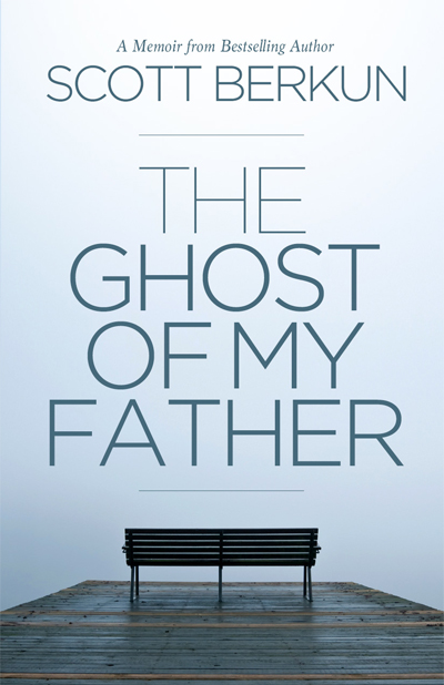
Updated edition
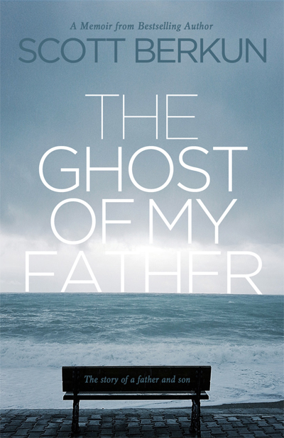
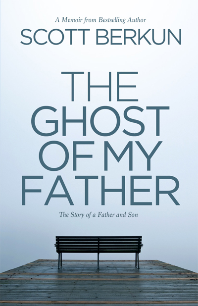
I wrote a new chapter for the book, after my father died, and we rereleased the book with an updated cover. We added a blurb to the bottom, and a visual highlight to make it easy to tell the difference between editions.
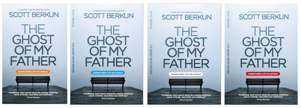
We settled on orange as the best contrasting color, and added a thin highlight strip to the spine as well, so anyone can spot the updated version even if it’s on a shelf.
![]()
You can buy the book on Kindle or Paperback, or read an excerpt (PDF). Kirkus reviews called it “A sobering, lucid memoir about the uncanny, precarious nature of family, masculinity and childhood.” It’s the best and most personal book I’ve written and if you like my other writing, you should really give this one a try. It changed my life to write it and may change yours to read it.
Nicely done. Like the empty bench and how you evolved the final image.
I love the way “chance” (in your case, seeing an image somewhere) can influence the creative process. Many of my best ideas for solving design problems have happened by chance. I love the final result of your cover, and the final result of your writing is excellent as well!
Thanks. If you’re not open to chance how creative can you be? In this case it worked out, but I thought at the time it was a longshot that it could work. You never know.
Interesting lens into your design process, Scott. One of my favorite parts of being an author is working with my own cover guy. I love the first look as well, since all ideas are the table. While I didn’t post the chronology of the covers like you did, here are four wild and crazy ideas for my new one. Ultimately, voting and tweaking produced the final one.
I can explain the symbolism of all of my covers save for the second. I didn’t press the publisher enough on a personal design. I don’t like that cover, but six out of seven ain’t bad.