When visualizations go wrong
Sometimes information visualization goes wrong. We quickly confuse whizzy fun visuals with using visuals to make explaining things easier. Here’s a recent example.
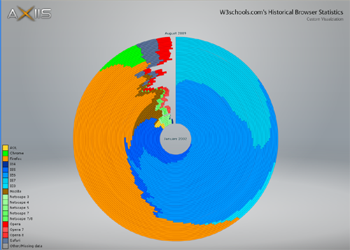
Michael VanDaniker used the open source data-viz toolkit Axiis, grabbed the data from w3schools.com for browsershare, and made the chart below. He explains in nice detail how he did it. To be fair, I suspect his goal was just to show off the toolkit, not necessarily to make a useful or usable chart. Much of his blog is well written posts about how to use various visualization tools, with code samples.
But the web & twitter has picked up this sample of his work, and has called it ‘wonderful’, ‘fascinating’ and ‘fantastic’ which in any sense of practical value, it isn’t.
If you want to play with the chart and decide for yourself first, go here.
Here’s a snap of the chart:

So far so good. This definitely looks cool, no doubt. It even looks like the Firefox logo. But looking cool and being useful are very different things.
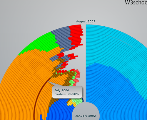
If you move your mouse over any block, you get a pop-up that explains what the hell you’re looking at.

Which is also fun and cool, especially when you fly your mouse around really fast, and see each unit flash, bubble up, and highlight. But after five seconds, it’s hard to know how each unit of info relates to the ones near it. It’s quite disorienting to wander around in these circles. If you try to use this visualization for anything real, it falls apart quickly.
The first missing piece of design knowledge is that the primary axis in data is (often) time, and time is easiest to understand linearly. Showing time in spheres, cubes, or concentric circles, while novel, adds little value, and makes time hard to understand. If you don’t get the direction the data is moving in, it’s very hard to see patterns or ask good questions.
The second problem is curves distort our perception.

@dmv pointed out an interesting thread about this chart here:
http://news.ycombinator.com/item?id=990136
But … the total number of browser users IS growing year by year. Or at least was growing for many years.
So flat picture would be misleading…
Mekk: The data is in percentages so that wouldn’t matter.
Comparing percentages between years is misleading (unless the population is stable, and it is not the case here).
In fact, the circular diagram could be the perfect illustration … if radius-es of successive circles were picked so they more or less match total users count.
Scott: Nice post and appreciation. It is easy to manipulate information, on purpose or not. No to mention the fact that some browsers are split into different versions while others are not. Very, very misleading.
Mekk: Comparing percentages is the only way to go, as the purpose of percentages is precisely to compare the proportion of browser usage independently of the growth of users.
Good critique! There are lots of problems with such a circular layout, such as the fact that the outer circles are much longer than the inner ones. So it’s never clear what you’re really looking at: angle or length of the circle segment?
There are some valid uses for this, especially when it comes to time series and finding/showing periodicity. But other than that, it’s almost always a bad idea.
We need to get people to understand that these things are used for showing and understanding actual data, not just to look colorful and pretty.
It’s good to show time on a linear basis, but not vertically as in your stacked bar chart. Time is best understood horizontally, left to right (at least in the West).
to play the devil’s advocate, there isn’t a perfect way to represent the evolution of parts of a whole over time. Stacked bars, matrix charts – all have their cons.
I agree that if there were such a way, it probably won’t be circular, data for various categories would be aligned to afford comparisons over time, and categories wouldn’t be arranged in that order for the sole purpose of replicating the firefox logo. and so on, and so forth.
But at the very least, the chart is intriguing and makes you want to manipulate it, partly because it’s so puzzling to decipher at first glance.
Jon: the left to right point is a good one, though I’d argue bottom to top is nearly as good, though not quite, as far as people’s ability to comprehend quickly.
Well, the linear diagram is definitely more accurate, but I think that is not the point. Anyhow, why would I be interested in the w3shools site audience? I know little about it, and it isn’t representative for the whole Internet.
This is meant to be fun more than accurate, I suppose.
Scott,
You hit the nail on the head. The visualization really was meant to be an Axiis demo and not a serious tool to explore w3schools’ traffic. If I was going to go that route, I would have picked a more interesting data set — perhaps actual browser penetration statistics. w3schools had their data in a relatively easy-to-parse table, so I went with it. The Firefox logo popped in out of nowhere during the early stages of development. I liked the idea of having the browser logo in there, so I tried to preserve it as I went on. Not a decision someone would make if they were trying to build something truly useful.
The linear solution you suggested would work much better for this data set. There really needs to be some sort of circular nature to what you’re trying to visualize for a circular visualization to work out. When that’s the case, they are usually hands-down more useful than linear variations.
The biggest problem I have with the browser visualization is that the arcs for any particular browser do not start at the same angle at each time step, so it’s difficult to compare how one browser changes over time. Filtering out all but one browser gets around the problem, but then you can’t compare one browser to another, etc.
Some of the commenters have said that distortion isn’t really a problem because internet usage has increased over time, so outer rings should have more emphasis than inner ones. I have to disagree. Internet usage hasn’t changed at the same pace as the of distortion the rings, so distortion is actually a problem.
Thank you for posting this commentary. It’s good to have a critical eye to keep things in check.
Hey Scott,
I know exactly what you mean. To tell a little story, I was the only one in a presentation from the boss (in powerpoint of course, which is a great tool – if you are willing to not trade facts for fancy) pointing out that his chart was problematic for me as it does put things in a relation that is not there, however, it let’s the data look better than it is, because we can’t compare curved 3-dimensional charts.
No one took me serious. It’s the same as usual, I’m very good in my work segment so people leave me be, but if I decide to speak up what everyone should be thinking if they see this, instead of going with the “uh, yeah, boss, great chart. It does exactly what we want: give us an opportunity to tell you how great your charts are, even though they are innovative for the sake of credibility”-style.
I really feel that people presenting charts about things that are debatable do have the same inherent error as most discussion forums on the internet: people don’t talk or post so that people can argue with them or develop new ideas, or change your crusted old beliefs. People want to tell what they think and, if attacked, defend it against belief.
Once, I did make a clear error, I wrote something down that was wrong at work, and people talked to me about it. I said “I see, I was wrong, you guys were right. Mea culpa, I’ll correct it”, which stunned me as the colleagues around me where stunned at someone at work freely admitting they did something wrong, in their own specializiation.
And data is always distorted to follow some purpose rather than inform about facts. I know that in the US, some time ago those DEA guys went rampage as they caught several hundred metric kilos of cocaine, “a big hit on the drug lords” etc., then I went to research, made a chart comparing the total drug busts of cocaine including this one to the total amount of cocaine imported in the U.S.
Nuff said, the complete busted stuff was almost not visible, a small line next to a huge block. Including that “serious” hit to drug lords.