Cover designs for Mindfire: vote!
In my continuing quest to involve you folks in the process of making this book, it’s time to look at some cover design ideas. For those who haven’t been following, the book is fun collection of provocative essays.
If you want to be notified when the book is out: join the list.
These are not final designs – they’re round two. I’ve worked with Tim Kordik on exploring different directions and these were the three most different – I’m sharing with you to get the best feedback possible.
How to Vote
- Our goals are: 1) simple & bold 2) Easy to read from far away 3) Positive & interesting
- The blurbs and other details are placeholders (hopefully this is obvious)
- We want feedback on direction – these are not final designs
- First impressions weigh heavily: don’t think too much
- Comments welcome: be constructive please
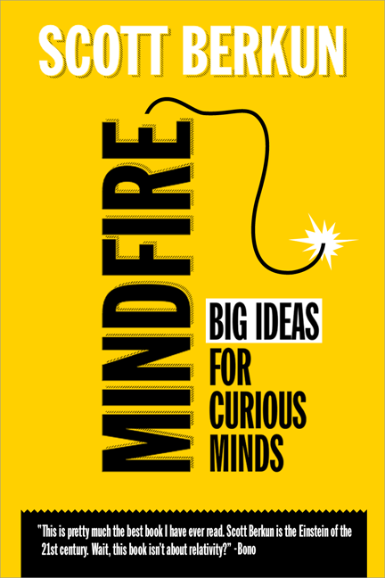
Design A: Dynamite

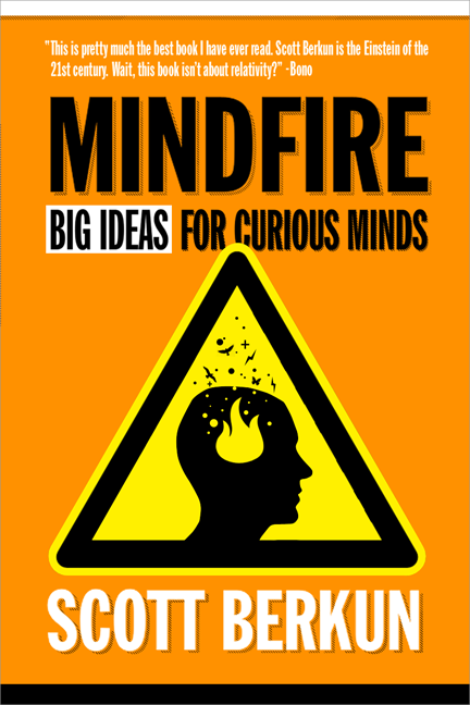
Design B: Triangle

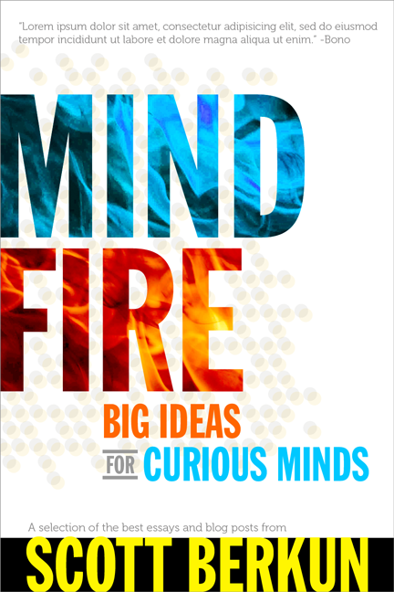
Design C: Blue flame


Don’t like the second one because it suggests Mindfire is a dangerous waste product. Dynamite is dangerous, but it’s creative destruction.
Third one suggests a dichotomy between mind and fire. Also it looks like two words instead of your single created word “Mindfire”. And it doesn’t suggest anything about what Mindfire might actually be.
For each design, replace the word art with other words or non-words and see what impression you get. If it only works with the right words it doesn’t support those words, it detracts from them.
A suggestion on the dynamite: You’ve got a drop shadow, which suggests three dimensionality. If you want 3D, it should appear rounded instead. Then, since you don’t have the drop on the subhead, lose the shadow on the author name also.
Hi Drew:
Thanks for the feedback. We had a few other designs we liked, but as you point out, fire is a tricky thing – it’s fun, but also dangerous. Balancing that visually is a challenge.
Triangle’s too busy; Blue Flame is too varied and hard to read. Dynamite is bold and easy to read (maybe a little hard on the eyes, though).
The first one: Simple and bold! No drop shadow at all for maximum clarity? Less compressed font for “Big Ideas” etc. (better readability)?
I like the first two designs better because they grab my attention while the third design looks like a book from the 90s. =) The second book cover with the triangle kind of reminds me of a caution sign. I would have to say the first cover is probably my favorite of the 3. Keep the designs coming!
Voted C. IMO A and B are too “cartoonish”, and C is more “professional looking/serious”. The yellow/black color scheme of alternative A caused me an instant association with the “for dummies” series.
You need to counterbalance the presentation of this! #1 winning could be an artifact.
How about combining the colors and infill flames of #3 with the dynamite of #1? #1 gets the idea across best, I think, but visually, at least for me, it’s harsh.
Definitely B. A suggest that there is a certain time to wait (rope) and C is just too plain. Also, what was said about Fire being dangerous, isn’t that the whole point?
Hi Scott, I liked “Design A: Dynamite”, but as a loyal reader of your books and blog posts/essays, I don’t really care about the design too much, I am sure it will be an awesome book because the content is awesome.
Great job Scott. Can’t wait to read this book.
I like the concept of A best, but I feel like the execution doesn’t get the job done. It’s too straight-up typography for a concept that is begging for a more illustrative solution. I think this is one of those times that calls for a second typeface as well – the title does not separate itself from the rest of the cover content in any meaningful way.
I really like the dynamite one! It’s worth trying to warp the text of the word “MINDFIRE” so that it looks cylindrical like a stick of actual dynamite.
The first one I misread as “Mindf*ck” — sorry. I think it’s the vertical print that crossed my wires. the last one does not look much like fire, more like ice… but I kind of like it. That left the second one, that looked kind of like the cover of an old Bruce Sterling novel. I guess I did not like any of these, but voted for the second one… does that help?
Greg, Author of Designing Search (of the “eggplant cover” fame :-) so who am I to say anything, heh?
The first is nice, but looking at your aims, I think the mindfire bit has readability issues (standing on its side, see mindf*ck above). Second seems like a warning not to read this and is dated imho. The third got my vote, but the typography of your nane doesn’t fit in. Seems the bookcover was finished and the printer foubd out your name was mussing – fixing it with a sticker. If you get that right C is a winner in my book.
I don’t know much about design, but I know what I don’t like…. Unfortunately I’m not a fan of any of these.
The 3rd one looks too much like a cheesy Stieg Larsson-style novel. The 2nd one looks like a “worst case scenario” novelty book.
That leave the 1st one, which is strongest – but I agree the type is hard to read. If the dynamite was at a 45 degree angle (so the text was easier to read) it might work.
I’ll buy it on a kindle anyway, so don’t mind me :)
I’ll be that guy:
All three options are typographical disaster zones. Each option tries to make every element on the canvas pop (using different techniques such as type size, drop shadows, orientation, patterns and color), but the result is that nothing stands out.
The graphic design is aweful. Option A has a dropshadows going in different directions. Option B has a z-plane challenged warning sign with a head that’s bubbling seagulls. Option C is an hommage to 90’s album art on the fire/ice theme.
I would drop the “Big ideas for curious minds” subtitle since it’s generic marketese. The subsubtitle in option C is more interesting and useful, although I would edit it down to “The best essays and blog posts from Scott Berkun”. While still a little too long, it drops the superfluous “a selection of” (“the best” implies that a selection has been made.
Of the words on the three covers, five matter to me as a fan of your books and thinking: Scott Berkun, Essays, Blog Posts. I would work towards a title and cover that focuses on that.
“Mindfire” sounds like a Queensrÿche album. It doesn’t tell me much about what kind of bok it is. My first impression was that it’s a book about brainstorming. But perhaps “mindfire” is the kind of ambiguous and awesome-sounding word that attracts attention in airport bookstores?
But having said all that, you could put a flaming turd on the cover, and I’d still buy the book because I love your writing :)
I like the blue flame the best, but the Bono quote in english.
My name is Todd, but I put required because I thought it was a suggestion.
I like #1. Even if the wick doesn’t mean fire directly, I like its simplicity and the way it distracts from the title. When I skim through covers, big ideas for curious minds will be as helpful to me as the actual title.
Kind of like the color palette on the first one. Don’t like the third one at all. Don’t care for the yellow and orange on the second, but like the yield sign. However, the yellow cover of the first design more tactfully conveys this, or rather understates it. The second one is a bit in your face. The fuse going off on the first makes me nervous. Looks like a mystery book. Like the overall simplicity of the first: simple color and font, but I like the image on the second. Don’t like the placement of the text in number two. Scott’s name seems far too prominent, almost bigger than the title itself (thinking back, but not looking back to confirm this). On the second version the subtitle is somewhat blocked by the image. Second one seems too busy. Perhaps make the image smaller and off to the side, reduce your name size, and use a similar font to the first.
I think the design A is better, but was wondering if a different color scheme might make it a bit more appealing.
1. Looks nice, but took too much energy concentration to read.
2. Very easy to read and gave me the impression of a warning sign. Not sure if this was part of the brief.
3. The graphics looks great. Didn’t like this at all, first impression was of a patriotic book written by someone in the tea party.
Number 1 is my favorite graphically, number 2 was the clearest.
Design B passes the squint test.
Vertical text makes me not want to crane my neck sideways to read a book cover, and the overall color scheme from B is the best of the 3.
Prefer A. Looks sober and professional.
I like the first one. I’d drop the title “Mindfire” and make the “Big Ideas for Curious Minds” front and center. Maybe then the verbage “Big Ideas” in the white highlighted area could be the stick of dynamite.
Equating dynamite and fire is a bit of a stretch in my opinion. Dynamite is for explosions, not for starting a fire (although it may be a side effect). Choice C is too cheesy. I am a big fan of choice B. I think you wan’t to convey that this is dangerous and revolutionary and choice B does it better than the other two.
I’m a graphic designer, so this was an interesting little exercise for me. While I really like A, I find the drop shadows behind the lettering detract from the words. Make them seem fuzzy.
I voted C because it’s the most legible for me – and from far, would definitely be the winner.
Still, A, with no drop-shadow… what do you think?
Also Scott, please when you are done with this write about what it’s like and what you have to do to publish your own book and get it out there to the masses.
The first one looks predictable.
The second one gives the sense of trouble, negative.
Voted for the third one, because of the color combination. It reflects the interaction that we have when we think (all the different thoughts and what they generate), serenity(blue), passion (red)… Its is simple as well as eye catching.
Hi Scott,
Thanks for including our input. This is my first post here, but I have been an admirer from afar for a while.
Although we’re talking about the nitty gritty details of each cover, lets not forget what this is really about. The cover to a book, that will attract someone’s eye for that split second and communicate enough curiosity and information to them that they may read the blurb. It’s worth remembering that anyone who is looking for Scotts new book will find it and buy it, regardless of the cover.
So, the casual shelf browser won’t really be worried or notice that it might say ‘mindf**k’ (may be even better if they do, and by the way that says more about your own mind!) or that the dynamite detail is not actually 3D, etc. Having said that, it is still a valid point that gives rise (no pun intended) to a new idea – you could make a relief cover with the stick of dynamite/word actually sticking out and in red if thats the direction you want to go in. It’d be more eye catching than black.
To this end I would say this: I actually like all 3. The 3rd cover could easily be a novel on the fiction shelf (not that it would look out of place where its supposed to be), whereas the first 2 lend themselves more to this type of book. Depending on what is on either side of that book when it is on the shelf will also play a much larger factor than many people may think as they often get caught up in the singular design. If it is surrounded by other books with bright yellow and chemistry/danger/explosive/lab experiment type covers I would go for the more elegant 3rd option.
Conversely, if there are no outstanding covers of a similar ilk, I would probably opt for number 2 as they currently stand – it has the biggest subconscious impact due to its association with authoritative warning. Once the fast gazing brain has discovered that there is nothing to be alarmed about they then see that they are simply being warned about the explosive possibilities lying inside the book that their thirsty curious mind may nourish itself with. Its definitely worth a trip to the typical bookstore where you can see the typical space this book will occupy just to give you a heads up of sorts. So then you can be atypical!
I’d like to see the dynamite cover as red on yellow and in relief, that would be a tough call.. Then again, you could experiment with making the second cover mindfire word red too (even with a short fuse…).
Lastly, but an equally important note (in my eyes, but perhaps less so for this particular discussion), the cover should be pleasing to its place in history as a piece of work you have done. I was the kid that loved the movie poster because it was the one single visual representation of the sum total of what I loved about the film, and it became more relevant years later. Think Back to the Future, Jaws, etc. But on this subject, the content of the book will create the kudos for the cover; just be sure that you yourself are proud of it. Seeing as it’s a collection of your best essays, I’d say its pretty important; and may come to be your defining work thus far.
I’m looking forward to your updates, and thanks again for having us.
Jay
Hi Scott!
Can’t wait for the 4th masterpiece. When do you expect the book out?
Yousef