New site is live: report any issues here
Thanks for bearing with us. The new design is live and the basics are working.
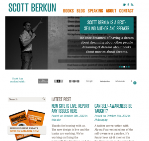
It should look like this:
We’re working on fixing the twitter/fb/feed buttons, and the mailing list signup form.
If you find other issues, from broken links or things on fire (that shouldn’t be) please report them here. Thanks.
Known issues:
We’re still dealing with some permalink issues.This should be fixed now. If you find broken links, please report them below.


The Podcast and Interview section still seems to be having dummy text. All the links in this section is pointing to same link, which again looks dummy.
Yup – good catch Rudresh. I’ll clean this up tomorrow. Thanks.
No problem. New site looks great!
Hey, site looks grate and really easy to navigate. One thing I noticed (and it may be done on purpose) there is no copyright notice in the footer.
Looks great, Scott. Very clean and your sense of humor is all over the front page.
“Too many redirects” error when going to https://scottberkun.com
This should be fixed now. And the permalink issue should be solved (if you don’t know what that means, be glad).
Things hung up for a bit while loading the third slide on the homepage and loading data from use.typekit.net. It eventually loaded.
The “Scott has worked with” text is misaligned compared to the list of references (at least in Chrome). Hurts my eyes, hurts my eyes, ouch ouch ouch….
broken link on picture (or actually amazon) under THE HISTORY OF RELIGION: EXPLAINED. (also in Chrome 22.0.1229.94 )
Fixed. Thanks Smaranda.
I’m not sure if this is the right place, but seriously Scott, I can’t stand the new design.
My main problem right now is font size and the amount of content I see on my normal screen. Can you PLEASE add an option somewhere to reduce font size to 70%? When I just open up the page, I see only the banner and the categories, no content at all. Also, compare font sizes for this page and any other one (I tried cnn.com and nytimes.com). I’m used to browsing the web in a small, non-fullscreen page and this is a really awkward, much-scrolling-and-clicking experience with the new design…
Also, I’m not that happy with the blog reducing comment length, so someone who reads the blog once a week ends up clicking on all new articles instead of just scrolling down the page and reading them all in one run.
Greetings, Daniel
Also, I can throw in three screenshots of how the site looked on my notebook:
http://imageshack.us/g/337/clipboard01qnc.jpg/
1) Firefox in fullscreen (with noscript plugins)
2) Firefox in half screen (what I usually use for browsing)
3) Chrome – comparison of type size with NYtimes and scottberkun.com
Daniel:
What platform/version are you running?
-Scott
Looks great on a mobile browser.
Typography and colours are great. Top marks to the designer.
This post seems to be missing a video…
https://scottberkun.com/speaking-videos/nunc-gravida-varius-mauris/
The font for the comments and the footer are a bit blurry in Chrome 23-beta. The same features look fine in IE9 and FF 15.
Found something else…I received a notice that more comments had been posted here. When I clicked on the links in the email, I got a 404 error. Here’s one of the links…
http://64.64.27.114/~berkun/2012/new-site-is-live-report-any-issues-here