Simple isn’t always good
[Originally published March, 2013 as The No UI debate is Rubbish, a reference to a once trendy concept that the best UI was no user interface at all]
A debate is rising over the platitude No UI is the best UI. It’s the latest formulation of an age old debate about when complexity is a sign of failure or an indicator of needed precision. I’ll tell you who is right: no one. I used to say things like this but I’ve changed my mind. Debates like these fall into the stupid trap academics have fallen into for centuries: Platonic ideals are an illusion. They’re fun to play with, they get attention, but are useless when your hands are dirty trying to solve a real problem for a real person.
The only sane alternative is The best UI is what’s best for the person and situation we’re designing for. That’s all. Who cares what’s best in the abstract? Who cares about the latest design trend? No one hires you to design abstractions, and if they did, your business card should read “Platonic Theorist” not “Designer.”
Jared Spool used to print t-shirts saying “It Depends”, a running joke about the only sensible answer an honest practitioner of design can offer to false dichotomies. The problem is false dichotomies are attention magnets, tempting people who aren’t busy actually designing things into grandstanding on the pretense one side is right and that winning proves their design talents. Even Krishna’s post on The best interface is no interface and Timo Arnall’s “No to No UI”, which are both well written and offer merits on both sides, go too far. Design abstractions are fun but not worthy of long arguments if taken too seriously. This is because at the moment a good designer sits down to design a specific thing for specific people these abstractions have limited value.
The best possible interpretation of the “No UI” platitude is its an echo of the age old cry for simplicity. Simplicity is a highly desired thing. No sane person wakes up and says “Dear lord I hope each of my interactions with machines today is complex and overwhelming! Praise the lord of complexity.” Of course everyone defines simplicity differently, but in their own little world simplicity is a goal.
But to proceed further is a fools errand: there is no perfect design for everyone (See The Myth of Optimal Design). All designs fail someone in some situation. That’s part of what design is: picking who you will fail and how you’ll fail them. Attempts to average a trend across all people and all situations is foolish (See ecological fallacy).
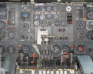
Sometimes a massive UI is the best UI
The canonical example is airplane cockpits. Pilots are control freaks. People may die if it takes 12 clicks to dig down to the nth level advanced control panel to change a setting.

Of course a designer could design a radically simpler design: The MegaGenius AutoPilot. It would have just one button you turn on to fly, and it uses it’s psychic power module to instantly recognize where everyone wants to go, plans the trip, cooks dinner, clears details with the tower, and takes off, while playing a music playlist perfectly tuned to the mood of the passengers and their destination. Now anyone can fly a plane (to the great sadness of the airline pilot’s union).

Is this better than the cockpit design with 4000 levers? It depends.
Questions include:
- Who are you designing for?
- What do they know?
- What do they need to do?
- What situations are important?
- Will they ever be in situations we can’t predict?
- How important is it to design for when the design fails?
There is an infinite spectrum of alternate designs between the ‘complex’ cockpit and the MegaGenius Autopilot. I’m sure cockpits are ripe for design improvements and simplifications, however we can’t say which specific designs are better or worse without answering questions like the ones above. In the abstract there is not enough information to design well, since you end up designing for everyone in every situation which is impossible.
But for fun, lets say we went mad. We convinced ourselves everything on the planet should just be a toggle switch. Our empire grows, building MegaGenius designs for everything.
And we run around installing psychic modules, ripping out the offending dashboards, keyboards, steering wheels, and every affordance known to the human race, replacing them all with automated magic switches.
What happens when one of these switches breaks?
As soon as anything breaks, the repair person faces a different kind of UX, the experience of trying to repair something. Are we designing for them too? Or do we not consider them users? Is the least amount of UI appropriate for them as well? If so, inside the switch should just be another set of toggle switches, going on into infinity all the way down? Even insane designers have moments of clarity and recognize that not everyone, all the time, is best served by militant simplification. There is always a person and a scenario justifying visible, and complex UI. Not all complex UI is designed equally: there are nuances to good complex design just as there are for simple ones.

Sometimes almost NO UI is the best UI
Now lets work the other way. Imagine we ran around the universe replacing every UI for anything with airplane cockpits. In every hallway, bathroom and bedroom, you’d find this on the wall instead of a light switch. To turn your mobile phone on or off, you’d have this to deal with. Want to open a door? No knob for you, instead you have to pull twelve levers, check readings on 3 displays and then simultaneously push two butons.
Of course this is absurd.
But it’s just as absurd as replacing every cockpit with a lightswitch. While the two UIs haven’t changed, the person and situation they’re being used in has and that makes all the difference.
In the end False Dichotomies are taunts. They get people riled up and picking sides. I’m telling you not to bother. Design is about specifics and when you see people red in the face arguing about abstractions either grab a beer and watch for entertainment, or do what’s more productive for your design talents and go make something for someone.
Absolutely nailed it, Scott. People debating any polar extreme is an absurdity, wrapped in the presumption of their personal truths are in fact universal truths that are applicable to everyone regardless of context.
Recently, there was a proposed Wikipedia UX/UI overhaul proposal (it was fan made, nothing official) that has been circulating the twitterverse. One things that really irked me was that they completed eliminated the languages listed with an aesthetic function in the top bar. This really irked me because no matter how “nice” or “cool” an aesthetic or UI change would be , it doesn’t excuse completely failing to take into account both the purpose of the intended interface and the actions for all user agents interfacing with the UI layer.
I mean, there’s a reason why Wikipedia lists every single possible language on their homepage and sidebar as it is the same reason why installing the your Playstation for the first time you have to set the languages.
While I can accept the merits of the NoUI argument and the counterpoints to each position within philosophical reason, the word “design” literally means “The creation of a plan or convention for the construction of an object or a system”.
You have to build on that abstraction layer for the purposes of how the users will function with it, not based on some aesthetic philosophy that limits the scope of overall utilization of your designs.
I’ve designed UX for mission critical workspaces like cockpits and I can confirm there is a reason every single button sits where it does. Latest trend in cockpits are touch and glass-only, positioning that domain something like 5 years behind everyday users of smartphones.
Cockpits will eventually move towards more automation and intelligence, but they can’t do it before technology is stable and properly tested. With an app UI design, you might try out some stuff the Lean Startup way, it just doesn’t work like that for cockpits. It needs to be proven, stable technology.
There is another reason why our real world will never go “Full MegaGenius”. Why? Because as we learn to automate and “hide” interactions, new features and options creep in. In the case of the cockpit, the interaction space has become MORE populated over the last 50 years, not less, even with advances in automation and context awareness, simply because the flying machine has become more and more advanced.
It seems that the “no UI” approach assumes that behavior and intent can be accurately detected and accounted for by design. Even Krishna’s post included two examples that are actually highly problematic: the car door and the sandwich shop. If I am walking towards my car, why should the software assume I want the doors unlocked before I take positive action (pulling on the handle for example) to enter the car. In the second example I order a sandwich and the NFC payment system handles the transaction without my intervention. What if I wanted to pay cash that day, or use a gift card? Many of the “no UI” examples stray too far towards “clippy” territory for my taste.
Moving to a higher level of abstraction, for this comment, I might add that a chairman might arrange for a couple of debaters in front of a room provided the purpose is not to “decide” but to stimulate the group’s thoughts for further discussion and action. And not as a cruel taunt.
It follows that the chairman, for this initial stage of a group meeting, would have to “stage manage” so the debaters would not get into specifics, where they would tend to agree, and would be alert to end the debate even before the time limit was reached, if that would serve the group. The debaters, prepared by the chairman beforehand, would fully realize they were serving as a means to an end.
You’re right Sean. I very much believe in the idea of debate.
I should have said False Dichotomies are often taunts, not always.
Another important issue is how different UIs behave during partial system failures. For example, does the cockpit UI make it easier or harder for the pilot to control the plane when the regular control surfaces are on the fritz, and she has to use left and right thrust to steer the plane?
Good point. It’s one trap of design: the simpler a design is the more fragile it can become.
No matter how good a design is it’s a large network of tradeoffs.
Ultimately we are designing (most of the time) for humans. And our human capabilities won’t change as the same speed as technology does
It’s fun when you get riled up. :)
There are some interesting examples to be found in the Mac and design world: Photoshop is frightening for the novice but amazing for the expert; iMovie and Final Cut Pro arguably alienated experts when their newer versions became more consumer-friendly; Flash became so complex that designers wanting to make simple animations were scared away. To use the analogy from Alan Cooper’s ‘The Inmates are Running the Asylum’, when you go into a plane, things are very different if you want to be in first class (ease of use) or the cockpit (power/mission critical usage).
I will just plop a quote from an old teacher and master:
“Only a Sith deals in absolutes.”
There’s something you start to touch on with the “Will they ever be in situations we can’t predict?” question, that’s worthy of further exploration: the extent to which a UI (of whatever kind) enables users to develop a mental model through using it which is *useful* in unexpected situations or failure modes. And all models are wrong, but some are useful (George Box).
However simple the toggle switch UI is, if it’s in the ‘on’ position and the light isn’t on, even a very basic mental model allows someone to infer that the switch is broken, or the bulb is burnt out, or there’s a power cut, etc. A very simple UI, in the right circumstances, can enable a useful problem-solving mental model to be developed. Think of engaged/vacant indicators on toilet doors – e.g. https://secure.flickr.com/photos/slack12/352361865.
But the “it depends” factor means that elsewhere only more complex interfaces can represent how the system works well enough to enable users to develop a useful model. The key with the cockpit example is not just “there are loads of indicators to monitor” but *how they relate to one another* – how the indicators and controls fit together into a model of the system, such that if one gauge is decreasing while another’s increasing, and a particular warning light is on, that indicates one state (and how to resolve it), whereas another combination of values indicates something different.
I know this is all obvious, but even looking anecdotally at people’s mental models of mundane No-UI systems (e.g. automatic lighting in offices and toilets, computer-controlled office HVAC systems, etc), you find people developing all manner of ‘folk theories’ as to how they work and what to do if there’s a problem – how automatic they are, who has control over the (invisible) settings, etc. In one set of interviews people sitting right next to each other attributed the temperature in their office to “a computer that controls it all” in one case and “some guy in the basement who keeps it deliberately colder than we’d like”. Neither believed they had any power over the system. It’s potentially only going to get worse with increasingly networked products and services which intentionally prioritise seamlessness (one of Timo Arnall’s points that really hit home for me): with unfamiliar systems, with minimal UI, how do we even go about forming useful models in the first place?
Office lights are a great one. Way back when I was still at Microsoft they instituted a cost saving measure where the lights would automatically go off at 6 or 7pm. There was some secret combination to put them back on (of course allowing the regular action of turning them on was too simple) but no one could remember what it was. I remember working late one night when the lights went out and a coworker and I spent ten minutes trying to remember the combination (it was something like all switches up twice, then down twice, etc.) before giving up and going home.
I’m not sure Timo’s article was an extreme, I always looked at it as a re-centering. He essentially wanted to refocus the talk around idea’s of materiality, feedback and culture. Aspects that affect any design, no matter if we choose to recognize them or not.
Your article is very correct that the idea of context, client, and user are realities of any design job, but there are always core concepts that no matter what should be recognized.
I’m sure this whole argument comes down to someone’s typo; surely they’re talking about No FI, usually spelled NFI. Certainly those espousing No UI seem to have NFI :)
There are valid points made here; however, this article illustrates, together with many other examples, how we consider the human interface more important than the actual work the computer does for us.
Personally, I would rather use a command line interface if the computer did a better job of the work we are asking it to do. It seems that we are quite happy to burn nearly all the power of the processor in making the screen look pretty. If we were a little less demanding on the “experience” and concentrated more on the work, then we may be able to have vastly more power efficient and productive computing.
However, maybe I’m just old fashioned.
I don’t think you are old fashioned (if you are, then so am I). As a programmer I have seen programming languages change over the decades. In a way, a programming language’s syntax is a form of UI. I have long held the belief that OSs should be written in assembly to keep the OS as fast as possible so it does not eat up most of the computer’s resources but keep those for the actual programs that run on it.
Thing is, programmers are also users; users of programming languages. But in doing so, ‘they’ forgot about the main user of a programming language: the computer. It must now wade though layer upon layer upon layer of frameworks, libraries, APIs and whatnot to accomplish a task. What was made simple for the human user, is now complex for the computer. And while it may be true that the computer does not care, in the end it creates compromises for the user in terms of loss of resources, speed, memory, etc. which are part of UX.
And at the end of the day I am not so sure that programming in C++ (for example) is less complex these days than assembly, because of all the APIs. In my time a programming language had maybe 50 instructions and functions. these days to write a program you need to have the API manual next to the keyboard and lookup almost every other line of code you write.
It is a form of simplification that resulted in complexity (but is not often perceived as such because there is no such thing as A programmer any more, today you are a C++ programmer of a Java programmer of a PHP programmer, etc.) And that has nothing to do with a grasp of the actual language (which are all more or less the same) but with a grasp of the accompanying libraries.
Great post – I agree 100%. I think this type of argument transcends the UI/No UI debate and bleeds over into a lot of things: it can be summed up as, “In any given situation, evaluate what needs to happen only in terms of that situation, not in terms of every situation.” Now, if only politicians could realize that…
Scott, you have eloquently described something which I have been saying for years (nobody seems to listen to mr though). I would only add one additional point. The drive to simplify also ignores one of the most powerful forces in design, specifically its evolutionary component. That is, designs evolve over time to be better suited to their intended purpose i.e., closer to optimal. The arbitrary drive to simplify things merely for the sake of simplicity deviates from this paradigm and very often produces a design which is far less optimal. The best example I can think of in this regard is Ubuntu’s Unity desktop. Yes, it may be simpler, but the drive for simplification abandoned years of evolutionary movement towards a nearly optimal design to produce what in my opinion is a beautifully decorated, very pretty, monstrosity. This is not given in the sense of arguing in favor of one over the other, but simply a statement of deviation from a movement towards the optimal. That is, Unity was not designed to further optimize the desktop, but to simplify it for tablet devices. In 10 years, Unity will probably re-evolve towards an optimal design, especially for the apparently intended target of “tablet” computing devices.
Nevertheless, there are countless examples of a similar type of issue, not only in terms of the “Simple UI”, but also redesign just because it has to be NEW – that is, “We have this new technology so we just HAVE to use it” – even if the older tech is just as effective, cheaper, easier to use, easier to understand and easier to repair (if you can repair the new stuff at all). There are countless examples of this in the Automotive and Appliance industries. Everyone reading this I suspect can think of several.
Seeing that cockpit image in the context of “less UI” gave me a thought.. Imagine a “simplified” plane interface by Microsoft and add Clippy back in!
Clippy: “I’ve noticed you are about to crash the plane. Would you like help doing that?”
ROFLFMAO! Brilliant!
“No sane person wakes up and says ‘Dear god I hope each of my interactions with machines today is complex and overwhelming! Praise the lord of complexity.’ ”
Great argument in the article as a whole, but this generalization is so far from my experience.
I wish for those interactions and praise the lords of complexity every morning, noon & evening. That particular kind of insanity is what drives me to want to design simpler things.
This article should be required reading for everybody on Microsoft’s design team who came up with “Metro.”
There’s almost no UI in Chrome. But if you’d like to, you can take a look at (and adjust) all the settings under the hood. Basically I think “no UI” works and should be promoted and praised. But a switch for looking at advanced settings should be provided as well.
Using aviation is a terrible example, sorry to say: Human error is the most common cause of aviation accidents. It stands to reason then that abstracting more technology away from direct human control will increase air safety. The level of automation built into aircraft continues to increase, and with this trend has come a corresponding drop in accident rates.
Designing a button to fire off a nuclear missile and one that takes user back to the home screen have complete different purposes, context, intention, intensity, and therefore can not be subjected under the same UI design principles you are debating over.
“That’s part of what design is: picking who you will fail and how you’ll fail them.” Reminds me of the old adage about wedding planning: You have to decide who you are going to offend and by how much!
Great article!
I’ve never heard that quote before about weddings – thanks.