You Pick The Ad for My Book (Get a signed copy of The Year Without Pants)
The fine folks at Jossey-Bass are working on some web ads for The Year Without Pants.
We’ve narrowed it down to two candidates – which do you think is best?
These ads will run on major business websites when the book officially launches (Sept. 17th)
Leave a comment with your thoughts: one lucky commenter will get a signed copy of the book.
Design B: Big Red
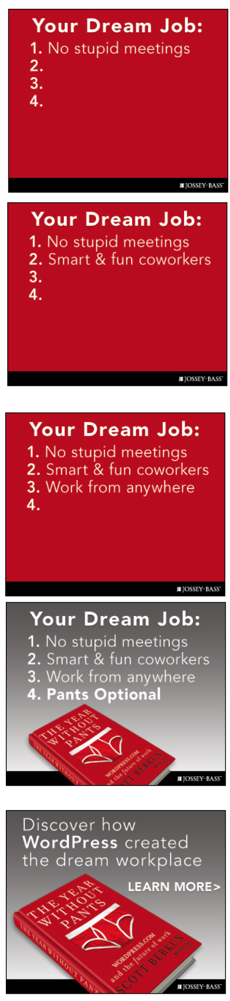
Design A: Clouds
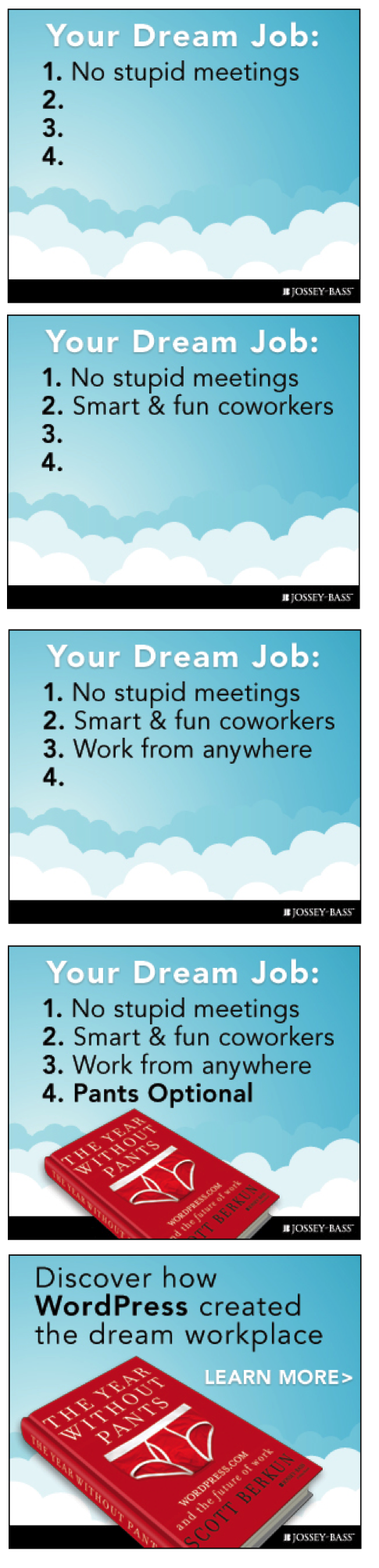
I believe the clouds work better. We have a whole lot of red on the web already :L)
Clouds evoke dreams and fantasy and people are more likely to pick up your book, whereas the red is mildly threatening. my .02
Well, it’s apropos. Scott is mildly threatening. :)
Mildly? I’ll kill you if you call me mild again.
I liked the 1st one better. The second is too “strong”, too much in your face. It is very visible but it made me hate it.
I swapped the order so by 1st I’m assuming you mean Clouds.
The clouds may be the “safer” option but it’s also the more boring one. For some reason, it’s making me think of “cloud computing” (even more boring). I’d go for the red one. It also ties in better with the book cover.
The red version looks fascist. The clouds are optimistic and compliment the text “Dream Job”.
Clouds fit the dream theme. And like Pedro said, we already have enough red on the web.
It seems folks think there’s both too much red and too many clouds :)
Perhaps we should make the clouds red and call it a day.
I think you should go with the red one; except, the red background ought to really be a super-zoomed in picture of the red underpants on the first frame. Each of the red frames zooms out, until by the third frame, you start to get that the red is the color of underpants and the white stripes showing at the edge unmistakably show “these are underpants”.
A this point, the user is thinking “wtf, why am I looking at underpants?”
Then the next frame does the reveal, where the underpants are part of the book cover.
Or stated another way, let the red in the first three frames be the red you see when you’re super-zoomed into the book cover, and you can see the gray background in later frames when the book is zoomed out to give you the reveal.
Khan’s comment hit all the right points. The big red square is too angry and abrupt (although it is attention-getting). But done as a tight shot on the underpants, and then zooming out, it would give an aura of voyeurism, a “need to see more.”
Go with Kahn’s idea and give him the underpants, er, uh, the book.
Mock up Khan’s advice. The dual dynamic of zooming out and adding bullet points might not turn out not to work well, but it’s certainly worth trying.
As Angie and others have said, the red grabs attention. Implementing Khan’s advice, you’re bound to remember part of the book title, “without pants,” instead of “gee, pretty clouds.”
One issue to consider while implementing this idea: would you be zoomed in on a pair of underpants alone (entirely leaving out the book title), or zoomed into a book cover (awkwardly lopping the book title in the early panels).
For animated ads zooming effects are hard to pull off: not enough frames.
The clouds are MUCH better. No question.
This was a hard one, but I settled on Clouds mainly because of the visual interest throughout; the first three frames of the red ad are too stark (though I like the colours at the end). If those red slides were dressed up, e.g. styled like someone giving a PowerPoint presentation I may have chosen that instead.
Having said that, the Clouds seem to be more harmonious with a light background of a typical business website, while the strong red background would provide too much contrast and give the impression of a pushy salesman.
Daniel: You nailed one of the limitations of this kind of polling – the ads have no context. Depending on the design of the site they’re on, they’ll look and perform very differently.
The clouds are better for it reminds people of their dreams. Red is very shocking, very strong and it hurts the eyes.
In contrast with most commenters, I like the red one better. It fits with the color branding of the book and looks good.
The cloud one looks generic and boring. It looks like an Ad that my brain already instinctively ignores on the web. To an extent, the red one does too, but its bold enough to make me at least take a look at it.
The red was more striking (I see a lot of clouds in display ads these days), and the shift in color to grey changed the mood in a way that grabbed my attention immediately.
That said, split testing FTW!
I liked the blue one. I disagree with the boring comments, but then I like a softer not screaming in my fave ad. However, it is an add, so the red screaming in your face might be appropriate.
Thanks for the comments. The concept bets on the “Your Dream Job:” prompt as being inviting, which, if it works, doesn’t depend on the aesthetics as much as many ads do.
I think the red one has more of an impact. It stands out more. I think the clouds one will blend in depending on the site the ad appears on.
I’d go with the red one; it’s going to make them stop for a second and try to figure out what’s going on. The cloud design looks a bit childish at first glance, kind of like a Comic Sans of the clip art background world.
I like the Clouds version since it indicates what most people want: a job that allows us to float and work to requirements instead of being tied to a desk; to work in an environment where we are respected for our thoughts and actions rather than our appearance.
Without question it is design A – Dream job and the choice is clouds or red background. Clouds are the winner. Red is not a color associated with dreaming unless you are in China.
Hmmm. With a red cover maybe my book will be big in China. How do they feel about public displays of underwear?
I like the red one. The blue one makes me sleepy. And you spelled “Innovation” in red in “The Myths of Innovation” and that book rocked.
I like your logic.
Split test them. Keep the variables (site, location on site, etc…) the same, and split test both versions.
Guessing before hand can get you in trouble, and cost you book sales ;)
Agree with a lot of comments. Send Khan red underpants.
I much prefer the clouds, but would encourage adding the book or something throughout. I worry it will be perceived and scrolled past, dismissed by a wider audience as yet-another-advertisement for a “work from home” web dream job (not a great book on same).
Cheers,
Derek
A: CLOUDS
I felt it was much more appealing to the eye… evoking the strong sense of ‘room for growth and expansion’, synonymous with “SKIES THE LIMIT”, where you could imagine yourself excelling above and beyond your wildest dreams/expectations.
Big Red. Better chance of being noticed on a busy website. Red connects better with the book design. Not sure where the clouds come in.
A: CLOUDS
I would add that against the backdrop of clouds, the book itself STANDS OUT REMARKABLY, unlike in the second option, which swallows it up amidst all that OVERKILL, UNDER THRILL RED, which didn’t convey any kind of inspirational message, or dig deeper into the subliminal mind.
As far as the last slide goes, I agree. The red cover on the cloud background is striking.
Hi Scott
I did notice that you mentioned (in response to one of your earlier comments) that you had chosen to change the order of the ads, favouring the CLOUD slides over showing the RED slides first. This insight did make me wonder HOW/IF the initial impact would have differed for me?
I have concluded that seeing the RED slides first would only have served to strengthen my resistance to them and any message being sought to convey through them would have been lost on me!
To add further to my initial observation, which is that the RED PANTS book cover stands out remarkably against the soft contrast of light blue and white clouds, by contrast to the RED ON GRAY… the RED was a total overkill to any message being put out, and seeing the RED PANTS book cover against the gray back drop put me in mind of a headstone! It was like a finale to the death march… SORRY!
The swap was a weak attempt at counterbalancing the data. Ideally everyone would see the choices in a random order but there’s no easy way to do that with WordPress and Polldaddy.
Blue skies are about summer, dream vacations and happier times. EVERYONE is happier when there are blue skies. For sure. Red is just red (though I do really like the color red). The blue one pulls me, the red just exists.
Chose the red one. It really stands out, it reminds you of the book (due to the color used), and I think clouds aren’t a really good fit (unless your book is either about cloud computing, or airplanes) to promote a book about the future workplace. Could be just me though :)
I vote for A, “clouds” 1,000%. The blue sets up the happy “dream” job, and then the red book suddenly pops against it. It’s a surprise, it’s a big contrast, and it’s fun!
With B, the red background seems to start out fun, but then it turns to grey…and then it’s a downer, depressing, and the red book doesn’t liven it up, You don’t realize that its the red book you are supposed to notice. It’s sort of like a movie that doesn’t end well…you always want a great, fun happy ending, and this has a sad finish.
Clouds!! :)
Agreed. Much better stated than my reply!
The red book cover is great, especially as it will visually stand out on a shelf, at the bookstore or at home.
The theme of the ad is your dream job. Do you really want to describe your “dream job” against a flood of anger, hostility, or too-much passion?
I work for a company that is the exact opposite of the WordPress values. Our employment agreements prohibit blogging and social media responses, and they have automation in place to catch offenders.
If you went with the red background, I would have expected one of the bulleted points to be something a bit harsher; to paraphrase Bob Sutton, “No Assholes”. Oops, it’s too dominating, but it goes with the red (and not ironically, the color of my current employer).
Clouds … because my 5-year old daughter likes clouds. And she’s really good at picking out the right thing, probably doesn’t over-think it like adults. I’d try to explain, but then I’d be over-thinking it … go with clouds.
I am so glad you asked your daughter. It reminds me that kids performed better than college students as shown on http://www.marshmallowchallenge.com Cheers, WAD
The first one with the blue background and clouds wins hands-down. Blue is soothing to the eye and gives a feeling of “cool” and “fun”.
Clearly B. It is in one line with the cover. The cloudy background from A is to generic and boring.
Clouds appeal is good.
The mix between red and dream job does not seem right because red annoyed me from the beggining. I’m not sure if blue is the best but is better than red in this case.
Go big red. It fits with your brand and isn’t washed out (emotionally speaking).
Hello, Scott. In my view, what doesn’t really work are the two last screenshots of the red ad. The gray background is dull, boring, uninviting. Doesn’t match the dream job idea. Isn’t cool. The blue sky and clouds ad conveys a sense of openness that is easier to link with the idea of working from anywhere. (Regarding the ad copy, I’m not sure about “no stupid meetings”. Of course I haven’t read the book, so maybe there is a lot about that in it. But in my experience you can have stupid meetings over Skype too.) Hope this helps. Good luck with the launch!
Hello Scott, I’m looking forward to read the book!
Now, regarding the banners, if I go on aesthetics, I think that the red ad is “too sharp” for the eyes, definitely your eyes will notice that there is an ad in there, but people is getting blind (or de-interested) in too aggressive banners.
I personally like the blue ad, but just for the purpose of raising it’s visibility (or in fact, the visibility of the main message) I would change the color of the text “Your Deam Job:” from white to a yellow (#FFCC00 for example) and a thin dark grey border, which will help the main message to stand out more on the ad as the most important message (since it is the “eye-catcher”)
Just to show what I mean, I made a quick version that you can see here:
http://www.screencast.com/t/2eADOvwG7h
But actually, maybe a brighter yellow would be even better…
The ad design is highly dependent on color theory and the context of the placement will determine its effectiveness.
For instance, the red ad on a website design with mostly cool hues (blue, blue-gray, green) will grab attention. Vibrant red when completely desaturated is dark, so it will stand out on a site with lots of light, cool tones (probably the state of most sites where this ad will be seen).
Red. Boom. Visual impact. Clouds remind me of saleforce.
Clouds work better for me. The red feels a little… bland. The clouds fit with the dream job, whereas the red/grey just don’t.
Looking forward to reading the book. Good luck with the launch!
Scott
I plumped for big red. Gotta love those pants.
Phil
I voted for clouds as I thought they suggested the idea of working anywhere, outdoors perhaps in the garden or on the beach. The grey background suggested the colour (and mood sometimes) of a typical office,
I prefer the clouds. You are in “heaven” with your dream job. The red of the book is a big contrast which makes it stand out.
The entire red background besides being “in your face” as previously mentioned – takes away from the slides with the book – no contrast of the red book showing up.
Clouds option is better as it avoids that transition from red to gray background.
The clouds provide a better image / background for “dream job.” The red is too stark, almost disturbingly strong.
Clouds are much better when talking about a future dream, of possibilities that you think are far off and not obtainable. Red is too shocking, and reminds me of Red Shirts. Much too dangerous, you go first.
Book cover pops better off the blue/clouds than the red for me. The white undie edging ties in with the white clouds. And how often do I get to say that about a potential ad??
I like the red one personally. I am currently doing software development for a realtime bidding company, and I called one of the AdOps guys over and got his opinion; he said that the red one would be more likely to trigger. He said he has done experiments with landing pages and others, and said that if he added some red or orange, he would see around a 150% increase in conversion rates.
I went for the Big Red. More catchy. There is too much of ‘cloud’ around these days, so people may tend to ignore it. And Red goes well with the book cover.
I actually hate the cloud theme. There is akready a plethora of these, while red is getting rare these days, fits with the book and is great to build tension for the fourth bullet point.
The clouds feel more pleasant to my eye, not to mention that it fits better with the theme of “Dream Job”. Plus, the fact that the Big Red changes to grey doesn’t sit well with me.
Definitely the clouds — images of dreams, pie-in-the-sky thinking, happy places!
Clous. No Douth.
Disclaimer: I have not read anyone’s comments. Obviously, the cloud one. When I saw “red”, stop came to my mind and it usually means “problem”. Example: red yellow green as shown on traffic light. For cloud, it means dreaming on! Cheers, WAD
For voting purposes it’s better that you didn’t read the comments first :)
Sigh. In the minority again.too many fluffy clouds in adverse. Go gutsy.
I see your point, but there is something hilarious about the contrast of the happy fluffy clouds with the bright red underwear on the cover. Makes me laugh every time.
Clouds remind me of twitter background too much.
The red ad only because the clouds IMMEDIATELY remind me of Twitter, which I’d mentally tune out if I were surfing a website.
I would most definitely go with Big Red, design B. It’s much more… professional, I think. Simplistic, but it works :)
Go with the blue. Blue signals trust, red signals danger, anger and alertness. I think your message meshes best with putting people at ease over increasing their heart rate.
I way prefer the red one; it much better prepares the stage in line with the cover of the book., red immediately draws ones attention.
The cloud, on the contrary, I associate with either something cloudy, cloud computing or whatever.
So, from my point of view, the red carpet is the way to go.
I simply liked the look of the Big Red piece over the Cloud version.
The clouds reminded me of a power point presentation. The Red one got my blood pumping and made me want to see the next “slide”.
Clouds.
Clouds. Some have said that they’d tune out the clouds, but I fee like I’d tune out the read background.
Definitely option A – the clouds! Option B is not bad, but is inconsistent – there is no other reason to change the background from red to gray (i.e. that will connect to the appearence of item #4) other than that the book is red, so no – option A is better.
While I like the clouds, I think that Big Red may have a better chance at standing out visually on a “big business website” — this might be a more important consideration in this case then anything concept driven.
Thanks for all the votes and opinions. I read them all.
Winner was chosen here: http://wp.me/p4vkk-3O7