Cover design vote: How Design Makes The World (first round)
My next book, which teaches just about everyone how to understand good design, is on the home stretch (release May 2020). Which means it’s time to get your feedback on cover design directions (I’m working with PageTwo Books).
If you haven’t been following along (outline and more at the link), Here are the book’s goals.
The book’s goals are:
- To teach anyone to see people, places and things more like our best designers do.
- To invite everyone to ask better questions about the designs they experience every day.
- To give designers a compelling, short book they can share with coworkers, clients and friends to explain what they do and why it’s so important.
- To have fun while understanding the world. Life is too short.
Stories in the book explore city design, product design, web design, aethetics, design process, flow, user research, mobile design, ethics, system theory, inclusion, business, org politics, tradeoffs, design for conflict and more.
Rules for Feedback
- These are preliminary so the specific images or objects should be considered placeholders.
- You’re voting on the approach, rather than for these being the final cover.
- The book is for everyone, not just you. Your personal opinion is interesting, but if you’re a designer most people buying this book won’t be.
- The brief is: clear, simple, inviting. Fun if possible. Readable in a thumbnail.
- Thoughtful comments welcome.
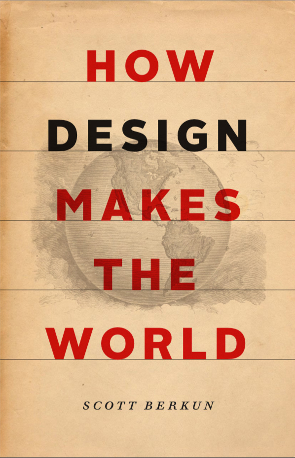
Approach A
One approach to thinking about the world, with a sample map etching as the background.
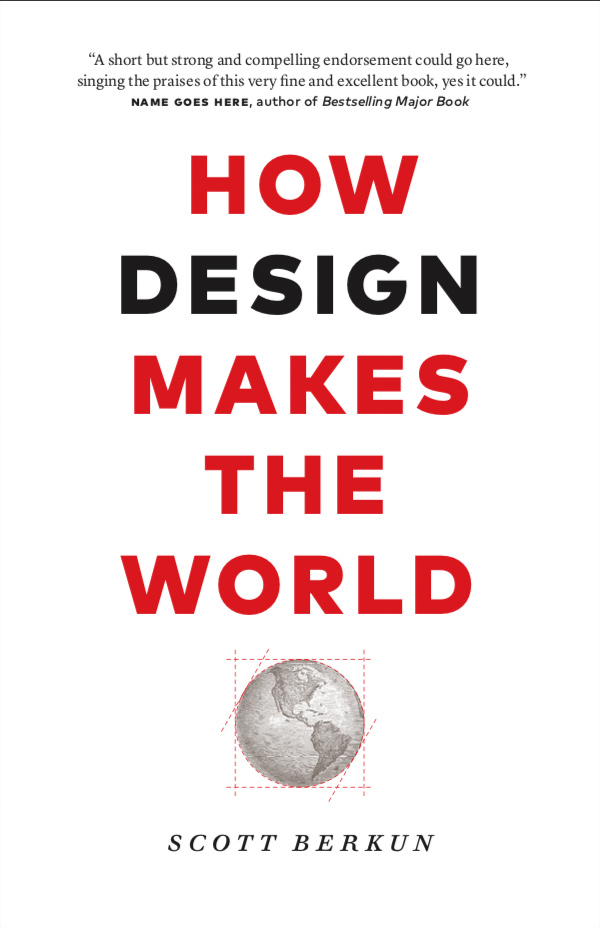
Approach B
Simpler visual style one an anchored image, in this case a globe (one idea for representing the world). Some variations below.
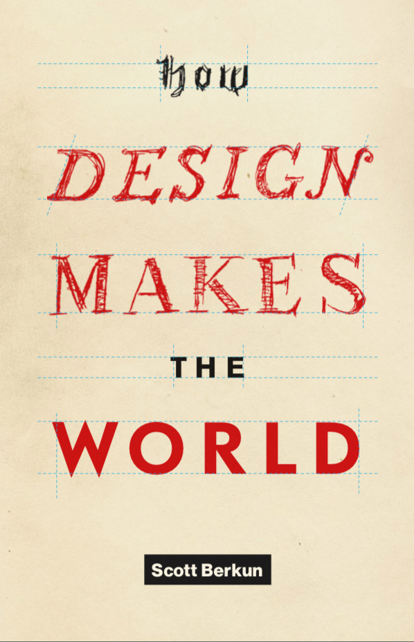
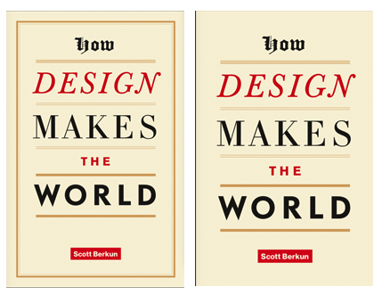
Approach C
Rough sketch – the idea here is to show some kind of progression in style and fidelity. This was done quickly but if we went down this path we’d invest in high quality hand lettering.
Approach D
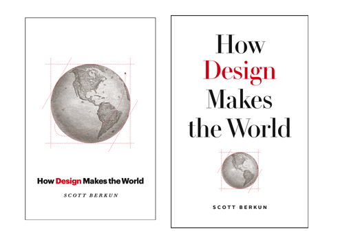
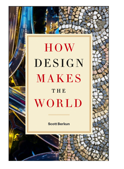
The background images suggest different kinds of design, and there could be many different options for what’s put there. Or how many there are.
Option below shows a different orientation of the images.
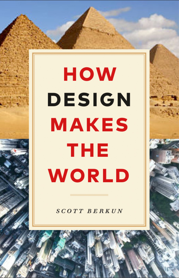
Option A, then B … prefer the title’s typography; both include the globe (accentuating the point of designing the world). Option C the typography looks messy (appreciate the “design” thinking behind it, but it seems undesigned), Option D the use of photography seems jarring …
HTH
Ric
As a software engineer and a NY-er, I hate anything visually complicated for no reason.
So #2 is my choice.
A – It looks like old, yellowed newsprint, archival, musty, dowdy, conservative. This is in stark contrast/conflict with the meaning of the bold, confident title
C – It’s forced, too cute, trying to be clever for the sake of being clever.
B – Clear, simple, modern, well-balanced layout, with eye-catching black type for “DESIGN”,
D- the balance of old vs new architecture adds up to overall imbalance–too much singular emphasis on one small slice of design–architecture. The globe images in the other samples are harmonious with the title, like a good bass line in music.
D could have almost any images in it, which could change the vibe considerably. What would you put there instead?
I think the intent of the typography on Version C is clever (although the blackletter is pretty cringe), but some combination of type on dotted lines with the earth/lines from Version B seems strongest.
They’re all preliminary, so if we go down path C, it’d be a higher quality version of all the different lettering styles.
Please dont’t make it D!
Wow – you only want to vote against one? :)
A. Makes the book seems old and out of date. Contrast of old style print illustration and modern type is jarring
✓ B. Clear, a little bit generic but I like the way the globe has been framed as if it’s been ‘made’
C. Like the idea conceptually but it seems unprofessional.
D. Please don’t go forward with D.
Hello,
I prefer A :-) It’s classic and modern as well.
Best regards,
Martin
I voted for B for its clarity of type and the opportunity it gives—with the right image—to make the point that design is all around us.
The one thought I have on the image is that we did not design the Earth, so the illustration might be misleading as it stands. One way of looking at it might be that Earth was our canvas and we’ve designed/built/whatevered on top of it. Maybe there’s the nib of a pen hovering ominously over it or or or yes and etc :-)
As the notes suggest it’s a first pass on the specific images – it’s not easy to represent the world in one image without missing something, you know?
Also: the world does have design (the human heart has a design, an ecosystem has a design, etc.), even if it doesn’t have a designer.
Not truly in love with any of these. They need a concept, not a construct.
Are they taking these basic forms because its more informational rather than narrative driven? Fiction books generally have concept covers, while informational resist being too flashy.
I think there could be a compromise between general readability with some motif, artwork.
Random example: https://lithub.com/wp-content/uploads/2018/12/A11cWJ4wR3L-682×1024.jpg
I know budgets aren’t huge, but find a great graphic designer in Seattle to work with?
One thing I do love is your Scott Berkun in a block like the Supreme logo. I know its a treatment, but it could be kind of cool for Scott Berkun to have a brand too!
I think B is clearest, and maybe the third option (mixed case). What if you took the word “Design” from C and plugged it into B, a word under construction amid heavy typeset/mechanical letters? You might also consider architectural lettering for the word, similar to Architect or Schema on this page (https://blog.miragestudio7.com/architecture-fonts-download-free-architect-handwriting-font/3339/).
That said, I’m not sold on the title. It feels ungainly, and if I may say so, undesigned. “Makes” is a verb with little impact – and even though it seems to fit with what you’re trying to show, I’m not sure it resonates as a title on a quick browse on, say, Amazon. “Creates”? “Builds”? “Extends”? “Upgrades?”
The ship has sailed on the title – so you’ll have to live with that one :)
Thanks Steven. Good to see your name here.
Glad you’re getting close. I voted for “B”. I like clean design.
That said, I would want the “blue print” drawing around the earth a bit more prominent. There’s probably a fine line (so to speak :-) between it cluttering up the design and it simply making “design” clear. The world is clear. The idea of “design” needs to be as clear.
For me, the other covers had “design” worked through but not in ways that I enjoyed more that got it across quickly (for me…).
Hope the thoughts are helpful.
Thanks Doug.
I favor approach D. It shows real world, large scale impact of design. The minimalist version B is certainly more beautiful. Especially on the screen. But I think design is more than fonts and screens. And I guess, that’s the point of the book, or at least the title.
Also that the title is surrounded by implemented design choices suggests that design surrounds us.
One historic and one current example tell that designing isn’t new technology. But inherent in human endeavors.
D is great.
Well, B is the safest bet and no wonder it is getting the highest votes (including on Twitter as well).
I would go for C. This is because you can do as much design messaging in typography as you want, without adding any scope of subjecterpretation (subjectivity-driven interpretation) that images tend to cause.
Thanks Vinish.
Huh. I find most of the commentary here to be sophomoric and ill-informed, so take my own with a grain of salt.
While I understand the use of the “globe” for the word “world,” I don’t feel it’s appropriate, as the globe/earth wasn’t designed.
This is why I opted for D. You can use a range of designed things (buildings, tiles, objects, etc.) to communicate the ‘design is everywhere’ theme. I think you could look into 4, 8, or even 16 images for the cover (instead of just 2).
If D doesn’t move forward, I guess I agree with the sentiment that B is strongest. I prefer the first direction shown (use ALL BOLD CAPS) to either of the options — the sameness of the letterforms/shapes works, especially with how the word DESIGN is then set in black. (It also works for the D cover).
Great point on the ‘globe’ vs ‘world’ concept. If you haven’t seen the title sequence for Amazon’s Jack Ryan series, do check it out. I can imagine lifting that approach, where different objects that share similar forms are matched up next to each other (a bicycle wheel split with an aerial view of DC, for example). Something that pushes version D further into an interesting graphic direction, that’s more suggestive, seems like it could be exciting.
Thanks River – I watched the video and totally got the point you’re trying to make. I’m trying to think about how to pull something like this off if it’s a static image. An advantage the trailer has, as video, is can create tension and relieve it, but a static image can’t really do that. So a collage style globe or world will be a challenge to make look good and clean.
I agree with you, River! That was what I liked about D. The potential for some really interesting juxtaposition of designs.
Thanks Peter!
Also… everyone commenting here is a dude. Most of them white. I wonder about the population that’s voting, and how truly indicative it is of your desired audience.
I agree with Peter – D most elegantly conveys the concepts and the others are too literal with the word “world.” Also, I am not a dude. So my vote counts twice, at least. ;)
I’d say 3x Ann :) Thanks.
I love the simplicity of option B. I always imagine this is one of the primary goals with good design.
If you do option A, pick a map that shows the entire world. Don’t alienate the majority.
Can’t wait to read the book irrespective of the cover!
Thanks Arthur. Appreciate the support.
Nice initial concepts. I like A and B, but the integration of type and image in A is more appealing. The words over the image create a layering and more dynamic visual style, the also provides a little bit of mystery, as opposed to B.
I’d love to see the world/map image made of different objects as an option here. That could happen with A or B, but would be a fun way of literally showing design making the world. You’d need a good illustrator for this, but if done well it could be really fun. I can imagine it with photos or the entire thing drawn.
Good luck!
I like Approach B, but with a little twist. An anchored picture isn’t actually about making the world, it is about drawing a globe.
How would you draw *making the world*? It is a challenge, but a nice one.
Lots of good points above.
+1 on the map should represent the whole world
+1 option D having a lot of possibilities but +1 I don’t like the antiqued feeling of the inset
+1 option B is clean and simple, I’d like to see Option B & D combined.
Thanks Vanessa!
Approach C is unique which wins it big points. When looking for a book simply by the cover something that looks unique will grab my attention and draw me in. This one offers that. While it seems a little piecemeal currently, it has potential to be a unique cover.
Approach B…To me, this looks like every other book cover out there. I would skip over it in a heartbeat. It doesn’t have enough simplicity to be interesting and doesn’t have enough complexity to be interesting.
Possibly play around with a white background with approach D to tie into more of a clean modern feel, allowing the focus to only be on the text/font. Consider making your name smaller text as well. This could really make the front cover more like an awesome, clean typography print/poster.
Maybe a change to first version of option C
Do a super stylized “WORLD”, with a Globe for the O. (Perhaps embossed?) and without the drawing lines. aka make it so the the first words in the title visually look like rough drafts and the WORLD is the final product.
I feel like the style of B has been done to death. Only use it if you want to look exactly like every other design book that’s been published in the past ten years. A doesn’t really speak to me, either, and C seems messy, with all of those typefaces. I think D has the most potential – I find the second version to be the most compelling.
I chose B based on a litmus if “I’m most likely to buy multiple copies of this book to gift to others on professional settings”. The clean and modern look, to me, implies a certain approachability inside. I think the broadest audience would actually try to read it.
I like how Approach C builds from the rough handwritten typography into the full printed version. exploring this theme is the winner!
Thanks Guy.
I like Approach C – where the old handwritten lettering progresses into the full print typography. exploring concepts on this approach is a winner!