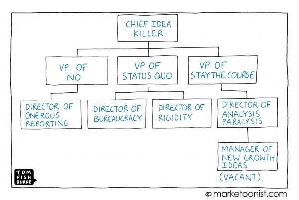
Idea helpers: ways to grow ideas

The happier twin brother of idea killers are idea growers. Things you can say in response to ideas to help them grow.

Unlike idea killers, these statements act as idea fertilizer, helping them to grow, find homes, make friends, and grow from ideas into solutions. Instead of ending conversations, they always provide a path for the idea to move forward, grow, or be the seed for other ideas.

(Thanks to Jennie Zehmer for suggesting this)

Idea starters

  • What do you need to make this work?
  • How can we explore this idea to understand it better?
  • Who else has done this before? What can we learn from them?
  • Whose support do you need?
  • How much time will it take to flesh this out?
  • Drop what you’re doing and focus on this.
  • Talk to Fred, our smartest guy, and see what he thinks.
  • What can you add to this to make it better?
  • What should change to help make this happen?
  • Lets run with this and see where it goes.
  • What can we cut to make room for this?
  • What’s the next step?
  • Here’s a blank check and the corner office.

Can you name others you’ve heard or said?

Idea killers: ways to stop ideas

In the creative thinking course I taught at the University of Washington, we spent time listing idea killers, statements often heard in organizations that prevent change. Chapter 4 of The Myths of Innovation explores them in detail since it’s essential any creative person familiarize themselves with these phrases and learn countermeasures to overcome them.

If you work with ideas, you will hear these phrases often in your life. Often they contain no logic, but unless someone challenges them they are used to end creative conversations.

For example, a statement like “we don’t do that here” presumes that there is a good reason it’s not done. But is there? Maybe someone bad at their job forgot to do it when the organization started? Or perhaps the fact that it’s not done is hurting the company.  The fact that something is or is not done says nothing about it’s value. You might as well say “the sky is blue” or “squares have angles”. They are merely observations.

But if a statement like “we don’t do that here” is said by a powerful person, it’s politically hard to challenge them about why this might be, or that it’s a problem. Progress is often based on doing something that has never been done in that organization before. But a leader’s pride in what might be a failed notion of tradition inhibits the examination of the tradition’s positive/negative values.

“We tried that already” presumes that the reason the attempt failed was because of the idea, and not the many other factors that might explain the failure. It could have been that the least competent people worked on the project, or that it was underfunded. The right question to ask in response is “Yes, but why did it not work before? What has changed now that might lead to a better outcome if we try again?” Unlike the idea killer, these questions lead to thinking, rather than preventing it from happening.

The basic method for defeating idea killers is to prepare, in advance, your responses to them. Convert any idea killer you hear into a question that examines the merit of the idea, rather than allowing the statement to presume there isn’t any. You can probably measure the open mindedness of a culture by how often idea killers are heard, and how well practiced people are in overcoming them.

Of course opportunity cost means that many ideas will need to be rejected to make any one idea possible. But when there is zero time allowed to consider new proposals, no new ideas are likely getting the support they need.

Idea Killers

  • We don’t do that here
  • That’s not the way we work
  • We tried that already
  • We don’t have time
  • That can’t work here / now / for this client
  • It’s not in our budget
  • Not an interesting problem
  • We don’t have time
  • Execs will never go for it
  • Out of scope
  • It’s too ambitious (“blue sky”)
  • It’s not ambitious enough
  • It won’t make enough money
  • It’s too hard to build
  • That isn’t what people want
  • Sarcastic / Snarky
    • What are you on?
    • Can we get someone with a brain in here?
    • Would you like a pony?
    • We will actively work against you
    • (Laughter)
    • (Silence)
    • This train is on fire

What are others you’ve heard? (Also see Idea Helpers, a positive spin on the same theme)

Chief_idea_killer_Marketoonist

Mindcamp 3.0: report

Seattle mindcamp was this past weekend and surprise: they let me in!

Here’s the short report:

The good:

  • New format rocked. The innovative organizers chose to take a risk and have pre-filled out forms for sessions. It made a dramatic difference: the quality of session titles and descriptions was very high. Encouraging people to plan paid off, without losing any of the free-form vibe or last minute idea possibilities. A lesson to all future unconference organizers.
  • Fun randomness. This is why i come – I met a female bodybuilder, talked to some friendly burners, shook hands with Tom Bihn. Awesome. it’s these non-tech interactions that interest me most. Chad McDaniel suggested a non-geek camp, same people, but non-geek topics, would be a more mind opening experience, and I agree. The Discovery Slam Bryan Zug and I ran nailed this (pun intended, thx to street performer guy), but it was just one session.
  • Ran a fun session on the innovation book. Had a great crowd, exchanged ideas, laughed and had good times all around. Many of the myths I heard are already in the book, but heard some comments that I’m still thinking about (If you have more thoughts, let em fly). Thanks to all that were there. Also sat in on Scott Ruthfield’s excellent session on innovation in big orgs.
  • Food, environment, lack of rules. The unstructured vibe always makes things fun, since as soon as it gets dull or I can’t find anything, I can make something up, or head guiltlessly home. Everything else was taken care of – kudos to organizers.

The complaints:

  • Some process problems. The new system, as expected, had some kinks. Sessions started late and without their organizers (they didn’t know they were up first).
  • Crappy pitches. I heard so many bad pitches for start-ups, projects and people, it drove me nuts – it was embarrassing. I did a lightning talk late in the day on how to pitch an idea, which might not have been useful, but sure was therapeutic. I think you know the start-up seriousness of a crowd by the average quality of overheard pitches.
  • Few projectors / wi-fi. There was no warning, so for Ario‘s UI design session, we assumed the requested projector would be there. No dice. Session canceled and we had to send 30 people on their way (some hung out for small group critiques). I don’t care much for wi-fi at conferences, but like projectors, session organizers need to know what to expect before we show up in the room.
  • Are 3 word intros worth an hour? It’s an unconference tradition, but Donte, Ario and I came up with less time consumptive alternatives: Idea: Let people who want an intro put a photo with their 3 words (or whatever they want on it) up on an ftp server. Have that projected in slide show mode before sessions, during meals, on the website before the day, and any other time when passive media has some value.
  • Where are the ladies? Kudos and all my platonic love to those that were there (all 8 of you, yes I counted), but there’s something bogus about mindcamp if it’s really “boy-geek camp”. Making mind camp less “geek-camp” (encouraging artists, writers, designers, to come) would not only make my brain happy, but would balance the gender ratios too. But perhaps this is the seed for a different event… (Sex camp!). No, I mean, roughly, Renaissance-mind camp. If you’re into this, leave a comment.

Kudos again to all the organizers – appreciate what you made happen!

Tags: ,

The early days of dogfood

There’s a theory that everything we think is clever or new has been done before – well, in the case of software developers dogfooding (forcing themselves to use early versions of their own work) it’s definitely true.

Here’s this gem about Edison’s lab:

“Workers at the Edison laboratory and the residents of Menlo Park became the guinea pigs for the first incandescent lighting system. Lamps hung from overhear wires lighted the workshops, the streets around the invention factory, and even a few residences.”

I’m just glad I never had to dogfood the first jockstraps, automobile breaking systems, or defibrillators.

(Quote is from the excellent Mastering the Dynamics of Innovation, By James Utterback)

(Seattle) Socrates cafe forming on eastside

I’m starting a philosophy discussion group here on the Eastside, and I need help. My rolodex of people that like to talk philo, and aren’t insane, scary, or humorless, is pretty slim.

A Socrates cafe is an informal, coffee fueled, humor encouraged, chat session about whatever topics people want to discuss, as long as its tied to philosophy in some way.

The idea isn’t to discuss philosophers (which is usually a bore) – but to ask questions and voice opinions and see where they go.

All the details are on meetup.

First meeting Thursday 11/16, 7pm. Redmond/Bellevue (specific coffeeshop TBD).

But do join the group even if you can’t make this first one: time & locale may change depending on what folks want.

Great managers of innovation?

I’m writing chapter 9 of 10 (so close!) this week – its focused on how dependent, or not, innovation is on the role of the team leader or group manager.

Many legendary innovations, from the Apollo moon landing, the Xerox PARC lab, the Macintosh, the Palm Pilot and the i-pod, were all driven by strong leaders (JFK, Bob Taylor, Steve Jobs, & Jeff Hawkins respectively).

Who else deserve mention on the list of great mangers of innovation?

Or specific to your own experience:

  • Have you worked with, for, or around someone who excelled at managing innovation projects? (Or are you one yourself?)
  • What are the traits, tactics and talents they used to be successful?
  • Or do you have a horrific tale of an innovation-assassin, who was somehow charged with managing an innovation effort? What anti-patterns did they use?

I hope you’ll take a minute and share a story or thought.

Legendary office pranks (w/photos)

prank.jpgI’ve seen my share of office pranks: filling an office floor to ceiling with packing peanuts, cover over the doorway to someone’s office, moving an entire office, fully functional, into the building lobby… the list goes on.

But some of these I’ve never seen before. Good fodder if you’ve got a co-worker about to go on vacation.

(Hint: its always easier to get a group of people to pull things like this off. Order a pizza, bring some beer, and you’ll be surprised what you can do in an afternoon).

With some careful searching you can find even more photos of creative pranks.

Time’s best inventions of 2006

keys.jpgAlthough this list isn’t in a web friendly top ten format, it’s certainly interesting to see what the folks at Time ranked as the best inventions of 2006.

Some are interesting, but enough are so consumer focused that I can’t help but feel every major magazine these days is more lifestyle catalog than anything else.

Pictured at right is an RFID kit so you’ll never lose household items again. Sure is interesting, but can this compare to the invention of the microwave, the PC, the automobile, or the laser? I think not.

Since these best inventions are new and quite expensive, only those who have been really good this year will see any of these for holidays (I’m not holding my breath :)

Browser review: Opera 9.02

Rounding out this week of browser reviews: to be honest I can’t recall the last time I took a serious look at Opera – regardless of when it was, 9.02 is a much improved and simplified experience. The toolbars look sharp, the clutter and over-featured UI of previous releases is gone, and I felt invited to spend some serious time putting Opera through its paces.

operatb-400.jpg

The good:

  • Opera has the correct UI hierarchy for tabs – they appear above the address bar, as conceptually the tab is the highest order UI element in any browser (I complained about this in my first review of Firefox). To take this all the way, tabs should be above the menus too, but there are some problems with following the model this far.
  • The notes & links sidebars rock. I’m a sucker for good sidebars as I designed them for IE4 & IE5 when they were new (and I was young). Everybody else has stood pat, but the notes field says “hey, I know you need scrap paper” and the links field says “Dude, relax. Here’s an easier way to use this page as a launching pad to other sites”.
  • Tight, lightweight, clean visuals. I never thought I’d see the day, but Opera has a cleaner visual design than IE. It’s not even close. They handle the new tab usability issue gracefully (no birth defect button).
  • Lots of unique clever goodness. The ability to start where you left off, save sessions (your suite of tabs), undo close page (Holy shit!), hotclicking and more. These are mostly done well and at worst give you the vibe of thoughtfulness: these Opera guys have clearly thought about what’s annoying in the browsing experience and tried to fix it.

The bad:

  • Shortcut keys – if you’re a market trailer, you must support the shortcut keys for the market leaders. No questions. It’s easy to implement, at least as an optional mode. Most frustrating: Cntr-H, which is history in IE and FF, closes Opera! Pressing Alt-D (Address-bar), my most used shortcut, resulted only in misery.
  • Active tab confusion: its hard to tell which tab is active. There’s not enough de-emphasis of non-active tabs, and the active tab needs stronger outline in connection to the browser frame (FF does this well).
  • Help! I couldn’t figure out some of their unique features, so plunged into help for an overview. Searches for “wand” & “transfers”, two labels for features in their UI, turned up nothing. I don’t expect much from help, but with the web and wikis, I expect basic coverage of anything in the UI. (Transfers = Download manager as I eventually figured out on my own). There was a welcome to Opera first run page, but I couldn’t figure out how to get back to it (Why isn’t it listed in the help menu?)
  • Vestigial weird UI. My old complaint about Opera was that it tried too hard: too many features designed in well intentioned, but awkward, goofy ways. 9.02 is much improved in this respect, but there are still some weird spots. The find on page UI is all too happy to highlight every instance of the first letter you type (shocking), and then switches to selecting the first, and highlighting the rest (I couldn’t figure out why: first instance is enough 95% of the time). There are some other oddities like this (print preview is a mode, not a separate view, the scrollbar has a bright yellow mouseover effect), but fewer than previous Opera experiences.

In summary, Opera is sweet! (Download here) I preferred it over IE7 for its personality and moxie alone, but until they soften a few more rough edges, I’m staying with FF.

Browser review: IE 7 & Firefox 2.0

Something’s wrong if, after 5 and 2 years respectively, the two most popular web browsers deliver mutually low-key major releases. All the talk of how Firefox has revitalized competition in web browsers, the most used PC applications, has had little impact on this round of browser design. Everyone (Opera and others aside) is shoring up, not taking new ground.

Any review of these two browsers, efforts so similar in functionality and core design, has to be about details. There are differences, primarily in interface design, but also in fit, finish, and vibe.

IE7

Five years since the last major release, IE7 delivers on most of the innovations Firefox popularized: Browser tabs & RSS feed support the most notable. Kudos to the IE7 team for picking up the design baton and making some visible changes, and for those who criticize them, you have to catch up before you can get ahead.

ie7toolbar-small.jpg

But within moments of taking IE7 out for its trial run, there are noticeable visual mis-steps: the shiny polish of the grayed out back/forward buttons. The weird background gradient behind the tabs. The empty tab all the way to the right (its the new tab creator, but it looks more like a birth defect, given it has no icon, text or anything).

These are the kinds of details only UI designers would call out – but they add up in the minds of users. Its the details that create feel and vibe, and that’s where IE7 leaves me cold. I know many people worked hard to ship this thing, but their love and passion was hard to feel when using what they made. I live in a web browser all day, and like my living room, the details matter. My guess is the visual designers were tasked with being midway between Vista and XP (explaining the elimination of the command menus), a difficult middle ground to hold.

However, in the days I’ve used IE7 as my primary browser I found its workman like charms. It does what it needs to do – stays out of your way, and seems to have filled in, lack of polishes aside, the major functional gaps between IE6 and Firefox.

Innovators note: the quick tabs feature is interesting but mostly a lark. Thumbnails of web pages, as much as i tried, never seemed to help me do anything except demo IE7. The Zoom feature was nice, given my aging eyes, and improved phishing detection (which was hard to demo) and other security improvements seem to be a large part of their marketing message, but I had few comments on these anti-features.

Firefox 2.0

I did a short, underwhelmed review on their beta2, and the final release held few surprises. This is entirely a polish and plumbing release. They invested in infrastructure (installer, JavaScript 1.7, etc.) and some minor UI enhancements. The addition of spell-checking (a la MS Office red squiggles) seems minor, but is easily the underdog champion for best low hanging fruit feature in this wave of browser updates (Despite its clear value I have to lament: it’s 2006, the age of the blog, and all browsers don’t spell & grammar checking? Yikes).

fftoolbar-small.jpg

While Firefox’s toolbar design is more conventional, it’s also more polished. The side gradient shading in the icons (look closely at the Reload and Back buttons) give it a warm, friendly feel. Notice how their tabs are easy to scan, uncluttered by text on blue gradients. They shifted all non-active tabs to black on gray, a simple way to make large tab sets less oppressive (though scanning non-active tabs is slightly harder now).

The summary

I’m still a dedicated Firefox user. While 2.0 is a conservative release, the product does a better job delivering on core ease of use and functionality: its an easy recommendation. Despite being a browser designer, I have mostly simple browser needs, and would recommend FF to just about anyone. If you factor in the vibrancy of their add-on community, it’s also a winning choice for power users.

IE7 is much improved – but visual design mis-steps, some awkward design choices, and lack of any compelling feature advantage makes it impossible to recommend it to anyone currently using Firefox. I’d recommend the upgrade to any IE6 user for the security improvements alone, but also for the benefits of tabs.

In general I’m left hoping hoping that both camps have their eyes on what browser user experiences could and should be like. There’s so much more user experience ground browsers need to cover. Lets hope IE8 and FF 3.0 build on their current foundations and take up the charge.

IE7 Download / FireFox Download

And don’t miss my review of Opera 9.02 – you’ll be surprised.

Book reviews: Engines of ingenuity & How Invention begins

Sometimes good books sneak up on you – you enjoy reading them, but their full value doesn’t surface until afterwards, when in the days and weeks that follow you find yourself thinking back on how the book changed your mind. Engines of ingenuity by Historian and NPR host John Lienhard, fits this profile.

The book is comprised of short essays on the history of technology and invention, largely from his NPR show by the same title (transcripts onlne). These essays read well, cover many famous bits of technology history and offer insights and fresh perspectives on some stories I thought I knew well. Highly recommended.

Lienhard’s new book, How invention begins picks up where EOI leaves off. This time he looks deeper into how inventions develop, exploring how often desire, and not true necessity, led to many of the major technoligical innovations of our past.

It’s written in a more challenging style than EOI: longer pieces, more rigorous history, and covers less well known territory. For that reason I recommend EOI or Leinhard’s short NPR pieces first, and if you enjoy those, they’re excellent introductions for How invention begins.

Good ideas/innovations that lost?

One myth that surfaces in innovation history is the faith that good ideas win: if a technology, product or concept is truly better than the status quo it will eventually win because of its goodness.

Many industry veterans love to tell me how often this faith has been broken for them.

But when I ask for examples of good ideas that lost – products that should have won but were out-marketed, out-politicked, out strategized, or lost for other reasons – very few names come up.

In my innovators survey and interviews I’ve heard the same four:

  • QWERTY vs. DVORAK
  • Beta vs. VHS
  • Windows vs. Macintosh
  • U.S. Street cars vs. automobiles

Can anyone name other examples of good products, or good ideas that lost, despite being “superior” to their competitors?

It’s fine if you dont have hard evidence, I can track that down myself. (And yes, I know defining goodness is entirely subjective – I’m leaving it all up to you)

This week in ux-clinic: managing sensitive designers

This week in the ux-clinic discussion group:

I’m managing a small team of relatively young designers. They’re smart and sassy, but have trouble being told no – as in “no we can’t build this”, “no it’s too expensive” or “no there are more important things than this idea.”. They basically shut down if the rest of the team doesn’t unanimously swoon over their ideas: they don’t argue, complain or even put up a stink in private. But they do shut down and stop doing their best work, or any work at all.

In our org’s culture they need to be able to push back, but more importantly, not give up because someone doesn’t follow their thinking on the first try. What should I be doing to help them along?

I’ve tried the basics, but there seems something very personal/sensitive about their design work to them and I don’t know how to help them get past it.

– Managing SDS (Sensitive designer syndrome)

This week in pm-clinic: Innovate or die

This week in the pm-clinic discussion forum:

Is innovation for innovation’s sake a good idea? I think not, but my new VP has it in his head that our entire organization needs to be more innovative – despite his lack of clarity about what that means. So all of the team leads (including myself) are like a pack of wolves, pacing and racing around our projects.

New ideas are flying all over the place (reorgs, new technologies, new directions), but progress on existing projects has stalled, morale is volatile (rising and falling daily), and there is a shortage on meaningful decisions about why we’re changing things, or how those changes will be made.

How can I help my VP sort out what innovation means? (Or is this some kind of leadership game where he’s testing us by watching our responses)? Or more cynically, protect my team and existing projects from this chaos until it passes?

– Innovate or die

How to make an innovative book? (help wanted)

It’d be daft to write a book about innovation without some effort to make the book itself an innovative thing. So I’m asking you, wise blog readers, for some help: How can a book, in how its designed, written, marketed, or something else, be an innovative thing?

Some thoughts:

As I’ve covered elsewhere, innovation means something new that’s good, or better than before. I’m not looking for fads or change-for-change-sake gimmicks: but I do want good, clever things you’ve seen other books do that should be emulated, or new ideas you’ve always thought should be part of what a good book is.

Book design: Aren’t most bibliographies a snorefest? Are there things about footnotes that drive you nuts? Isn’t there a smarter way to help people find other resources? Either in the book itself, or connecting the book to the web? Kawakasi made the cover a design competition (an idea I like) – what else has been done, or should be done?

Marketing: I did two no-frills low radar book tours to support artofpm. Is there a better way to use my time on the road besides the standard lecture, Q&A, drinks routine? Especially on a budget? Things more interactive, more fun, and more memorable? What’s the best book related event you’ve ever been too? The best book marketing you’ve ever seen?

Book writing: I’ve been doing my best to use this blog and open interviews (still open!) to help bring people into the process. But as I head into draft two, are there other new ideas I should be trying? Something I missed or you heard about that might work for this project?

Speak up! – now is the time to help a book be all it can be. Please pass this link on to all your designer and marketing friends :)

IDEA 2006 Conference: summary

I’m finally figuring out that small conferences are better in almost every respect than large ones. You can easily find people, get access to the speakers, single track makes it a shared experience, and everyone is chill and informal in a way impossible at 500 or 1500+ person events.

(Wait: was the conference itself an experiement in designing large datasets? hmmm).

The IDEA 2006 conference worked for me on several levels:

  • Venue/Event synchronicity. It’s so rare that venues match their event. The Seattle library was the perfect place for this.
  • High intellectual space between sessions. The topics ranged so much that I felt my brain working to fill the gaps and make new connections. No one took the topic (large spaces) too literally, giving me lots of room to fill things in on my own.
  • Speaker diversity. It went from Park ranger, to librarian, to data mappers, to web entrepreneurs: awesome range of ways to attack the topics.
  • Big fat pile ‘O interesting ideas. Highlights were many, but deepest impact cam from the Local project folks, who make the most meaningful work out of design, and information, I’ve seen in some time. But the contrasts in hearing people talk about their approaches to designing data vs. design libraries, vs. designing parks, set off my thinking and left my mind buzzing.

I’m still going through my notes (my liveblogging entries can be found here) – Truly had an excellent two days: time well spent.

Tags: Idea2006

Can CounterStrike teach your team? (Video games as training tools)

One of the many great conversations I had at the Construx summit was about how games like Quake, CounterStrike and Warcraft teach people basic teamwork and communication concepts.

Well, wouldn’t you know: A report was published this month by the American Federation of Scientists making similiar claims.

Here’s a CNN article on the topic and the full AFS report.

Report from executive summit @ Construx

Last week I had the pleasure of speaking at Construx’s annual executive summit: an exclusive small conference of executives and C-levels from the software industry.

My talk on teams and stars was fun: lots of follow up questions, side conversations and� ocassional debates about star egos, military fire teams, and team compensation. Great crowd and I had a great time.

Slides from the talk: Teams and stars and the essay the talk is based on.