Sacred places: NYC architecture tour report
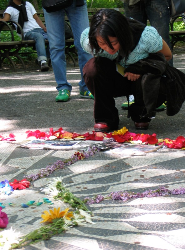 As part of the GEL 2006 conference I ran an architectural tour through NYC, focusing on sacred places. What makes a place sacred? Answering that question was part of the challenge of the day. Half of the stops had some religious affiliation, but the other half were secular (A park, a train station and a square). Since the goal of the tour was to explore these powerful places as designers, I wanted a wide definition for what a sacred place is.
Questions we asked:
- What feelings did the architects want people to have when inside? When entering? When leaving?
- How does the design achieve those effects?
- What is the visual focal point of the space? How is it supported?
- How are rhythm and symmetry used?
- What senses are activated by how the space is designed?
- What are the sacred places in your home? How do you use and honor them?
In my studies of architecture, especially sacred architecture, I realized that churches, shrines, and temples are all designed by people. There are no blueprints, and few descriptions, for them in most bibles or holy texts – so what you see in them is an expression of design imagination and talent, as much as anything else. I’m confident that most people can appreciate these buildings and designs in a non-religious way, if they choose to.
Where we went
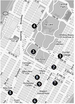 We only had half a day, and NYC has several hundred sacred places. Here’s the list of stops we made:
1. St Vincent Ferrer
2. Christ Church
3. Central Park
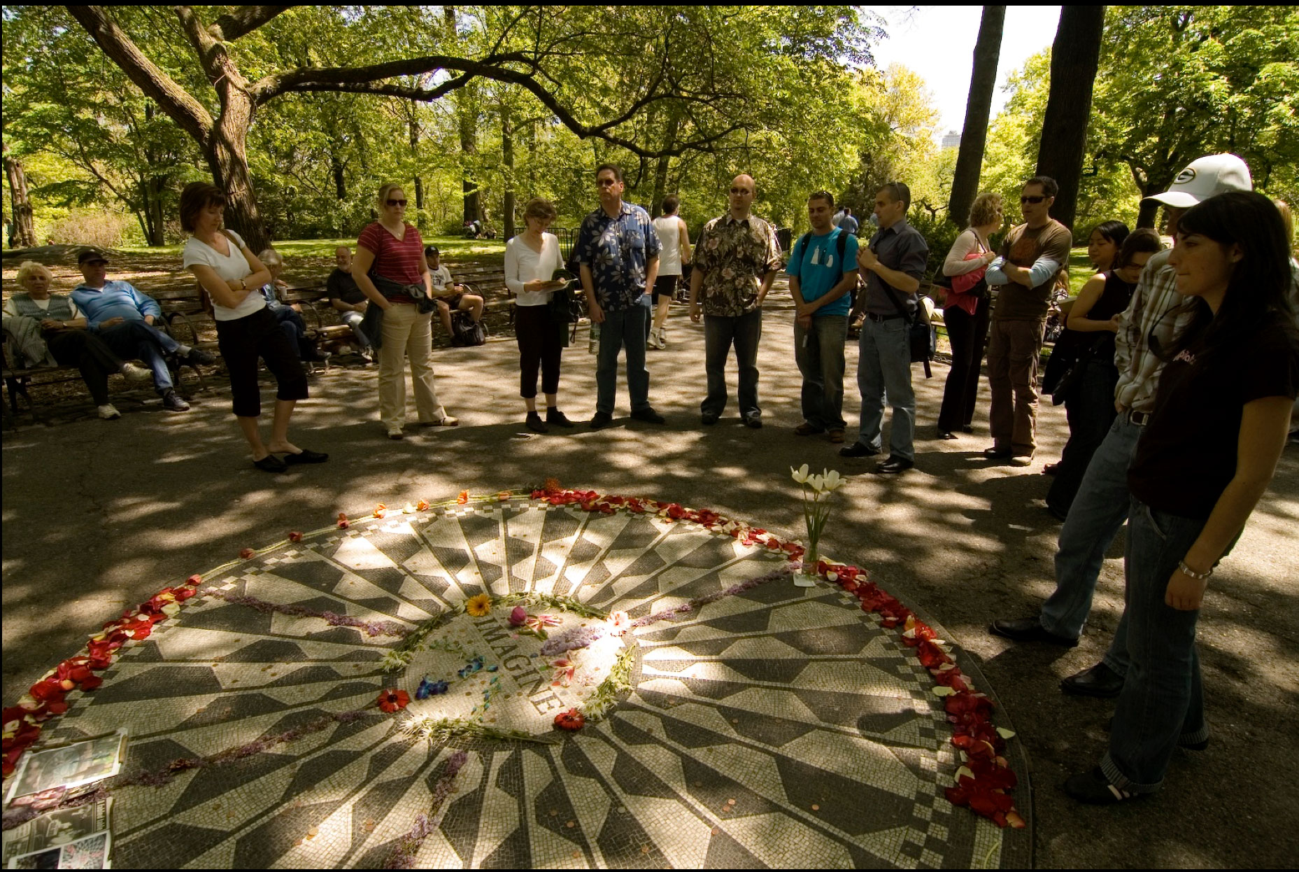
4. Strawberry Fields
5. Times Square
6. Grand Central Station
7. Central Synagogue
8. St. Thomas Church
9. St Patrick’s Cathedral
We also took time for a few impromtu stops at interesting buildings on Park Avenue, W44th and elsewhere. There are so many interesting buildings and I wanted to make some side stops along the way based on what the people in the group seemed interested in.
Sacred brochures and paying attention
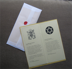 To help set the mood and get people’s attention, I worked with designer Jill Stutzman to design a brochure for the tour. We made something simple, functional, but that presented itself as a sacred thing. We wrapped it in vellum, and sealed it with wax: two things that signify a gift or something personal that should be handled carefully.
But we didn’t want to go too far: after all this handout was supposed to support them on the tour, and it should feel ok to put it in a back pocket (note the 3.5″ width) or write some notes on the inside. One trap all designers can fall into is making things too pretty, which can kill the comfort level people have with actually using the thing for its intended purpose.
What we did
 I confess I hate guided tours. They treat you like children, lecture you to death, and bury the pleasure of discovery and learning under the weight of itinerary. I think anti-tour tours are the best possible experience. And since this was a group of designers, people who know how to look at things, I planned to provide some context, teach a few architectural concepts, but mostly get out of their way and maximize people’s time exploring on their own.
The brochure gave background info on each place for those than wanted it, and I pointed cool things to look for and brief explanations of architectural theory (positive/negative space, form, flow, etc.) to round the experience out.
Tour design challenges
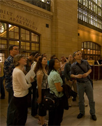 I found the challenge of tour design echoed the common issues designers face: tradeoffs, compromises, logistics. The challenges of moving 16 people around NYC forced me to concentrate the locations we picked.
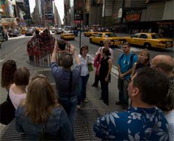
I had to dry-run each location and make sure they were open (churches have services, receptions, etc.) and, in the case of secular places, had spots suitable for a large group to stop and talk together (see photo).
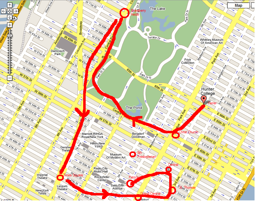
If you look at the map above we hovered around midtown. I had wanted to hit more contrasts, and visit a Mosque (The Islamic center at Lex/96th is awesome), a Synagogue, and a Buddhist temple, but the most interesting buildings were too far apart to fit a half day.
Then there was the question of lunch: turns out there is a pizza place built out of an old church near the Village, but that would have meant another cab or subway trip, costing us valuable time. Instead we chose the relatively ordinary City Pie on 72nd.
I found it much more fun to talk and look at design you can step inside – it’s a more powerful way to explore design concepts than the flat 2d screens software and website provide.
If things work out for GEL ’07 and I do the tour again, I’m sure I’ll try another combination of places. Like all designed things there’s always another, hopefully better way, to make things work.
(Thanks to Kevin Fox and Kareem Mayan for the photos above)
Added 6/10/13: I found this route map, showing the order we used.

Sounds like a great conference! The questions on the architecture and design of sacred spaces were insightful and thought-provoking. Would love to attend a GEL conference if it ever comes to California!
Hopefully the 07 gel will go through. I’ve always ben intrigued by architecture and learn alot of new thing just from the post. this blog is great!!!
I have just returned from a spiritual pilgrimage and have had some experiences that have made me want learn more about sacred architecture, places, and objects. Where should I begin?.. I would also like to do some exploring around in the city.
I love the idea of this tour! I will definitely check out some of these spaces next time I am in NYC.
After reading the description, I remembered a book I read called “The Architecture of Happiness” by Alain Botton. The author seems to ask some similar questions about other spaces – some we are familiar with it and some are totally obscure. It is amazing how different buildings can make you feel when you encounter them.