WordPress 2.5: Review
Last week I upgraded to the latest version of WordPress. I’m a huge WordPress fan, I love what these guys do, and I was psyched to see what they’d done this time around.
Total time: 9 minutes. This was end to end, from downloading their software, to reading instructions, to the moment I was able to make my first post. And this included an extra 2 minutes where FileZilla imploded and I had to start over.
Summary: Thumbs up. Go get it. Most of the changes are for the positive, the UI is cleaner, my top gripes (text-editor and thumbnails) have been fixed, and there are some new minor features. Top complaints are UI fit and finish, there are some gotchas that should have been caught.
Kudos:
- Text editor is much improved: less buggy, fewer perf issues, and better media support. People spend 80% of their time in WP here so happy to see investments to core use here.
- Site wide search instead of just blog posts – obvious win.
- The UI visuals shows some style love – in many places, like the comments view, the style choices make it easier to scan long lists. Other nice touches include a flag next to the comments tab when there are new unmoderated comments.
- Many under the hood improvements that I don’t fully understand or expect to use but feel good about anyway.
- Automatic plugin updates. Nice, though this broke for a few plugins I had. Expect the kinks will be fixed by plugin authors from here on out.
- The install is just a few steps and takes minutes with no special skills required.
Complaints:
- Leap of faith upgrade. Doing hand copying of files is very 1980s. I read the instructions ten times to make sure I had it right, and even then I had the willies while waiting for both the files to be copied, and to see the new dashboard working. The intermediary UI didn’t calm my fears at all. Say what you will about Windows or Mac software, but great relief comes from pushing an “install” button, and watching one little progress bar while the software does all the work. Instead in WP there’s a useless page offering no clue how long it will take, and given my hand-copying of files, no way of knowing if I’d screwed something up. To be fair it did take about 20 seconds, but they were the most stressful I’d had all day.
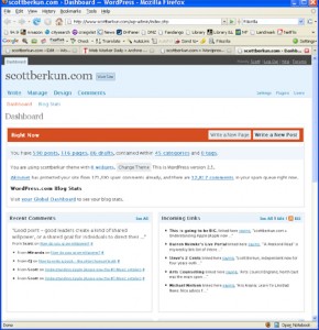
- Admin redesign. This felt not quite finished. It’s definitely improved but has 1 step back for every three forward. It’s a space heavy design, with several levels of hierarchy floating in dreamy soft blues and whites. If it’s really a dashboard it should be more software app like than a webpage, but it feels more like the later. The core problem is 4 levels of UI, with varying left right dominance, creates a visual ping pong (left, right, left). Plus there are mismatches of prioritization: The Write a new post button, the most used button on the page, is off the right, while the text “Right now” gets prime real estate on the left.
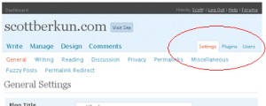
- Tab confusion. The UI rules for tab are simple, peers share the same tabs so people know what is on the same level as what. But there are three orphaned tabs all the way on the right that turn out to be peers to the stuff on the left. No idea why they’d do this. Similar problems on the top with a dashboard tab all the way left, and three orphans on the right (Help/Logout/Forums)
- Settings confusion. Much of the UI in wordpress is config related, but is there really a need for three different hierarchies for Manage, Settings, and Plugins? Some of the UI in each can be compressed (e.g. Privacy has one option and doesn’t deserve it’s own page). Even after a week of use I find it hard to remember which top level category to go to for what.
- My everyday tasks are still hard to optimize . This is my top gripe. I’m a very basic, vanilla user. I post 2 or 3 times a week, text and link heavy, with images and thumbnails in most posts. That’s it. No media streaming, no dashboard customization, no multi-users or anything whiz bang at all. Yet I still find it clunky to add images, check links, preview and review, and worse, despite having done it 5000 times there’s no efficiency path. No shortcut keys or tricks to make my routine faster.
Nitpicks:
- The Comments listing should default to showing unmoderated comments. That’s the primary view people with moderation on need to see when going to the comments page.
- On the home dashboard page, first page people see, the word dashboard appears 3 times, all on the leftmost column. The second one is highlighted to indicate it’s active, so the third one isn’t necessary. If people don’t notice the red highlight means it’s active then change the highlight, don’t add another instance of the word.
- Moving the category field to the bottom of the post page is a huge pain. Most people use categories so they hit this set of checkboxes for every post. The current layout forces two scrolls: one to get down there, and a second to scroll the list of categories. This UI should be in the critical path of the UI design for the post page.
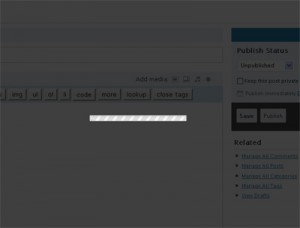
- The add media UI is overkill. First, clicking on that tiny little image button takes over the whole screen. Blam – I thought I’d broken something. It’s a jarring, horrible transition. Going modal is ok, but don’t hit me over the head. There are other issues with the flow in this UI: not sure what use cases it is designed for, but everything seems to require lots of steps (And what does Crunching mean? Downloading seems more accurate).
Even with my complaints, I strongly recommend WordPress. If you want to give it a spin, you can use their free, hosted, blogging service at wordpress.org. If you’re thinking of upgrading or switching check out this handy guide: How to update wordpress with minimal downtime.


Thanks for your detailed report here. But one thing concerned / intrigued me… “hand copying of files” during the upgrade process.
I’m planning to use Fantastico (it comes with my CPanel hosting) to handle the upgrade with one click. Any reason you dont use it?
Gary Harvey
http://FindHotMarkets.com
At some point way back when I hand installed an upgrade, which usually breaks the one-click feature on most hosts. I’d use it if I could :)
Hi, I really liked your post so I submitted it to yearblook.com. Yearblook is a competition to find the best blog posts, and they print the winners in a book. Good luck!
There’s about zero documentation on any of the new stuff, if you want to design your won themes. Matt and the gang really need to build working documentation for wordpress.