If you’re working this week, you’re smart (Vacation strategy part 2)

With one of the biggest U.S. holidays, Thanksgiving, on Thursday, many people will be traveling to visit with families. If you’re working today, and most of this week, you’re smart – as I’ve talked about before, the best vacation strategy is to work when everyone is away, and spend your vacation days on days you’ll be escaping from actual work.

I don’t even work in an office, yet I’ve already had two out of office messages from people I work with at various companies – they’re already on vacation.

Of course often you don’t get to choose when to spend vacation days – if the family tradition is to meet back in your hometown at your folks place on the day before Thanksgiving, well, you’re stuck.

But if you have a choice, stay in the office on those extra days when everyone is away. You’ll be more productive than you will on a typical day, and you’ll save that vacation day for a time you really need a break.

Especially in the U.S. where we get some of the fewest number of vacation days in the western world (Europe averages about 40 days, U.S. 13 days).

What’s so special about a team of rivals?

Found this nice op-ed piece this morning called What’s so special about a team of rivals, By James Oakes. It’s the perfect antidote to the sloppy thinking circling the now cliched phrase ‘team of rivals’.

Another nice observation I heard on NPR last night was that every cabinet choice leaves the half dozen candidates you didn’t pick miffed with you. And if you pick the rival, there is some powerful candidate within your party or staff who will never view you in the same way again. All choices have opportunity cost and there’s no perfect way to select something as complex as a cabinet.

I confess I haven’t read Goodwin’s book, Team of Rivals. And I do buy the nugget of the theory that selecting people who have diverse opinions, even in some cases opposing ones, can be a useful force if the energy of those tensions can be converted into the positive: better decisions or better policies. But to do that means picking very special kinds of rivals. Rivals with whom intelligent discourse and deep trust are possible, which is very hard to find.

Wednesday linkfest

Wednesday linkfest

Do we suck at the basics?

The longer I’m alive the more often I realize the cause of problems is someone’s failure to get the basics of their job right. We all love to believe our problems are advanced: it’s rare that any of us admit, or even consider, that the reason for something going wrong could be something basic we overlooked.

For starters, it takes confidence for anyone to take responsibility and even say something like, “This project did not go well and it’s my fault.” It’s far more common to point fingers, use passive language like “the project went badly” or hide in false complexity such as “our innovation infrastructure needed to be redistributed to support the unexpected variable dynamics.” Even if, all the while, the simplest and best answer is “this went poorly because I overlooked <fundamental thing/concept/question>.”

We habitually hide the core problem under layers of noise and complexity because it makes us feel safer, and feel more competent than if we openly looked for, much less confessed to, the simple truth. It can also be less awkward for others too as there can be safety in emotional ambiguity. To cut to the core requires everyone to be able and honest. Yet we know many professions where there is nowhere to hide. The best baseball players hit the ball safely only 30% of their attempts and strike out hundreds of times a year. Yet they don’t explain it away or invent jargon for it in the way people in the professional world do for failures of a simple nature (although some do complain to the referees far too often).

Perhaps worse is how once we have been doing something for 5 or 10 years, we convince ourselves we must be experts. And to admit we got a basic wrong hurts our egos and, we fear, our reputations.  Yet in reality to call something what it is would likely enhance someone’s reputation more than hurt it, but many are not brave enough to find out. A true expert is valuable not only when they get it right, but in their speed, accuracy and remediation when they get it wrong.

Example #1: What percentage of people in every profession do you think are bad at what they do? 10%? 20%? 50%? There has to be a number. What do you think it is? I say, based on exactly zero data and pure conjecture, it must be at least 25%. People whose peers would never hire them to do what they are currently paid to do. To be fair they may be poorly treated or underpaid, but even if we limit this rant to the well treated and paid a sizable number remain.

Example #2: I’d guess half of all professional managers have not earned the trust of their team. Now if you don’t have the trust of your team, no budget, no brilliant plan, no clever organizational model, is going to save you. Your team will always under perform if they do no trust their leader. End of story.

So regarding the working world: want to fix 50% of the projects out there? Forget the advanced theories and complex explanations. Convince these managers to find the integrity to trust their own people, and then in reciprocation, the team will grow to trust the manager. And have leaders model the behavior of taking responsibility for basic things that go wrong without obscuring them away.

I seem to be in the minority, but perhaps many challenges managers believe are intractable, impenetrable, situations so complex they believe a PhD in 10 disciplines is required just to understand it, can be framed as one or two fundamental problems currently ignored that if called out could be solved and transform the situation.

What do you think? Do we need a reality check at the basics of our crafts? Or am I just being cranky?

[light edits: 4-1-2021]

What I learned in Trinidad

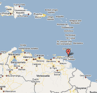
Last week I was in Trinidad, just off the coast of South America. I was speaking at the BDC’s Innovation to Income conference and took a few extra days for fun.

It’s an interesting place – since most tourists head over to the quiet, beautiful neighboring island of Tobago, Trinidad itself isn’t an easy place to be a tourist. The capital city of Port of Spain is tough, crime is a problem, and there are few true tourist attractions, nor info centers or tourist desks that I could find. But that made it real travel – I had a most interesting time walking around the core downtown area (Indi Square). It was the first time in awhile I went somewhere impossible not to stand out as a foreigner (80+% of the population is of African or Indian decent, and I’m of neither), which was a thrill.

Here’s what I learned:

  • A continent can look like an island if you are an idiot. From my hotel pool I asked one of the staff “what is that island in the distance” and was told “That? That’s south America”.
  • The Hyatt Regency is a fantastic hotel with one the best pool I’ve ever seen. It’s outdoors on the 4th floor and is lined up so the pool horizon matches the actual horizon. Fantastic.
  • Local lingo: Limin’ = to hang out. BamBam = your rear end. Boof = to insult or yell at someone.
  • Fried shark is a delicacy. Up at the beautiful Maracas beach I tried what’s called Bake ‘n Shark, which is fried shark on a sandwich with various toppings like garlic sauce (yum).
  • You can buy aged Rum – and it’s quite good. I had no idea Rum could be a premium alcohol (like Scotch), with 8, 10 and 15 year aged versions of premium brands.
  • A roti is not just bread, as i assumed from having had it at Malay Satay in Seattle. Here the roti is the container for various stuffings. Roti shops are basically like us sandwich shops.
  • KFC is extremely popular here. Vaguely like McDonald’s was in Moscow. Long lines.
  • Obama has made the US popular again, at least here. Walking on the street at Independence square, total strangers asked me if I was American, and if I said yes, they’d happily yell Obama! and shake my hand

.

Innovation in sports: Chessboxing

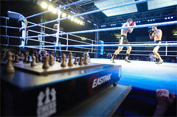
Chessboxing

One breakthrough moment as a kid was the first time I played a pinball machine that, when you hit the right bumpers, would release a second ball. This little change transformed pinball forever, as the level of panic required to managed two or more balls at once created an entirely different experience of game play.

A bigger breakthrough occurred when watching the biathlon in the 1984 Olympics. What on the surface seemed to be a boring combination of two boring sports (skiing and precision rifling), was a suprisingly interesting event to watch – a fascinating combination of two very different skill sets. It’s still one of my favorite sports. It made me realize you can make interesting things by combining two boring, but creatively unrelated things, and putting them together.

So when I first heard about Chessboxing, I was thrilled. The name itself expresses everything. Like the biathlon, it takes two unrelated skills at opposite ends of the physical/intellectual spectrum, and throws them in together.

Here’s how it works:

  • Competitors play a 4 minute round of chess, alternating with a two minute round of boxing
  • You win by knockout or checkmate
  • The chess is speed-chess, which means you have a total of 12 minutes of time to make your chess moves. If you run out, you lose.

I’ve never seen a chessboxing match – there don’t seem to be to many of them yet, but I’d watch.

I’ve also come across SlamBall, which combines basketball with, well, trampolines. It’s basically a version of basketball focused on trying to be like a video game, as the trampolines that make up the court allow for amazing dunks, blocks and lots of high impact mid-air collisions (Youtube highlight reel here)

So what new sports have you seen? Or always wished existed? It can be hard to think of it, but there was a day when soccer, baseball, and football were only ideas in someone’s mind.

(Photo credit: wikipedia)

CMU study on privacy – opinions wanted

A group of super smart researchers at Carnegie Mellon University (who I happen to be friends with) are conducting a web-based survey about online privacy concerns. They did it last year and your input was super helpful. They told me so. Twice.

Not only will doing this make you feel good and support efforts to protect privacy, you also get a nice shot at several $75 gift certificates for amazon.com.

To participate in this survey, go to: http://cups.cs.cmu.edu/survey-0807/

Will 2008 election ballots be usable? An expert interview

At UI13 I had the chance to chat with Dana Chisnell of usabilityworks.net, who has been working on ballot design and usability for the last few years. She agreed to answer some questions about what’s happened since 2000 and 2004, and what we should expect from ballot designs this week.

SB. What is the state of the art in ballot design? Which states have done the best job of learning from Florida? Which states have done the worst?

DC: The state of the art in ballot design is in a beautiful document published by the US Election Assistance Commission called Effective Designs for the Administration of Federal Elections (PDF). It includes detailed design specifications for printed ballots of various types, all based on user research and usability testing. It’s available for free here:

The objection that states and counties have to the designs in the EAC report is that they pay no attention to cost. For example, the report recommends using 2 colors (usually black and blue), but adding color is expensive. Also, making the type larger or opening up the layout of printed ballots often means making the ballot cards longer, flowing over onto the back side of a ballot card, or printing more cards. The printing is expensive, and with more voting by mail, the postage costs go up.

Several states have implemented as many of the best practices as is practical. Oregon — where all voting is by mail — was on the forefront. But other states such as Nebraska have embraced the guidelines. Florida’s Governor Charlie Crist took as one of his first acts after he was elected to warehouse all of the electronic voting machines and forced all the counties to go to printed ballots after the November 2006 election. One of the drivers to that change was a huge undervote in congressional district 13 (Sarasota and Charlotte counties) in 2006. Typically, between 1 and 5 percent of voters don’t vote on any particular race in any given election. But in that election, somewhere between 11 and 15 percent of voters did not vote for a representative to Congress. There weren’t any security issues. The programming was fine. It all comes down to a ballot design problem.

There are still serious problems with ballot design, though. Ohio’s secretary of state sent out a ballot template that included one best practice — putting the instructions in the top left of the ballot card — but then split the presidential race across two columns. We know from previous elections that people either don’t vote for candidates in the space under the instructions, or they overvote by voting for someone in the first column and in the second column, which would mean than neither counts.

A few places have started conducting usability tests of ballots before they’re printed or loaded into voting systems: Sarasota and Duvall counties in Florida; Los Angeles County; Marin County, California; Clark County (Las Vegas), Nevada; and the state of New Hampshire. I take this as a sign that there is hope for the world.

SB. Typically whose job is it to actually design local and state election ballots? Is there any training required to do this job?

It’s different in different places. In many states, the secretary of state issues a ballot template. But it always comes down to local election officials at the county level to implement the design. Often the local election official outsources the actual layout to a vendor or to the manufacturer of their voting systems because the layout software is wicked hard to use.

There are lots of layers of training. The first is to know intimately the election statutes for the county and the state. It seems whacky, but in most places things like type size, capitalization, and the language of instructions are all defined in a law. The number of languages that ballots must be available in is also legislated.

Next, you have to know the constraints of the voting system you’re using. For example, if your county uses an optical scan system — the type where the voter fills in bubbles or connects the ends of arrows — the choices on the ballot must line up with tick marks or registration marks on the edges of the cards, which definitely constrains leading or line height.

Finally, there are dozens of different types of districts in every county. Where you live in Washington State, there are hundreds of combinations of local districts: school, water, cemetery, conservation — the list goes on. So there can be hundreds of variations of ballots within a state or county (if it’s big enough). A given county could issue one ballot for all or as many as 300 variations on a basic ballot because of the different district combinations.

But to answer your original question, there’s usually one person in the county who is responsible for the design of the ballot. And then a few other people do reviews. Usability testing is a really new, new thing in the world of elections.

SB. How difficult has it been to get legislators and politicians to understand the value of design and usability? What tactics have worked best? Has this been different in your experience than working with business executives?

Some of the problems are the same in the public and private sectors. How do I fit this into my already-tight election cycle? How do I get design and usability for free (or for cheap)? What if there are hideous things that I don’t have time to fix?

In the end, it comes down to two things: a) the possibility of getting bad press; and b) how much will it cost if something goes wrong and we have to do recounts (which usually also involve multiple law suits).

As a reaction to the “butterfly” ballots used in the 2000 general election, Congress passed the Help America Vote Act (HAVA), which mandated replacing old voting systems. Most of the new systems were electronic voting systems with touchscreens. Local elections officials loved this idea. It was thought that computers would be safe and reliable. Soon the discussion was hijacked by security concerns. The original problem — ballot design — is still being addressed and solved.

It’s as if legislators have had to learn the hard way. We’ve just been running one gigantic live usability test over the last eight years. As problems are more closely identified and eliminated, the more nuanced things come to the fore.

It all matters these days because elections are so close. When the margins were wider, there was much more room for error in design. Now, not so much.

SB. What is your opinion of electronic voting? Does it solve any of the important problems we have?

Advocates for people with disabilities like electronic voting very much. And there are a lot of good things about electronic voting for people with disabilities. It is *amazing* to hear stories from people who have never been able to vote independently before talk about marking and casting their own ballots.

BUT from a design point of view, I think that some of the problems are multiplied. For example, not only do you have to consider type face and size, color, line length and height in the visual design, but now you also have to deal with navigation and interaction issues that just don’t exist on the paper versions, as well as error messages and instructions for using the user interface. For example, on most electronic voting machines, to change a selection a voter must deselect the choice already made before she can make a new selection. There are good reasons for doing it this way, but it isn’t conventional (no ATM or ticket kiosk works that way) and there are no instructions on the screen.

SB. Have you examined how other counties design their ballots? Where does the U.S. rank in terms of ballot usability?

The US has some very special problems. In other countries, the whole country votes on the same ballot. Unless there is a referendum, there are rarely questions or propositions on the ballots. So it’s easy to be consistent from location to location.

But other countries have to deal with things we don’t normally think about in the US, such as low literacy. In India, Africa, and South America, ballots have pictures of the candidates on them or symbols for the parties or both. In those places, they also have to be concerned with bandits or terrorists forcing people in far off, rural precincts to vote the way the bandits want them to vote. So there are panic features of the voting systems that allow them to be shut down and secured easily.

SB: What can designers and usability experts do to help support improving ballots in the future?

Sign up to be poll workers. It is estimated that 2 million poll workers will be needed for the election on November 4. There’s nothing like observing real people use a design in real time. Take note of the types of questions voters ask.

Sign up to be a temporary worker counting ballots or doing canvasses after the election. If the jurisdiction used paper ballots, you’ll be able to see post hoc how voters marked them (the variety is amazing).

Learn everything you can about ballot design issues. I’ve included one link to the Effective Designs report above. The Usability Professionals’ Association also sponsors a Usability in Civic Life project that works on ballot usability and accessibility issues and maintains a blog about issues and findings. There are also some interesting reports from research conducted by the National Institutes of Standards and Technology at vote.nist.gov, not to mention hundreds of blogs about voting, election administration, voting system security, and so on.

Visit your local election department (but wait until December or after). Ask for a tour. Interview the election director. Volunteer your time to do small things, like a day of asking people who show up at town hall for other things to vote a ballot that is in the design process while you observe them. Show people voting instructions and ask them to circle or highlight anything that isn’t clear or that they have questions about. That sort of thing.

SB. For fun: in all the usability studies you’ve run regarding voting, what’s the most tragic failure you’ve seen by an ordinary citizen in a voting booth?

Voting a completely empty ballot on an electronic machine because the touches on the screen did not register. When we asked the participant how confident she was that she voted as she intended, she said she was very confident. When we asked her if she had noticed that the things she touched on the screen did not change color (as the instructions said they would, as she had read aloud to us), she said, “That’s the way computers work.”

Book Review: The New Kings of Nonfiction

I’m a big fan of essay collections and when I came across this one, cover of kings of nonfictionThe New kings of Nonfiction, edited by Ira Glass of This American Life fame I had high expectations.

The book is good. Three of Five stars. If you’ve never gone out of your way to pick up a book filled with non-fiction essays, this is a decent place to start. I’m a bigger fan of the Best American Essays series, which has never failed me. I enjoy being able to abandon authors or essays I don’t like, and try another in the next chapter. It’s like a writing sample pack: great way to discover new voices and different kinds of writing.

In Glass’s compilation you have Michael Lewis (Moneyball, Liar’s Poker) reporting on a teenage day trader arrested by the SEC, A Malcolm Gladwell essay that appears in The tipping point, and other essays by Dan Savage, Michael Pollan and more.

But by far my two favorite essays were from two writers I’d never heard of before. Losing The War (full essay online), by Lee Sandlin and Toxic Dreams: A California Town Finds Meaning In An Acid Pit, by Jack Hitt. The $10 you’ll pay for this book is worth it for these two superior pieces of funny, clever, tightly written, truly thought provoking works. “Losing the War” explores a truer history of heroes and WWII than most of us know, while “Toxic Dreams” is the story of one of the first toxic waste dumps, and how the imact on the town nearby slowly unraveled over more than a decade.

Have a novel in you? Prove it (National novel writing month)

In about a week, hundreds of folks will start working on a new novel, writing about 1500 words a day as part of National Novel Writing Month (aka NanoWriMo). It’s a great way to kick yourself into gear, and use the collective morale energy of other amateur and pro writers to psych yourself into overcoming writers block, get in there and just write.

The FAQ will answer all your questions. Sign up is free – there are forums for support, you can track your friends daily writing progress and more.

I’ve met Chris Baty, the founder of NanoWriMo, and the whole thing they’re doing here is fantastic.

If you truly want to stop talking about writing and do it, here’s the best chance you’ll have this year.

See also: How to write a book – the short honest truth

Luddite news: My new cell phone is…

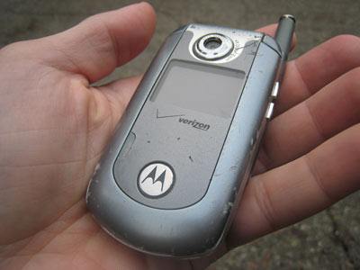
I’ve owned one cell phone in my life – This Motorola something or other. I bought it in 2003 when I quit my job. Back then, I bought it mostly because my wife got the same one – she’s smart, and on average copying what she does works out well.


Motorola phone

When the recharge jack died and the phone overheated after a long plane trip, it was time to shop. I knew I needed the following things in a new phone:

  1. Dead simple ease of use for my 75% usage: calling and talking to people.
  2. High durability. I never want to worry about dropping something I carry in pocket. Look at the scars on the above photo: that’s the mark of a well used, well built piece of technology.
  3. Any fancy features never get in my way.

I spent 4 months looking at phones in person and developed the following simple test, knowing it represented 90% of what I’d use one of these things for:

  1. Make a phone call
  2. Send a text message
  3. Add a contact
  4. Type in a url, view it and add it as a bookmark
  5. Look up the map for an address
  6. Add an appointment
  7. Sync to my desktop PC

If any of the above took more than 30 seconds to figure out, or seemed like it would take 30 seconds to figure out every time, I gave the phone a failing grade. I looked at dozens of phones and 95% of them failed this simple test for me.

The only phone that passed, was the one I bought last month – The Palm Centro:


Motorola phone

I’ve had the phone nearly a month and I’ve been very happy. It’s slightly bigger than the Motorola, but still fits easily in my jeans pocket. The phone doesn’t have some of the latest super cool features and whatnot, but I really do not care – for what I actually do, its been great. Simple, simple, simple, with many thoughtful UI design elements. Hopefully the phone will last me, like the last one, another five years. While it lacks GPS, there’s a google maps update that gives you 300 yard accuracy by pinging cell phone towers, good enough for every situation I’ve been in so far.

Many friends point me to the Blackberry, but even the latest models were larger than the Centro, much harder to use, and their UI was downright ugly. The Palm UI, from fonts to layouts, has a superior level of care. As much as I wanted to like the Blackberry, by my standard above it wasn’t close.

I did look at the Apple i-phone, and while it looks great and has some excellent design aspects, it totally failed #2 above. I’d scratch that screen in a day, and drop the phone in a week, and after killing two apple nano i-pods (call me the screen destroyer), I wasn’t convinced it would survive my travels. I also had problems with the touchscreen keyboard: I just don’t like typing on touch screens (YMMV). It seemed designed well, but Centro’s keyboard, despite all my instincts against mini-keyboards, worked super well even with my extra-large hands.

(See my follow review months later)

Wednesday linkfest

Late bloomers vs. Young geniuses (Critiquing Gladwell, Part 2)

Gladwell’s article, titled Late bloomers: Why do we equate genius with precocity?, makes one major mistake in not addressing the questions researchers have about the notion of genius. Entire books have been written with the premise that there really is no such thing as a genius in the sense most people use it, and that the distinctions of ‘prodigy’ and ‘genius’ are so abused and misunderstood as to be useless.

This essay uses the idea of ‘the young genius’ as a point of leverage for late bloomers, suggesting that you are either one or the other (this is the core thesis of economics professor David Galenson’s book, Old Masters and Young Geniuses, whom Gladwell quotes in the article). Dualism of this kind is dangerous and nearly always misleading. It brings to mind that old joke: there are two kinds of people in the world, those that think there are two kinds of people in the world, and those that don’t.

The more I’ve studied creative thinking the more convinced I am these sweeping categorizations are 1) supported by selective research 2) not the best tools for those who want to follow creative paths themselves.

Gladwell wrote:

Picasso was the incandescent prodigy. His career as a serious artist began with a masterpiece, Evocation: The Burial of Casagemas produced at age twenty. In short order, he painted many of the greatest works of his career, including Les Demoiselles at the age of twenty-six. Picasso fit our usual ideas about genius perfectly.

But what are those ideas? He doesn’t say. I think most people imagine young Pablo, if he were a genius, learning to paint largely on his own. I think it’d be a surprise to learn his father was a painter, and taught Picasso to draw and paint from a very young age, sent him to an excellent art school as a youth, and encouraged his trips to Paris, where he quickly made an amazing assortment of connections in the art scene before he was 25. Similar family and community support can be found in the story of Mozart (his father was also a musician who trained him early). Who your parents were is hugely significant in the history of prodigies and geniuses.

Another fact that doesn’t usually fit our idea of genius: at the time Picasso painted Evocation, he was basically starving in Paris, in a situation similar to Van Gogh’s a few decades earlier, faced with the choice on many mornings of buying food or buying paint. Picasso had been working seriously, by most definitions, for years before Evocation was finished. We don’t think of people with prodigious, gifted talents starving and struggling, but there he was. Another counterpoint is that Picasso had a ridiculously vibrant painting career that spanned decades – one of his greatest works, Guernica, was made at the age of 56. The passage from Gladwell hints that his 20s were his best work, but that’s not true. It was an intense time of productivity, but not the only productive time in his life.

Gladwell continues:

Prodigies like Picasso, Galenson argues, rarely engage in that kind of open-ended exploration. They tend to be “conceptual,” Galenson says, in the sense that they start with a clear idea of where they want to go, and then they execute it. “I can hardly understand the importance given to the word ‘research,’ ” Picasso once said in an interview with the artist Marius de Zayas. “In my opinion, to search means nothing in painting. To find is the thing.” He continued, “The several manners I have used in my art must not be considered as an evolution or as steps toward an unknown ideal of painting. . . . I have never made trials or experiments.”

This is an outright contradiction of Picasso’s performance in the documentary The Mystery of Picasso, where he spends 70 minutes revealing his creative process as a series of experiments, risks and gambles. Over the course of an amazing hour we see him take risks, make mistakes, and continually reinvent and change individual paintings. It’s a rare and amazing thing for any artist to expose themselves in this way, much less the difficult and reclusive Picasso, but he seems, on camera to take deep pride in his creative experimentation.

Nothing can stop Picasso from having contradicted himself, but if he did, both ends of the contradiction have value in this discussion.

More to my point, there is a huge inventory of creators who have been called geniuses who mention experimentation as a critical to their creative process. They include Frank Lloyd Wright, Hemingway, David Byrne, Miles Davis, Paul Simon, and on it goes.

Finally, Gladwell offers:

This is the final lesson of the late bloomer: his or her success is highly contingent on the efforts of others. In biographies of Cézanne, Louis-Auguste invariably comes across as a kind of grumpy philistine, who didn’t appreciate his son’s genius. But Louis-Auguste didn’t have to support Cézanne all those years. He would have been within his rights to make his son get a real job, just as Sharie might well have said no to her husband’s repeated trips to the chaos of Haiti.

But what is not mentioned is the amazing social network that enabled and supported young Picasso to do what he did. Dependence on the effort of others is not a factor exclusive to late bloomers. On his first trip to Paris, he quickly met Max Jacob, who taught him French and French culture – they’d share a room for years. He had many friends in the art scene in those early years, including Andre Breton (founder of surrealism), Gertrude Stein, and Henry Matisse. Not a bad crowd to get advice from for an artist in his 20s. He also befriended artist George Braque, and through collaboration they would develop a little thing called cubism together.

(Hat tip, Ario)

Related:

Quote of the month

This is what politics is to me. Someone tells you all the trees on your street have a disease. One side says give them food and water and everything will be fine. One side says chop them down and burn them so they don’t infect another street. That’s politics. And I’m going, Who says they’re diseased? And how does this sickness manifest itself? And is this outside of a natural cycle? And who said this again? And when were they on this street? But we just have people who shout, “Chop it down and burn it” or “Give it food and water” and there’s your two choices. Sorry, I’m not a believer.

– John Malkovich, Esquire Magazine, Nov 2008

Why Designers Fail: The Report

Why designers succeed and fail in organizations is mostly a matter of opinion as there’s little data to support theories or make claims. To help ground discussions on this subject I ran a research study on why designers fail – exploring the psychological, skill and organizational reasons why designers, and people who work with designers, believe designers don’t achieve the results they desire (PDF of survey questions here).

Update: this research was originally presented at UIE 13,  and also at MX ’08, An Event Apart Seattle ’08 and ’11. The latest version of the slides can be downloaded here, and this is the written sumation.

Top line summary

The survey consisted of 41 issues, divided into three categories: Psychological, Skill and Organization. Each participant ranked each issue on a scale from 1 to 5, with 5 meaning the issue was highly significant in explaining why designers fail, and 1 meaning least significant (3 was identified as a neutral value).

The 389 survey respondents self identified as (rounded up #s):

Designer 34%
Project manager 17%
Programmer / Tester 12%
Usability engineer 10%
Group manager 7%
Business / Marketing 4%
Documentation 1%
Other 17%


The top 16 issues, ranked by average scores were:

People in non-design roles making design decisions 4.18
Managers making design decisions w/o design training 4.14
Designers don’t seek enough data before designing 3.92
No time is provided for long term thinking 3.81
Not receptive to critical feedback 3.69
Lack of awareness of the business fundamentals 3.66
Only lip-service is paid to “User centered design” 3.64
It’s never made safe to fail or experiment 3.62
Designer’s power diluted by too many cooks 3.60
Over-reliance on one kind of design style 3.54
Poor collaboration skills 3.51
Poor persuasion / idea pitching skills 3.49
Poor communication skills 3.49
Poor understanding of domain 3.48
Pressure to use first solution, not a good solution 3.45
Big Ego / Expects others to cater to their whims 3.41

Average scores per grouping

The average scores for groupings showed little different in weightings: there was no single grouping of issues that proved to be significantly more important in explaining why designers fail.

Organizational issues: 3.37
Skill issues: 3.15
Psychological issues: 3.11

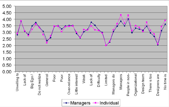
Managers vs. Individual contributors

(Note: these charts are quick and dirty. If you’d like the raw data to generate better ones, just ask).

One research question of the study was to see how individual contributors and managers varied in their thinking on failure. 49% of those surveyed identified as playing a lead or management role.

The results showed extremely high correlation between the opinion of individuals and managers.

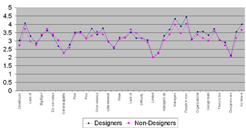
Designers vs. non-designers

Another research question was how designers and non-designers results would compare. The results showed only minor variance in how designers and non-designers view causes of failure.

The results showed extremely high correlation between the opinion of designers and non-designers on why designers fail.

Conclusions

  • Many top reasons for failure are not typically considered design issues, such as collaboration skills, persuasion skills, and receiving critical feedback.
  • General consensus on top issues: managers, non-managers, designers and non-designers all had highly similar scores.
  • Nearly half of all respondents took time to write in additional issues and thoughts. There was a great deal of interest in discussing this topic further.

Background and Disclosures

  • This survey was designed primarily for qualitative use and as a basis for further discussion and research. I’m sure there are flaws and bias in the study design but I believe this study is valuable anyway.
  • The issue list was based on 3 things: my own experiences managing UX design training for Microsoft from 1999-2002, many years of debating this question at drunken design conference receptions, and this discussion on a previous blog post.
  • The issue descriptions listed above were modified to fit in the post – see the actual survey if you’re suspicious of leading questions or other survey bias issues.
  • The survey was distributed via this blog, the iXda mailing list and the pmclinic list.
  • A PDF version (95k) of the actual survey can be downloaded.

You can download the slides from from my talks on this at  UI13 and an An Event Apart Seattle. 

I’m looking for folks to help continue this research. If you’re interested leave a comment.

How to design an office for designers?

One question that came up at my session on Leading breakthrough projects at UIE 13 last week was how to design an office for a team of designers.

I’ve been asking around but haven’t found either a well written description of what a manager decided and why, or some research into how to structure spaces for creative teams.

Joel Spolsky’s writeup on the Bionic office comes close, but it’s written about designing an office for programmers, not creative types in general. This is a great start but I’m looking for more.

If you know of other writeups of office redesigns (including how to design a design studio), or research into how to design a workspace for creatives, please leave a comment. Cheers!