Vote on Mindfire cover: Final Round
Over 400 people voted on the last set of cover designs. Wow. Who thought you’d find this so interesting? The pre-order page is now up, and off to a great start. I appreciate all the support for my first self-published effort.
Since so many of you participated, we’re back, after weeks of work and iterations, with another round of designs for you to look at. This is likely the final round, so choose wisely.
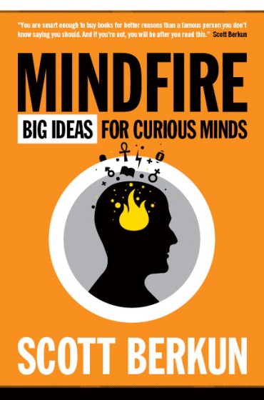
Design A:

Design B:

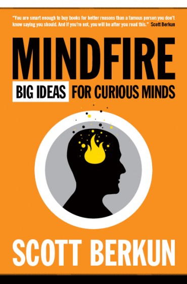
Design C:


I hope A wins!!! I somehow love the ank!
The best cover is the one you have in the thumbnail on the post right before this one!
am i the only one who finds the design quite similar to the Brain Pickings logo?
Since we headed down this direction of having a profile of a head, I’ve noticed how common profiles of human heads are in various logos. Once you’re mind sees one idea, our brains are wired to notice it more often than we would otherwise.
I actually like symbols better than the “effervescent head” (C) that I voted for. But which symbols to use are so important. What symbols will your target audience reach for? What does a skull & lightning bolt mean to people? Will they see the Mars & Venus symbols as “thinking about sex” and think, “yeah, OK I’m doing that already anyway”?
What symbols will say exploration, inspiration, surprise, opportunity, etc?
Sharon: I agree. That’s been the challenge for the direction of having the symbols. We’ve done several different treatments, both with different symbols, and different arrangements and none of them quite felt right. That’s why we’re including the simpler version here as when there’s too much time spent fiddling with a design element, occams razor suggests removing the element completely.
I think symbols generally appear all by themselves – they’re powerful shapes and they’re not well suited for being oriented in space near each other. Most of the time when you see a set of objects around a central object, they’re all the same or similiar things (rays of light, streams of smoke, etc.)
B.
for some reason the 2 symbols on A remind me of either: The Zodiac killer, or that you are a Jesus freak.
B conveys thought, without any symbolic connotation.
B – for the infinity sign there. I see that as infinite questions and ideas coming out of the mind.
I’m a little surprised at the difference (at the moment) in the voting for A and B – is an infinity symbol that much more popular than an ankh cross? Is it because of the different connotations for a mathematical symbol vs a (semi?) religious one?
I think the symbols (generally) are a little more polarising than the “bubbles” – maybe that’s what you want?
I like B
I found the symbols so distracting I voted for C. Perhaps I wouldn’t have cared if I wasn’t comparing the designs, but they just took over the cover for me.
Design B Is Perfect In My Opinion.
What´s the difference?
none of the above — it looks like all these crazy things are going IN the brain, rather than ideas coming OUT of it. also the fire is kind of uninspired. colors and typography look great though.