This week in UX-Clinic: The Frankenstein prototype

This week in the UX-clinic discussion forum: Topic #1 – The frankenstein prototype:

For 3 weeks I’ve been building a design prototype and I’ve earned support from programmers and managers. But now, I’m losing control. The focus of debate has moved from the hallway to the prototype: everyone wants to push the prototype in different directions. We’re adding things that clearly contradict each other and I’m losing control of the (sanity of the) design.

How do I keep the prototype from becoming Frankenstein (an out of control, and very ugly, monster)? I realize I can’t be the prototype dictator, but how can I keep the authority I’ve earned?

– Signed, Avoiding Frankenstein

Pm-clinic: The happy holiday bonus

This week in the pm-clinic discussion forum: Topic #55 – The happy holiday bonus.

Dear pm-clinic,

I’m a team lead at a small software company. My boss, the CEO, told me I have $5k in bonus money to give away this (U.S.) holiday season and that it’s up to me to figure out how to distribute it. I have a team of 5 people. I’ve never given out bonuses before: what are my alternatives? I’d like to do something performance based, but I’m on my to determine what that system is.

– How to give away money

The Song airline experience

Song air

Just returned from NYC on a flight from Song, the ill-fated Delta airlines experiment. Without much explanation Delta recently announced Song would be dismantled and its flights would become Delta air routes.

What follows is an experience designer’s critique of flying with Song.

  • Personality as experience. From the moment I sat in the waiting area for my outbound flight, I noticed a difference. The brand colors were not a combination of blue, red and white (colors used by almost every major airline) but an off-green. The waiting area displays had sarcastic jokes in them. And the overhead announcements were entertaining and made me want to smile at the staff ( a rare feeling for frequent travelers). This was reflected on the plane: the safety announcements were sung, not spoken, and the song changed every day. A personality for the ariline was chosen and manifested it in the design of everything, and in the choice and rewards for all staff (Begging the question: if your software/website was a person, who would it be? Who would you want it to be? How will you get it closer?)
  • Love vs. Annoyance . The risk of having a strong personality (or an experience) is that it’s subjective. In order to make something person A loves, you will always make something person B hates. Most brands chicken out and pick things that A and B accept, but don’t love. Assuming your target market has more of A than B, you’re ok. With Song, at first I thought I was a B. When onboard I was miffed at first by the relentlessly happy, cool vibe present in the onboard staff and all the materials (the safety warnings are done in song, and acted out by the air crew). But over the course of the flight, and the return trip I enjoyed it. I was being served by likeable real people, not robots. It was one of the most enjoyable flights I’ve had.
  • Television is the flight opiate. I’m a reader. I bring 3 books when I fly. The TV screen on the back of the seat in front of me was an immediate annoyance and I turned it off. But when I caught my neighbors screen with the ESPN Classic channel on, my eyes lit up. I spent most of the flight watching classic football games and the discovery channel (one of 20 available). Never has a flight flown by so fast. A movie of my choice was available via credit card swipe for $5. The in-flight menu had above average food at reasonable (for airports) prices.
  • The business confusion over style vs. experience. It’s not clear why Song was pulled: I haven’t found much analysis online other than reports of low ticket sales (but why?). Given the drops in experience quality across all airlines, and how unpleasant air travel can be for many, a service focused alternative (even at a price) seems a business opportunty. I fear that whatever the failures/mistakes were, good experience design will be lumped into the pile, and it will be some time before Delta, or anyone else invests in this way again.
  • Growing brands vs. making them. One guess about why Song is being pulled is their approach to brand. Good brands take time to develop: you can’t always buy your way – you have to earn it. Given the backing of Delta they might have taken on the new brand with the goals of a billion dollar big player in mind, which can lead to marketing distractions (such as a Song store in NYC) over things with direct impact on the bottom line. There was real value in what they offered, but the emhpasis on style and presentation (The Song name, non-traditional colors, general sassyness) over substance (pleasant flights, decent food, high quality service) may have confused potential customers on what Song’s advantages really were.

Song air

References:

Which airline has the best overall experience? Why? (and if anyone finds other critiques or business commentary on Song, please comment).

This week: winning at schedule chicken

This week in the pm-clinic discussion forum: Topic #54 – Winning at schedule chicken.

Dear pm-clinic,

My project team is one of three on a large project. We are currently in a big game of schedule chicken (each team thinks the other team is further behind schedule than they are). The result is escalation: none of the teams are backing down and are protective of their knowingly slipping schedules on the basis that the other projects are slipping worse.

As a leader of my part of the project, how do win this game for my team? Do I just try to get better at playing schedule chicken (how do I do that?) Or should I be looking for ways to defuse the game, and try to get my peers and superiors to replace it with a better game (how do I do that)?

– CSC (Chicken at schedule chicken)

Taking back the web: the next generation

News.com has a special issue on the latest generation gap and how differently the current generation of 7-12 year olds uses the Internet. It’s a bit fluffy and positive, sort of like a Time magazine article, but it does quickly hit key points, with some supporting data and commentary.

A recent study from Pew Internet and American Life found that more than half of all teens online–12 million kids–create original material for the Web, whether it’s through a blog, home page or school Web site, with original artwork, photos or video. A large portion of that active group also will creatively “remix” other material from the Web to create something unique.

Taking back the web ( A news.com special report).

But the articles don’t ask questions about about the risks or downsides of these trends. For example:

  • In the data sited above: what percentage of all kids are online?
  • What about in other countries? Are “the millenials” a U.S. phenomenon? What about Europe and the Far East? ( South Korea is apparently light years ahead)
  • Do other (and better) education systems approach/guide youth Internet usage differently?
  • Does the amount of time spent online (and on their asses) correlate with youth obesity trends in the U.S (30% of 6-11 year olds overweight, 15% (1 in 7!) obese)?
  • The mashup culture is being led by people much older than millenials – why? Which of the trends mentioned are isolated to 6-12 year olds, and which ones cut across age groups (even if only by early-adopters and tech enthusiasts)?

Announcing UX-clinic: a discussion on design

Today marks the one year anniversary of pm-clinic, a friendly discussion group on leading and managing teams. It’s been a great success, growing to over 500 members but keeping a very high signal to noise ratio.

In the same spirit, I’m pleased to launch ux-clinic. Same basic structure and format, but different domain. We’ll be discussing common situations people who work on web, software UI and interaction design face.

All are welcome to join. I expect the list to be mostly usability engineers, web designers, managers, programmers, information architects and interaction designers, or people that play them on TV.

Over the next two weeks we’ll be self-organizing the list and then kick off the first weekly discussion in December.

So if you want to help shape a new community, join up now. Have questions? Comment here.

ArtofPM on slashdot

Earlier today a brief review and chapter excerpt (13: How to make things happen) appeared on slashdot.org.

I’ve been reading a new book from O’Reilly which, despite my intense aversion to books of this type, outshines its class. Scott Berkun, has written The Art of Project Management. While my own review of it is tardy and still forthcoming, he & the fine folks at ORA have sent us an excerpt. Below is Chapter 13 – well worth reading, and getting the book.

Check it out.

Ask Berkun: open for your questions

The forums are back up and running. If you’ve read the artofpm book or any of my essays and have a question you’d like to see answered, fire away. Anything goes: leadership, design, management, web 2.0, the brooklyn bridge, you ask it, I’ll answer it.

Currently there are 45 questions and answers up there already.

If you’re lazy (Scott raises own hand) feel free to ask your question as a comment here.

How to follow web 2.0: programmableweb.com

programmableweb.com

It’s hard to find information on web 2.0 that isn’t highly polarized or self-serving. One great resource, currently my favorite, is programmableweb.com. Unlike other sources John Musser, the industry veteran running the site, reports on what’s happening with a focus on what’s being built rather than what’s being said. His references page is the best one stop shop I know for people playing catchup (or are trapped in acronym hell) and his mashup list will keep you occupied for hours. Highly recommended.

Also of note: The Web 2.0 working group.

This week: the fate of acquired teams

This week in the pm-clinic discussion forum: Topic #53 – The fate of acquired teams.

Dear pm-clinic,

Your assignment, should you choose to accept it, is to assess a new project & team. Your job is to provide input on whether the team should be funded or should be killed, and it’s resources assigned elsewhere. What questions do you ask? What are your metrics? How much time would you need? How would you want to report your results? (As one specific example, imagine a project team that was acquired through acquisition).

– A tired man in an airport

Seattle MindCamp wrapup

Seattle Mindcamp

This weekend was the first seattle mindcamp: a seattle version of the O’Reilly FOO camp and Bar camp. I’ve been to a few of these semi-self organizing events before, and here are my notes:

Highlights:

  • The seattle tech sector lives. There are few open get-togethers in Seattle for tech sector folks, despite the size of the industry here. It was telling how easy it was to get 150 people to sign up for this event, and it’s embarassing that no one had done it before (Kudos to Andru). A few people mentioned idea day, which I haven’t been to yet. Thanks to all the organizers and volunteers.
  • High quality sessions. There wasn’t enough time: I missed good sessions. The mix was good: less tech-centric than the last FOO. I threw myself in the middle of things, and got involved in 3 sessions, but that meant I didn’t go to many others. Ario, Joe and I did one on leading software teams (we met through the event wiki), I did a solo on why smart people defend bad ideas and ran a UI critique session with Mr. Richard Stoakley Thanks to windowssecrets.com , teachtown.com and others for letting us critique their sites in front of a crowd.
  • Show and tell of ideas . Everyone had something to show or talk about, and the informal vibe made it easy to share. I spent a half hour chatting with Andy Edmonds about browser design and software instrumentation. Learned about the Firefox Attention trust effort from him as well. I saw live demos of gada.be, Ruby on Rails, a choose your own adventure DVD and two good sessions on information overload and web annotations by Ario. Given the number of sessions it was easy to bail on anything that bored me.
  • Left with a mental buzz. I heard so many different ideas and passionate people that my head spun for the next 24 hrs. It’s easy to forget how stimulating it is to meet new people who are passionate about what they’re doing.

Lowlights:

  • Wireless didn’t work. I felt bad for the folks who talked for 10 mintues at the start of the day for how they set up the wireless system (and how cool it was). After a few hours of everyone failing to get it to work, those guys were hard to find: it wasn’t their fault, as the building had less bandwith than they were told. It turned out ok: I was glad people had more reasons to close their laptops and talk to each other.
  • Little incentive to stay overnight. The Sunday morning schedule was weak and there was a no alcohol rule: two strikes against staying. The building was huge which also hurt the stay overnight factor. Many folks I met left by 1am (myself included). I came prepared to stay over, but I couldn’t make a good argument for it.
  • Some first time event mistakes . I used to run training events and I’m familiar with how hard it is to get it right. On the whole they did well. My notes: many had never been to a self-organizing event before and had no idea how to prepare or what to expect (Lots of “I would have brought X” or “I could have talked about Y”), the directions were confusing (even at the complex itself: there were no signs outside) , there was no phone number for people who got lost and the website didn’t help people hook up before the event (Something FOO did a good job of with photos of everyone up on the site and at the event itself).
  • Post event value opportunities being missed. There was talk of capturing as many sessions as possible, but I have no way of knowing if that happened. The Seattlemind website and wiki hasn’t been updated since Friday. Everyone’s understandably exhausted come Sunday, but there’s time now to collect slides from all presenters, roll together lists of podcasts, etc. If nothing else it makes it easier for folks to prepare for Seattle Mindcamp 2.0 .

Suggestions to future Foo/Bar/Mind camp organizers:

  • Have a “First time at camp?” FAQ . Make it easy for folks to understand exactly how to prepare and how different it is from regular confererences. Don’t make up the FAQ: ask people who just went to their first one what they were confused about and what they wish they’d known before they’d arrived (Don’t codle them with detals but get them over the hump). I’d write it if someone would use it.
  • Encourage pre-event connections. Name tags are not as good as faces. When people sign up, ask for a URL for a photo and include it. Also, many sessions listed on the wiki didn’t happen: why? not sure. There was plenty of room late Sat and Sun morning. There was just no supported way to tell those people before they event I was interested in their topic. The wiki/website made it hard to dig up e-mail or contact info for other people.
  • Have a single primary pre-event news and update feed. In the days before the event it was hard to find details on updates and changes. There was the seattlemind website blog, personal blogs of organizers, the main wiki page, the session_ideas page, and various other child wiki pages. Instead, make it easy to track news, requests and updates in one place to fuel the self-organizing process. This same primary feed should be the way to get post event news (podcasts, slides, etc.) as well.

The worst software bugs in history (and how to learn from them)

Wired’s article on History’s worst software bugs is a short and darkly entertaining read that makes us feel better about all the comparatively benign defects we’ve all shipped out to the world. We’d never make anything that bad, right? Wrong.

The difference between these stories and 90% of software developers is the context of the work. Few of us work on medical equipment, anti-lock brakes or nuclear weapon arming devices. We don’t work on things with the potential to kill or cost $100 of millions. For most of us, if we employed the same development practices we do on a daily basis on a mission-critical project, we’d make this list in no time. The difference between us and them isn’t skill,  it’s domain.

Another problem with articles like this one is that they offer little to learn from. It’s to easy to laugh at how stupid the mistakes seem and gleefully return to writing code. These lists tend to give us unfounded confidence that it’s our approaches to work that makes us immune from these kinds of mistakes, but that’s not true.

Worse, unlike other kinds of disasters, such as airplane crashes, medical errors, or building collapses, few of these worst bugs in history have publically available analysis of why they happened and how we can avoid similar mistakes.

Learning from the past is not a strong part of the practitioner software development culture, and it’s a shame, since we repeat the same mistakes again and again. Understanding landmark failures is an integral part of most engineering disciplines (See Petroski’s To engineer is human: the role of failure), is not yet part of the software development culture, but it needs to be.

It’d be great for every CS major to study one of these software disasters before they graduate and understand something about how failures really happen before they start building things as professionals. Back at CMU the only course I took on engineering failures was in the humanities school (and it may have been the best course I’ve ever taken).

Here are some resources for learning from the mistakes of others:

  • Risks list. A monthly catalog of reminders of how fragile technology is. People submit stories of potential mistakes and recent failures with emphasis on understanding and avoidance. Cuts across many technologies and businesses.
  • Why software fails. My favorite essay from the above magazine issue: distills lessons out of the previously mentioned case studies.
  • Digital woes. A book of 13 stories of software disasters, written for a layperson audience. It frames each disaster in a social and engineering context and has recommendations for people that are starting new projects. Highly recommended: easy read.
  • Fatal defect. Similiar to Digital woes but different examples. Also well written.
  • Primer on software testing. I’ve come to hate the word “testing” as it implies you fix software after it’s written – but this summary of techniques is a great refresher for anyone that’s writing code. It’s a reminder of how much is known about making quality software that most shops never even think to put into practice.

Anyone have any references I should add? How do you learn from the failures of others? Your own?

This week: the joy of team rivalry

This week in the pm-clinic discussion forum: Topic #52 – The joy of team rivalry.

I’m a team leader on a project chartered with rethinking how rss/blog newsreaders work. It’s a good team (Team A), I love the problem space and things are good. My problem is that there is another team (Team B) that is trying to solve similar problems, but from a different direction. No one has said outright “you are competing with each other” but it’s pretty clear the designs each team has are on mutually exclusive paths.

How do I balance the conflicts of interest? Ho do I treat team B when I talk to them? Is it appropriate not to share all of our plans? What do I tell the members of my team when they encounter people from team B?

– Signed, The joy of rivalry

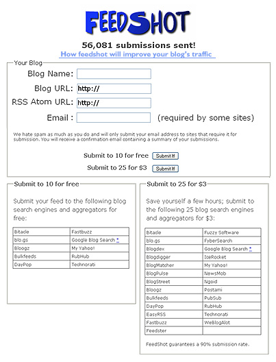
UI critique: feedshot.com

Feedshot.com

Summary: this isn’t a site as much as a dialog box for a service. Two buttons and four fields. Should be a piece of cake. But some layout issues and seperate of control creates a few stumbles. 6 of 10. (Would be a 7 but degree of difficultly here is low).

Core tasks:

  • What is this for? There is a basic question of purpose here: what does this site do and why should I care? there is a link at the top that says “how is this different from pingomatic” but what if I don’t know what pingomatic is? The blog at the other end of that link says “FeedShot is a blog feed submission service, submitting your RSS or Atom feed to a large collection of search engines and news services with the click of a button.” A short version of this description should appear on the main page.
  • The value proposition. Another mistake here is in approach. The value to me isn’t the technology: it’s traffic. The tagline shouldn’t be “56,000 submissions sent” but “56,000 feeds enhanced” or “56,000 feeds now with more traffic” or something that gets at the value, not the technology. The link should say “How feedspot advertises your blog for you. “

Basic layout:

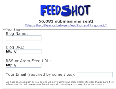
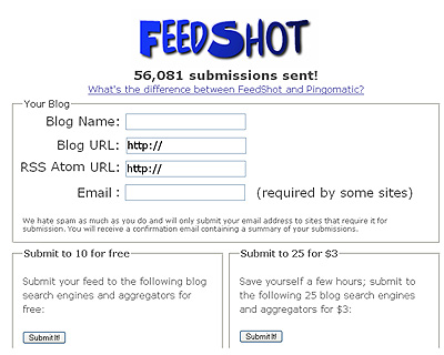
  • Layout needs cleaning up. A common mistake with form UI is to ignore how eyes work. We like scanning lines. The fewer lines you can group together, while keeping line length short, the better. So here’s a before and after:

    Feedshot main page
    Feedshot main page

  • Confused control. The group boxes of the UI implies that functionality is seperate, which it isn’t. After filling out the form I have to click one of the submit buttons. It takes a few seconds to sort this out, since the two buttons, which do different things, are labeled the same. The decision buttons should be moved into the form, as shown here.
    Feedshot reloaded
  • Further cleanup. It’s possible to go further: Why have two buttons that say the same thing? You could put the meaning into the buttons themselves. The challenge is that black on grey doesn’t look so good for sentences: $3 for 25 may not be easy to read as a button, but If it were me I’d do some mock-ups and give it a try.

UI critique: seattlechildrens.org

Sadly these critiques (in honor of world usability day) were delayed due to someone hacking the forums on my site. I’ll be getting to these queries over the next week as I recover some time.

Seattle Children’s Hospital

Summary: Nails the basics. It’s clear that most decisions made were done with care. The design has a clear audience in mind and carries through a consistent set of design concepts and elements, however there are some lapses and gaps here and there. Overall score: 7 out of 10 (just shy of an 8).

Seattle childrens

Core tasks:

  • The good and the bad. It’s impossible to critique a design without some understanding of what it’s supposed to do, and who it’s for: especially a large site like this one. But this design does what good designs do: the front page tells me what the designer thinks the core tasks are. The right most column lists (what appear to be) some of the most frequent tasks people have. However, why are they on the right? The U.S. crowd reads left to right. Making this change breaks up the composition, so it doesn’t look great with my 5 second photoshop treatment, but that’s a direction I would go with (Among other things you’d have to change that arrow glyph to something else).
    Revised main page
  • Physician finder easy to use. I dug in here and poked around. Piece of cake. It was easy to pick a location and a specialization and get a list of docs. Search results pages were clean. My only gripe is that that no medical site in the universe has reviews from patients: referals being the most important thing for many parents in picking doctors.
  • Donations and Gift shop. The interior leaf pages are nice and clean: easy to find my way and fill out the forms. The gift shop UI was good: I could pick gifts to send to guests. The only downside is that once inside the gift shop, the main navigation goes away. I have to hit the logo in the top left to return to the top: no other way to get back to the navigation (-5 points for that).
  • What are the key needs? I spent some time in the health care advice and services sections, but if this were a critique for hire I’d be spend more time thinking about core/frequent behavior. There are clearly other core tasks worthy of exploration, but it’s time to move on.

Navigation:

  • Mostly consistent hot track. Most navigation items, such as links and buttons hot track (mouseover) to white. But some don’t. The primary navigation at the top doesn’t have any mouseover behavior at all. This should be consistent. The impact is minor though: so many sites jumble up mouseover & link behavior that most people can figure it out.
  • Tabs + breadcrumbs? I wasn’t sure the breadcrumbs were needed, given how clean and simple the tab navigation is. It seemed redundant, especially when pages had a graphic underneath the tabs.
  • Section colors don’t unify the site. It’s clear that the colors for each sub-section of the site were chosen with care: they’re equally saturated tones. But the change between each subsite is strong enough that for a moment it feels like you’re gone to a different site altogether. Those colors should come through into the main navigation on the home page: either those are the colors for those sections or they’re not.Navigation 1
    Navigation 2
  • Here’s a quick mock up of the main nav with consistent colors:
    Navigation 3

Aesthetics / Layout:

  • Linespacing and links can be cleaner. Although the color and style choices are good, there was some room for cleanup. First move was to make better use of the title space by moving Calendar and News to the top. Then, a rule: all headlines fit on one line. This always makes things easier to read. You can see in my tweaked version B it’s easier to skim. You could go further and experiment with moving the date into the link itself.
    Line cleanupOther comments and nitpicks:

    • Title is not the place for marketing. The site title is “World class pediatric health care from…”. Not good. This title string is what will appear in user’s bookmarks. It should be like a phone listing: terse. “Seattle Children’s hospital” is perfect.
    • Title lengths. The titles grow on sub pages: even one level down they grow to more than 80 characters long. Who is going to read this? There’s no need to track the site hierarchy in the titles. All you need are two things: A short tile for the page and a short slug for the the site itself (and in that order).
  • Artofpm reviews: B&A and MSDN

    Still seeing some reviews come in which I’m grateful for, 5 months after the book has been out. Most folks don’t know it but the window for books is small: if it’s not picked up in reviews soon after publication, odds are slim anyone will ever even hear about it.

    My own interests aside, any time you write a blog post or amazon review for a book, it makes a huge difference to us authors. Even if sales don’t follow, it’s super validating to any author to hear the book meant something to someone. I hope to write more book reviews myself here.

    MSDN Magazine had a short review of artofpm:

    Scott gives you project management concepts in simple steps, using lots of examples of successes and failures from his own experiences, and he is always considering the “people” factor. With all the emphasis on tools and process that we have today, it’s refreshing to see a book on project management that spends as much time on human factors as it does on technical tools and metrics.

    This book is a candid and honest piece of work written by someone who has really been there, done that, and is willing to share.

    Boxes and arrows, a webzine about information architecture and UX, had this review:

    This is a comprehensive, how-to book devoid of jargon and theory. The author gives direct advice from his own experience. The real value of this book, though, is that it is not about a single methodology for project management, nor is it just for project managers. Instead, Berkun is able to speak about project management at its highest-level without filtering it through a given approach. It is deep enough to keep seasoned project managers reading, but also appealing to non-project managers. I’d recommend this book to anyone looking to improve general project skills.