UI critique: feedshot.com
Summary: this isn’t a site as much as a dialog box for a service. Two buttons and four fields. Should be a piece of cake. But some layout issues and seperate of control creates a few stumbles. 6 of 10. (Would be a 7 but degree of difficultly here is low).
Core tasks:
- What is this for? There is a basic question of purpose here: what does this site do and why should I care? there is a link at the top that says “how is this different from pingomatic” but what if I don’t know what pingomatic is? The blog at the other end of that link says “FeedShot is a blog feed submission service, submitting your RSS or Atom feed to a large collection of search engines and news services with the click of a button.” A short version of this description should appear on the main page.
- The value proposition. Another mistake here is in approach. The value to me isn’t the technology: it’s traffic. The tagline shouldn’t be “56,000 submissions sent” but “56,000 feeds enhanced” or “56,000 feeds now with more traffic” or something that gets at the value, not the technology. The link should say “How feedspot advertises your blog for you. “
Basic layout:
- Layout needs cleaning up. A common mistake with form UI is to ignore how eyes work. We like scanning lines. The fewer lines you can group together, while keeping line length short, the better. So here’s a before and after:

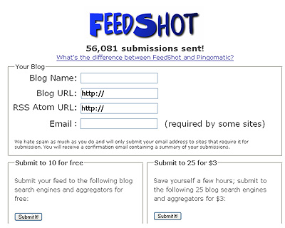
- Confused control. The group boxes of the UI implies that functionality is seperate, which it isn’t. After filling out the form I have to click one of the submit buttons. It takes a few seconds to sort this out, since the two buttons, which do different things, are labeled the same. The decision buttons should be moved into the form, as shown here.
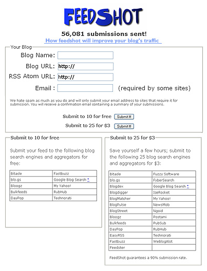
- Further cleanup. It’s possible to go further: Why have two buttons that say the same thing? You could put the meaning into the buttons themselves. The challenge is that black on grey doesn’t look so good for sentences: $3 for 25 may not be easy to read as a button, but If it were me I’d do some mock-ups and give it a try.


 Other comments and nitpicks:
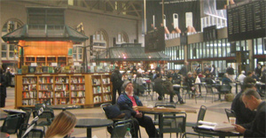

 I quickly lost myself in the MIT campus. It was fun to poke my nose into classrooms and departments observing everyone busily doing their things. I must have fit right in, as two different people asked me for directions.
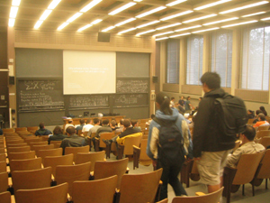
 I walked the 15 minutes from the ever swanky
  Stupid mistake #1: At Sun, the host for boston-chi, I realize I left my power cable back at Northeastern. Yes, I made the same mistake on tour #1. And yes, I am a moron. A quick call to Peter and there’s a shot it might still be in the room (it’s recovered later thx to him).
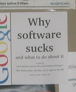
  At 3:30pm I talk to 70 or 80 students and faculty about software design in a talk called “Why software sucks: and what to do about it” (