Vote on the cover for my next book
A few weeks ago you voted on the title for my next book. Thanks to your help that decision has been made:
The Year Without Pants: WordPress.com and the Future of Work.
The book follows the behind the scenes story of my year working for Automattic, Inc, the makers of WordPress.com and what I learned from working in a 100% remote based, email-free, open-source fueled working culture. It was a fascinating experience in many ways and the book teaches everything I learned about management, leadership, creativity and organizations.
I’ve been working with the folks at Jossey-Bass on the cover design. Here are 4 concepts – Which direction is best? Place you vote.
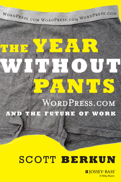
Option A
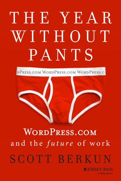
Option B
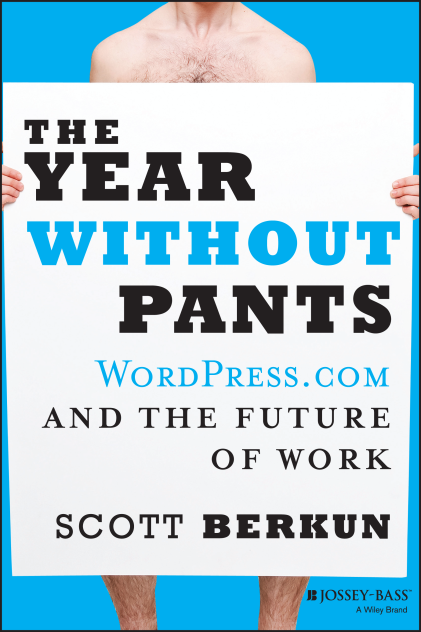
Option C
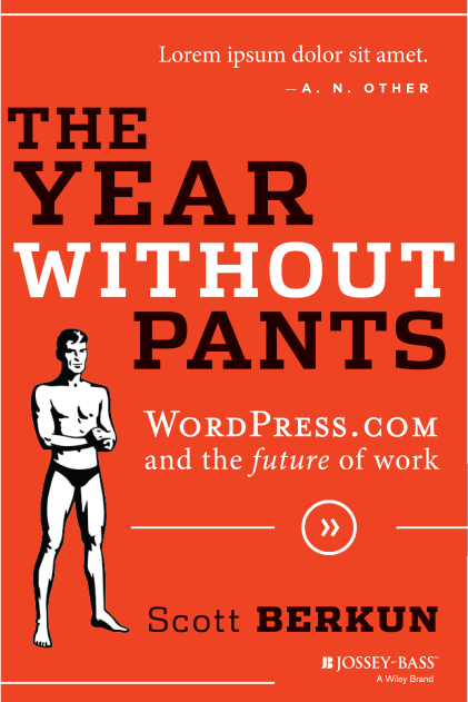
Option D
If you want to be notified when the book is on-sale and get access to exclusive content, sign up here.
#4 is the best in my view.
We are lonely in our choice.
Hey Scott, is that you in Option C? It could effect the voting…
:)
Oh, it’s *that* kind of book…
50 Shades of Berkun
I would go with Option B as my first choice and Option D as my second. The red/orange color is really impactful.
Option 2 looks like a Valentine’s Day ad, option 3 looks like a flasher, option 4 says “the year with only underpants” so that makes option 1 the best.
I don’t like any of them. Part of that may be that I don’t like the title either.
The only option not showing pants is C. I would vote C but maybe that design can be improved.
I voted for (D) but I agree that the image implies “a year with only underpants”.
However options A & B were a bit too realistic (somebody else’s underwear?) and option (C) seemed more like “a year working naked”.
Regardless, as an at-home worker (for SAP of all places) I know the book will be quite worthwhile for everyone.
Scott, will you keep the same title for non-US editions? Outside of North America, the term ‘pants’ has a different meaning (hint: it’s one layer lower on the garment stack).
Hi Ian: I’m aware of the pants issue. I find it funny but we’ll see what happens.
All of these options are very gendered. Is the book itself male-centric? If not, this is a bad slate of options.
Of course, the mention of pants also has a male implication in American society, at least.
The central story of the book is mine.
Gender issues have definitely come up for me – the title choice made that hard to avoid, giving clothing/nudity are likely visuals to support it. It’s a tricky thing with art of any kind that specificity has power. To make something more generic makes it less interesting. This doesn’t justify offending people of course, but so far these are items of clothing on a colored background.
We’re still exploring other options, specifically boxers which are more gender neutral – but to answer your question your concerns have definitely been on my mind.
It’s not so much about offending people as potentially excluding part of your audience based on superficialities…
I voted for “A” although “B” was close. Having said that, the title had me thinking “gym shorts,” not boxers. :-) Honestly, I’d probably feel a little weird taking any of these to the checkout in a bookstore; thank goodness for Amazon. :-P
my first instinct was A, but the underpants on that cover look a bit …worn out. i’ll leave it at that :).
maybe try a more cartoony treatment (less realistic), but the same placement of text?
can’t wait to read it!
When I try to vote (for C) I get an error message that says “This poll did not load properly”
That’s at least one “C” vote not included in the totals…
My preference goes to option B which is the most original to my opinion.
Take D, but put the guy in a shirt w/tie. Try it with both (1) shorts and sandals and (2) speedo/underwear and barefoot.
I found B the most intriguing with A coming in second.
What’s with the red though? You’re orange and WordPress is blue. Why red? I think B would work just as well in WP blue, although it might look a tad conservative. Maybe that’s a case for orange after all, but red? I don’t know.
I voted for C. It’s a bit more provocative. A & B have that “underpants left on the floor” look.
Option B, purely from a visual perspective. It looks awesome and is somewhat classy and quirky at the same time. Really feel like “WordPress.com” should follow the uneven lining of those underpants.
I agree with Sören above too about the coloring. Seems like a better fit would be the classic WordPress blue or even grey!
Here’s another vote for B, definitely the most cohesive design in my eyes.
P.S. We don’t use Mrs. Eaves on WordPress.com anymore. :) I’d just set it in the typeface you use for the rest of the cover. Good luck with the launch!
I like B, and how the pants are there but part of the background at the same time. All the others reminded me of another book :/
Definitely the second. I really like the comments about gender, and while it’s the most visually together one, it’s also the least gendered (the last two are also pretty tied to the white male tech worker stereotype.) I do think you’re totally right about specificity and it being your story, but that’s apparent in the words I’m guessing and the cover can be visually stimulating while being open to a more generalized interpretation.
I think understanding that it is YOUR year and making anyone, literally anyone out there, think that they can have a similar experience isn’t mutually exclusive. Ideally, they should be putting themselves in those pants.. or the lack of them.