Vote On The Cover Design: Final Round
More than 350 of you voted for the previous round of cover designs. Thanks for your feedback dearest readers. A few weeks have passed since then and I’m back today with what are likely the final cover concepts: only two to choose from. How exciting!
Important: If you missed the kickstarter campaign, you can join this list to be first to be notified when the book is on sale, and receive early giveaways, free book excerpts and more.
The book itself is rolling along – still at work on draft #3 and it’s progressing nicely. Plan is for the book to be out this fall.
Regarding these designs: they’re not final, but we’re close. I’m still working on what the tagline will be (“The story of a father and son” isn’t quite right), or even if there will be a tagline at all.
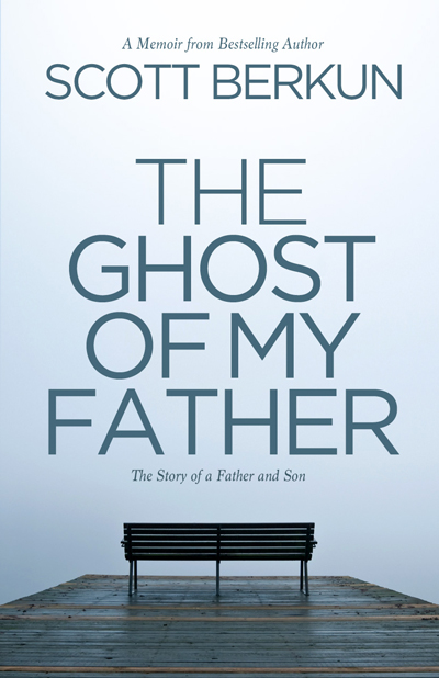
Design A: Bench

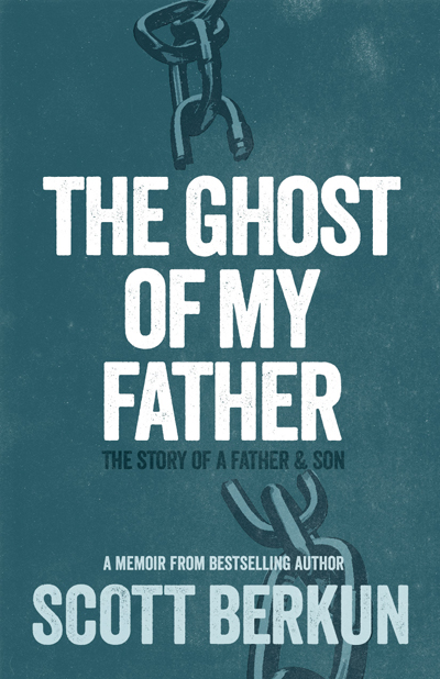
Design B: Chains


Both are very strong, but the two covers send very different messages. What message would you like to send people as they pick up your book?
There is no specific message to send other than to be interesting enough that people will want to read the book. Although they’re different they both represent the book well, just for different reasons.
I like the message from cover A. That said I agree with Sam regarding the message you’re trying to send, they are very different
What do you think the messages are? If I tell you what *I* think they are it kind of ruins the conversation because I know too much :)
The bench has “movement” by inviting me in.
Maybe the tag could be two paired words, like “of struggle and reflection” or “of youth and grace.”
The first cover has a thoughtful, reflective mood. The second feels active, with a justice and slavery vibe. I voted for the bench, as it seems more memoir-memory-foggy past, but I could see both depending on your content, as your other commenters mentioned. What a healing thing to write, for you and your readers. I have two drafts of mine, and I am still not brave enough to let all the ugly bits show. I admire your effort.
Thanks Genevieve
The bench is inviting. “Come sit a while, friend, and let me tell you a story.” The chains one kind of scares me. Why did you need to break free from the shackles of your father? That’s what they say to me at least.
The empty bench speaks absence and uncertainty very appropriately. Using a photograph brings a certain solidity and maturity to the look of the book.
I like both but gravitating toward Design A. Not having read the book, Design A seems to allow for a loving component to your relationship, whereas Design B strikes me as more negative.
Having said all that…and I realize it’s just a tiny nit picky point…please have your graphic designer look into the kerning of the copy in both designs. For instance, the kerning between the ‘O’ and ‘T’ in your first name in Design A and the kerning between the ‘A’ and ‘T’ in father, also in Design A. There are other kerning issues, including within Design B but I think I’ve made my anal point.
The bench to me suggested emptiness as in “absence” whereas the chain suggested something broken as in not as you’ve broken away as someone suggested but that the relationship was broken. Also, cover B somehow seems to elicit a stronger negative vibe (to me anyway); with cover A it’s a kind of peaceful-ish sad vibe. Don’t know if this makes any sense to you but thought I’d share my thoughts.
About the tag line, I think it’s not needed–the title is powerful and with the cover, it will have the pull/intrigue factor.
PS: Also, what Phillip said.
I like the Cover A. It’s like a quality talk time with your father. The Cover B remember me the idea of “kill your father” or “kill the unhealthy ideas” taught by your father, in order of being a mature man.
I prefer A, it seems more open, less violent. It leaves more room for interpretation; the chains metaphor is more overtly negative. This may be the feel you’re going for (we won’t know until we read the book), but it seems a little nihilistic, and not reflective of the life you seem to have lived despite any breakdown in the relationship with your father
Scott, I think the first cover design with the bench is the clear choice. While I obviously do not know the book content, the cover evokes a relationship feeling and is more welcoming. The chains may be symbolic within the book, but convey a much more negative initial impression and would not encourage me to buy the book.
The bench is more inviting and is something everyone can relate to.
I supported the project on Kickstarter. I did not know how to reply to your post about the tagline yesterday. I agree, I didn’t like most of your suggestions. Without knowing the book detail, hard to provide suggestions.
Tagline idea:
The rediscovery of a relationship.
The search for a relationship.
None: the title and book cover tell what you want.
Thanks Brad.
btw: Kickstarter lets you leave a comment on any backer update.
The first one suggests either imagined conversations or a a sadness that conversations never happened. The second suggests you are still imprisoned by whatever happened.
From the decription I read of the book, if there is to be a tagline I would play with the word ghost and what that means – that he wasn’t present; that his presence was ephemeral, etc.
Maybe something that contains the word illusion, myth, shadow or haunted. Or a ghost story is something that is based on imagination rather than fact. The pretense of truth.
Looking forward to reading.