Essay: How to detect bullshit
We all like to think we’re good at spotting BS, but how is it done? and why do people make stuff up to begin with? I take a shot in 2000 words.
Essay: How to detect bullshit
We all like to think we’re good at spotting BS, but how is it done? and why do people make stuff up to begin with? I take a shot in 2000 words.
Essay: How to detect bullshit
This week in the pm-clinic discussion forum:
Our team has a monthly process called add/cuts, where all the head honchos get in a room, look at the feature lists, and decide what features to add and which to cut. These things are usually quite bloody, carnage heavy affairs – typically 80% cuts and 20% adds. It’s an ad-hoc meeting where we review goals, run the work item lists, and try to make things fit the schedule. Unfortunately it often falls into ritual feature killings, where each head honcho cuts things to prove to the others how hard core they are.
The result is that the meeting functions best to motivate people to finish work before these meetings (perhaps good), but also to skunk work, hiding work items, to avoid having them discussed in these meetings (which is bad).
I’m influential enough that I can propose a different way to run these feature level add/cut meetings. What should I propose?
This week in the ux-clinic discussion group:
– Signed, Cut-less in Chicago
Over at ario’s blog he’s got a great post asking questions about the pilecentric nature of our lives: we worry so much about to-do lists, e-mail, magazines, blogs, yet the best things in life are often when we’re able to escape the piles and have experiences free of them. As I wrote in an an essay on attention I’m convinced happiness comes on the tail of questions like his.
Slate has a nice slide show by the famed architecture critic Witold_Rybczynski about major works of architecture that were big failures. It’s a good runthrough of some large scale works, with Cliff’s notes like commentary from Rybczynski on where things went wrong.
I don’t agree with his opinions on some (I’ve been to half of them): EMP is ugly, but still breathtaking. The Montreal stadium is a functional failure, but has amazing aesthetics, and the Getty museum rocks a free escape from the USA, a magic otherworldly garden up on a huge hill, looking down on LA.
I wonder what a slide show of greatest software duds might include? And what would we say about each one?
This is #7 on the list of questions I get asked most often ($10 if you can guess #1). It’s hard to find good people, period. Everyone complains about this in every industry everwhere so get used to it.
The challenge is that seeking talent has an inverse polarity: The louder you broadcast your job openings, the smaller the ratio of good candidates you’ll get (You may have 10k resumes, but a tiny percentage of good ones). If you want to avoid the misery of long coffee amped nights of resume skimming, put some energy into targeting your efforts.
Here’s some thoughts:
But in the end, most people chose to make broadcast job postings because it’s easy, and you never know. Here’s a short list of places to try:
Also see my essay on how to interview are hire people.
Have a tip for finding good people? PMs or otherwise? Please comment.
One common pattern I’ve seen with small tech companies is how their initial success by focusing on self-driven engineering talent creates problems they are completely unequipped to solve. I call this the start-up management inflection point.
The premise:
No matter how self-directed programmers are, eventually their utility declines as ambiguities in direction, conflicts in direction and ownership increase.
When a certain size is reached, likely 100 to 200, the company changes because of scale effects. But scale effects are hard to recognize, predict or compensate for. Hiring more brilliant engineers won’t solve this problem.
The trap:
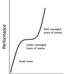
Dozens of tech-sector companies are stuck in this trap and have been for years. They have manager to programmer ratios of 15 to 1, bad user experiences (a common result of different programmers designing things differently) and consensus driven decision making models that squander programmer brilliance.
For awhile the fast pace of changes hides these problems, but soon those with more experience realize the effectiveness of individuals has dropped dramatically.
So what’s the solution?
The answers come fast if everyone has shared goals. Someone has to call out this new kind of problem: the meta problem of scaling up #s of people, and make managing it a top goal. Talent and passion alone are not the solution to this new kind of problem.
Good questions include:
With those questions fresh in everyones mind overcoming the inflection point is possible.
Goals start-ups need at the inflection point:
With pain points + goals, the magic happens. People can see why surgical addition of management structure, or smarter ways to work when you have teams of teams, are logically necessary. It’s the same smart, no-frills behavior that’s gotten the company to where it is, just applied to a different dimension.
Tactics to use to get past the inflection point:
The pain points of any growing start-up vary. But here’s a starter list of common tactics that should be considered.
Whatever you do, clarify the reasons/goals before you do it. Then check in with all the impacted parties in 2 weeks after the change, and see if the pain is gone. If it’s not, stop or change what you did, and try again.
[1] – Most start-up literature I’ve read focuses heavily on getting off the ground. I’ve found little about the difficult transition from start-up to small company, especially from a management perspective. If I’ve missed a good resource, leave a comment.
[Post lightly revised 7-17, and link added]
This week in the pm-clinic discussion forum:
I lead a small team of 6 – we’re paired with 3 other small teams, all reporting into the same group manager.
Problem #1: the group manager doesn’t have a vision. He’s vague and tends towards disinterest in leadership matters.
Problem #2: All of us leads have visions, but they’re different.
Problem #3: Leaders and founders seem content to let us fight out our respective visions in code.I’ve run up this hill before – it’s not fun. I want to find another way to deal with the situation and I’m hoping pmc can help.
– Surviving the visionless manager
This week in the ux-clinic discussion group:
Recently, I switched from working on consumer websites, to the more staid, practical, button-down world of accounting software. As in, accounting software for accountants. In reviewing all the usability classics, I’ve noticed how focused on the pick-up-and-play side of things most of it is.Aside from the odd mention of Fitts Law and the number of clicks required to perform a task, there’s little coverage given to designing for efficiency, especially expert efficiency, in interface design.Anyone have experience with designing for performance, not ease of learning, as job #1? What tips and/or references can the list offer that might help me adjust my mindset to this new set of demands? Is it even possible to make such data entry software a pleasure to use?– Working beyond don’t make me think
I’ve done nearly 20 interviews so far for my next book, and I need more. To quicken the pace I’m being innovative and going digital.
Call for all innovators
If you have a good story of innovation, or have thoughts on how innovation happens, I want to hear from you.
What do you get:
The survey is a scant 15 questions long, and should take less than 10 minutes. If you give high quality answers, odds are high I’ll want to chat with you 1-on-1 over e-mail or phone, and may use your material in the book.
Get interviewed on innovation now!
Deadline Friday 8/18 (Drawing held end of day).
If you want background on the project, look here.
It’s been months since I’ve commented on Firefox, IE and the state of web browser design. I’m back: I recently installed Beta 1 of FF 2.0 and here’s a short review.
Beta 1 releases are tricky strategically: you wan’t to hold back on some big features so competitors have less time to recover, but you do want mileage and feedback on big changes. As beta releases go, this one is conceptually conservative. Especially since IE7 is late in the game, with a recent beta 3 release.
Highlights
Lowlights
Some reviews I’ve read highlight the new History menu (replacing the idiotic Go menu – yay!) and its list of closed tabs. It’s a thoughtful gesture, but it’s a hacky, Microsoft-esque UI design, in that the real solution is a better tab close model, rather than a greasetrap that captures things after they’ve fallen.
But there are other UI problems with the history menu: it still colides the history tree with the back tree. Take a look:
These two snapshots show two different histories: one for the back tree, one for the history list? Why two? Not sure – probably because back/forward follows a pruning algorithm and the history list doesn’t. But now that there’s a history menu, the conflict is more obvious (or then again, perhaps only browser UI weenies like myself catch these things). The back button is king here, so I’d rationalize in it favor of whatever it’s behavior is.
Here’s waiting for beta 2. Working on trying to get IE 7 Beta 3 installed, so stay tuned.
The good folks at step two designs are taking me on tour in Australia next month – If you or anyone you know lives in the only country that doubles as a continent, please help spread the word.
Where: Sydney, Canberra, Melbourne – Sept. 1,6,8
What: An interactive fast paced class for folks who lead or work on projects, particularly UX or design intensive work.
Topics include:
Who should attend:
What you get:
Tons of interactive learning, fun exercises, comical war stories, answers to your toughest questions (including post-class e-mails), the meaning of life, two kitchen sinks, plus a copy of the bestselling artofpm book (Which I’ll sign, spill beer on, or do other activities of your choice with) with every registration.
Full registration info here – $995 GST if you sign-up before August 14th. Please help spread the word. Cheers.
Biznik is a fun Seattle business networking group – they host local events and meetups for people looking to trade skills and meet interesting folks. Every member I’ve met so far seems smart and cool, so it’s time to get involved.
So, this month UX expert Ario and I are running a Biznik event:
A crash course in web design and usability
When: August 23, 6pm
Where: 1730 Minor Ave Suite 1100, Seattle WA
Cost: $25 (Pays for the room/overhead)
The session is unusal in that it’s BYOW – everyone brings something they want critiqued, and we use that to teach lessons, explain concepts and offer alternatives. No lectures or big theories: just real websites and good advice.
To attend you have to be a biznik member – but becoming one is free and takes about 20 seconds (Ok, maybe 30 if you type slow).
Learn about joining Biznik or details on the workshop.
The history of innovation has many crazy tales – the patent office is involved in many. In 1836 the first U.S. patent office burned to the ground: despite all the great ideas in the building, they didn’t get around to fireproofing the building itself (An ivory tower lesson if ever there was one).
Anyway, the fist 10,000 or so U.S. Patents were lost in the fire – about 2000 were recovered but the rest were lost.
After the fire the Patent office began its numerical numbering system (giving up on the prior name and date system) – U.S. Patent #1 was granted to Senator John Ruggle of Maine.
The invention? Comically enough, a reinvention of the wheel. Ruggle designed a new train wheel that yielded more traction and prevented sliding.
The true first U.S. patent was for pot ash (no, not that kind) and granted in 1790. However patents in Europe date back hundreds of years earlier – but that’s another story.
(From NPR star John Lienhard‘s new book, How invention begins. Review coming soon)
This week in the ux-clinic discussion group:
We’re a pair of UX folks (a designer and a usability engineer). We’ve teamed up to turn our team around, but despite our awesome talent combo, we’re spinning our wheels. The team had the good sense to hire both of us, but is fixated on tiny, short term, miniature UI developments. Big architecture work is added to the schedule easily, but all the UI bits are “tweak this”, “improve that”, or “provide a basic UI for new feature blah”.
Our team is smart and leaders are good – but they’ve never taken, or witnessed, a big bet on UI, despite the customer centric project goals. How do we use our powers, design or usability, to change our leadership psychology so that sizable UI/UX investments are part of the game?
— Superhero UX vs. the conservatives
This week in the pm-clinic discussion forum:
I’m a project leader in a research organization – as in a hard core blue sky R&D future thinking lab. We loosely organize around projects but our goals are the inverse of typical software: it’s the IP and the concepts we invent that people pay us for, not feature sets or code quality. Our releases to clients are vehicles for our concepts and research, but nothing more.
What I’m looking for are ways to apply project management skills to blue-sky, big think, projects. Can we improve the quality of our process and scheduling, or get more mileage out of the concepts we invent, but with a minimum impact on our ability to experiment, change directions, and go after big powerful ideas? What do things like specs, exit criteria and status meetings mean for a 100% proof of concept project?
– Flying in the blue sky
Back at the Emerging technology conference I presented a quick and dirty makeover of several popular web 2.0 sites and UI idioms (See slides for my talk: data vs. design). The fun and much loved Del.icio.us was one and here’s a makeover recap.
Step 1. The popular page
Del.icio.us is a social bookmarking site, and the /popular page shows which bookmarks in the del.icio.us system are most popular – but the layout uses open flow, blue on pink text (eek), and sloppy columns which all contribute to making the page hard to scan.
Step 2. Make a grid
The most basic layout trick in the world is the grid – throw down some columns and check how the stuff in the design lines up. The more things that don’t line up, the more work people’s eyes have to do. In this first photo, look at how the del.icio.us design compares against a simple 3 column layout. Not well.
In the next screen I’ve marked every visual column that the existing layout creates – each one of these lines is a point in horizontal space people’s eyes are forced to track to each time they try to read the next line – that’s a lot of wasted energy (and time).
Step 3. First pass
As a first pass, I’ve aligned all text into 3 columns. I killed the blue on pink, switching to black. I’ve also trimmed all the extra text from the pink brick, trimming its size by half.
Step 4. Second pass
After 15 minutes of experimentation, I was able to pull the data down into two complete, easily scannable columns. I brough back slim color bricks, but forced them into three buckets (light pink = low, pink = medium, intense pink= high) as that’s enough to indicate how popular they are, but keeping them easily distinguishable (And yes, there are better color choices to go with blue/black but I’m lazy in no-frills makeovers).
Step 5. Side by side comparison
Here are the two designs side by side, original on left and my quick makeover on right. My makeover fits more data into the same space, is faster to scan, easier to read, and slightly more attractive. It’s both easier to scan titles and which items are most popular.
Summary
What’s next?
Have a popular site you’d like me to throw some design mojo at? Name it.
Copyblogger offers good advice on writing blog and other headlines with 10 sure-fire headline formulas that work.
And athough the post is a top ten list, it doesn’t list top ten lists among its suggestions, giving you a bonus 11th tip. How nice. And if you count the “..that work” ending, that’s #12. Lucky day.
Purely for entertainment purposes, here is a blog title I made based on applying all 12 suggestions to a single title:
The top ten surefire things everyone ought to know about how you can discover who else wants the secrets of little known quick methods that work for getting rid of something so you can be proud of yourself like a rock star.
Lets not try that at home please.
If you liked this, you’ll be happy to know it’s part 7 of a 10 part series on magnetic headlines.
CHI 2007 , in San Jose, CA 4/28-5/3 2007, is the big dog of UI conferences – it’s one of the oldest, largest and most comprehensive ways to learn about what’s happening in the HCI / interface design world.
The big challenge is quality presenters – finding qualified people willing to get up there and teach. It’s all too easy to get rejected at CHI as so many folks want to participate. But this year something is different: I’m one of the gatekeepers.
So if you have good ideas for sessions – we want you.
I’m the co-chair for both the management and education communities – so if you’ve been waiting to contribute in these areas, and waiting for a crazy person to be at the controls, now is your chance to make a run for it.
Here’s the run down:
Courses: these are 90 minute or longer tutorials. If accepted you’ll recieve a $700 stipend per 90 minute segment you teach. We’re in big need of qualified folks interested in teaching.
Panels: Run a debate or reality tv show inspired session involving multiple presenters. I’m hoping someone will improve on the panel format – better speakers, more challenging topics – and remember we did the live competition Interactionary as a panel session.
Workshops: Full day discussions for small groups.
Reports: short, less formal papers on developments you’ve made in design, methods or other topics.
There are other session types, and Deadline for most things is Sept 1st, 2006 but check here for details.
Contact me if you have ideas, especially if you’re interested in submitting something related to UX management or HCI education.
This week in the ux-clinic discussion group:
I work for a large medical software company that attempts to follow a strict engineering process (partly for ISO certification). All logged bugs are supposed to be tied to a requirement (we use ReqPro), but managers aren’t sure what to do with “visual” bugs because visuals aren’t included in the official requirements docs.
So the big question is: What is the best way to fit the visual/UI deliverables into the engineering process?
Specifically:
- How best to deliver visuals? PDF? HTML?
- If designers don’t write the req documents, even if we wanted to, how do we get the designs into the requirements?
- How should visuals relate to the written requirements?