Seattle: Crash course in web design & usability

Biznik is a fun Seattle business networking group – they host local events and meetups for people looking to trade skills and meet interesting folks. Every member I’ve met so far seems smart and cool, so it’s time to get involved.

So, this month UX expert Ario and I are running a Biznik event:

A crash course in web design and usability

When: August 23, 6pm
Where: 1730 Minor Ave Suite 1100, Seattle WA
Cost: $25 (Pays for the room/overhead)

The session is unusal in that it’s BYOW – everyone brings something they want critiqued, and we use that to teach lessons, explain concepts and offer alternatives. No lectures or big theories: just real websites and good advice.

To attend you have to be a biznik member – but becoming one is free and takes about 20 seconds (Ok, maybe 30 if you type slow).

Learn about joining Biznik or details on the workshop.

Who holds the first U.S. patent?

The first U.S. patentThe history of innovation has many crazy tales – the patent office is involved in many. In 1836 the first U.S. patent office burned to the ground: despite all the great ideas in the building, they didn’t get around to fireproofing the building itself (An ivory tower lesson if ever there was one).

Anyway, the fist 10,000 or so U.S. Patents were lost in the fire – about 2000 were recovered but the rest were lost.

After the fire the Patent office began its numerical numbering system (giving up on the prior name and date system) – U.S. Patent #1 was granted to Senator John Ruggle of Maine.

The invention? Comically enough, a reinvention of the wheel. Ruggle designed a new train wheel that yielded more traction and prevented sliding.

The true first U.S. patent was for pot ash (no, not that kind) and granted in 1790. However patents in Europe date back hundreds of years earlier – but that’s another story.

(From NPR star John Lienhard‘s new book, How invention begins. Review coming soon)

This week in ux-clinic: Superhero UX vs. conservatives

This week in the ux-clinic discussion group:

We’re a pair of UX folks (a designer and a usability engineer). We’ve teamed up to turn our team around, but despite our awesome talent combo, we’re spinning our wheels. The team had the good sense to hire both of us, but is fixated on tiny, short term, miniature UI developments. Big architecture work is added to the schedule easily, but all the UI bits are “tweak this”, “improve that”, or “provide a basic UI for new feature blah”.

Our team is smart and leaders are good – but they’ve never taken, or witnessed, a big bet on UI, despite the customer centric project goals. How do we use our powers, design or usability, to change our leadership psychology so that sizable UI/UX investments are part of the game?

— Superhero UX vs. the conservatives

This week in pm-clinic: Managing proof of concept

This week in the pm-clinic discussion forum:

I’m a project leader in a research organization – as in a hard core blue sky R&D future thinking lab. We loosely organize around projects but our goals are the inverse of typical software: it’s the IP and the concepts we invent that people pay us for, not feature sets or code quality. Our releases to clients are vehicles for our concepts and research, but nothing more.

What I’m looking for are ways to apply project management skills to blue-sky, big think, projects. Can we improve the quality of our process and scheduling, or get more mileage out of the concepts we invent, but with a minimum impact on our ability to experiment, change directions, and go after big powerful ideas? What do things like specs, exit criteria and status meetings mean for a 100% proof of concept project?

– Flying in the blue sky

UI makeover: del.icio.us

Back at the Emerging technology conference I presented a quick and dirty makeover of several popular web 2.0 sites and UI idioms (See slides for my talk: data vs. design). The fun and much loved Del.icio.us was one and here’s a makeover recap.

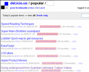
Step 1. The popular page

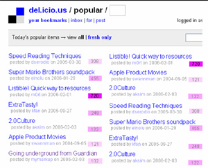
Del.icio.us is a social bookmarking site, and the /popular page shows which bookmarks in the del.icio.us system are most popular – but the layout uses open flow, blue on pink text (eek), and sloppy columns which all contribute to making the page hard to scan.
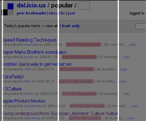
del1.jpg

Step 2. Make a grid

The most basic layout trick in the world is the grid – throw down some columns and check how the stuff in the design lines up. The more things that don’t line up, the more work people’s eyes have to do. In this first photo, look at how the del.icio.us design compares against a simple 3 column layout. Not well.

del2.jpg

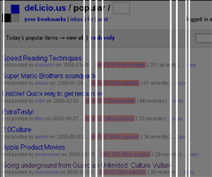
In the next screen I’ve marked every visual column that the existing layout creates – each one of these lines is a point in horizontal space people’s eyes are forced to track to each time they try to read the next line – that’s a lot of wasted energy (and time).
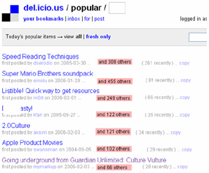
del3.jpg

Step 3. First pass

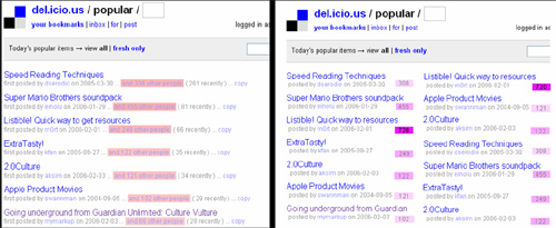
As a first pass, I’ve aligned all text into 3 columns. I killed the blue on pink, switching to black. I’ve also trimmed all the extra text from the pink brick, trimming its size by half.

del4.jpg

Step 4. Second pass

After 15 minutes of experimentation, I was able to pull the data down into two complete, easily scannable columns. I brough back slim color bricks, but forced them into three buckets (light pink = low, pink = medium, intense pink= high) as that’s enough to indicate how popular they are, but keeping them easily distinguishable (And yes, there are better color choices to go with blue/black but I’m lazy in no-frills makeovers).

del5.jpg

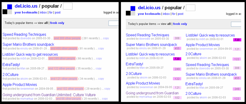
Step 5. Side by side comparison

Here are the two designs side by side, original on left and my quick makeover on right. My makeover fits more data into the same space, is faster to scan, easier to read, and slightly more attractive. It’s both easier to scan titles and which items are most popular.

del-final-comparison.jpg

Summary

  • If you’re a data centric site, be fast, clean and lean.
  • Use a grid or basic columns to frame the layout, and speed user eye movement.
  • Trim extra text – especially if you’re repeating things every line.
  • Use colors to signify and speed understanding, grouping data together (high / medium / low) to speed comprehension.
  • (And yes I cheated in some screenshots as the examples don’t match perfectly – but you got the idea, didn’t you?)

What’s next?

Have a popular site you’d like me to throw some design mojo at? Name it.

How to get people to read a blog post

Copyblogger offers good advice on writing blog and other headlines with 10 sure-fire headline formulas that work.

And athough the post is a top ten list, it doesn’t list top ten lists among its suggestions, giving you a bonus 11th tip. How nice. And if you count the “..that work” ending, that’s #12. Lucky day.

Purely for entertainment purposes, here is a blog title I made based on applying all 12 suggestions to a single title:

The top ten surefire things everyone ought to know about how you can discover who else wants the secrets of little known quick methods that work for getting rid of something so you can be proud of yourself like a rock star.

Lets not try that at home please.

If you liked this, you’ll be happy to know it’s part 7 of a 10 part series on magnetic headlines.

CHI 2007 – We want you

chi2007.jpgCHI 2007 , in San Jose, CA 4/28-5/3 2007, is the big dog of UI conferences – it’s one of the oldest, largest and most comprehensive ways to learn about what’s happening in the HCI / interface design world.

The big challenge is quality presenters – finding qualified people willing to get up there and teach. It’s all too easy to get rejected at CHI as so many folks want to participate. But this year something is different: I’m one of the gatekeepers.

So if you have good ideas for sessions – we want you.

I’m the co-chair for both the management and education communities – so if you’ve been waiting to contribute in these areas, and waiting for a crazy person to be at the controls, now is your chance to make a run for it.

Here’s the run down:

Courses: these are 90 minute or longer tutorials. If accepted you’ll recieve a $700 stipend per 90 minute segment you teach. We’re in big need of qualified folks interested in teaching.

Panels: Run a debate or reality tv show inspired session involving multiple presenters. I’m hoping someone will improve on the panel format – better speakers, more challenging topics – and remember we did the live competition Interactionary as a panel session.

Workshops: Full day discussions for small groups.

Reports: short, less formal papers on developments you’ve made in design, methods or other topics.

There are other session types, and Deadline for most things is Sept 1st, 2006 but check here for details.

Contact me if you have ideas, especially if you’re interested in submitting something related to UX management or HCI education.

This week in ux-clinic: The requirements to design gap

This week in the ux-clinic discussion group:

I work for a large medical software company that attempts to follow a strict engineering process (partly for ISO certification). All logged bugs are supposed to be tied to a requirement (we use ReqPro), but managers aren’t sure what to do with “visual” bugs because visuals aren’t included in the official requirements docs.

So the big question is: What is the best way to fit the visual/UI deliverables into the engineering process?

Specifically:

  • How best to deliver visuals? PDF? HTML?
  • If designers don’t write the req documents, even if we wanted to, how do we get the designs into the requirements?
  • How should visuals relate to the written requirements?

This week in pm-clinic: the myths of buffer

This week in the pm-clinic discussion forum:

I’m a lead programmer on a web 2.0’ish startup. Our team of 7 released an alpha version last week and we’re planning the final release, and need to make partner date commitments for launch.

Our biggest debate is buffer. All of our experienced programmers have pet philsoophies about buffer and I’m looking for someone to dispell the myths and give real advice on: Should buffer be used at all? When? why? Where do you put it in the schedule? Do you tell the team? And what are common stupid things arrogant leads do with buffer that shoot themselves in the foot and how can we avoid?

thanks,

– Wannabe buffermaster (WB)

How do executives learn? Executive software summit – Oct. 16-18

When Steve McConnell asks you to speak somewhere, it’s hard to say no. I’ve been invited to round out the stellar speaking ticket of Joel Spolsky, Watts Humprhey, Steve McConnell and Ed Yordon at Construx software‘s annual executive software summit in Seattle, October 16-18.

Paraphrasing from their website:

The Construx Software-Executive Summit is a forum for top software executives to share, analyze, evaluate, and improve their experiences at the enterprise level. Participants develop new insights into their own organizations and explore challenges and opportunities with a select group of peers. Last year’s event was a huge success: 100% of attendies would return again.

At the 2005 Summit, 98% of participants held titles of VP, CTO, Director, or higher. The main criteria for attendence is multi-project responsibility for software development.

It’s an exclusive event – I don’t qualify myself – and there are only 60 seats for the whole thing. It’s a rare opportunity for executive level managers to experience a peer focused conference. The $3k fee includes a voucher for $1195 in free training from Construx for anyone in your org – so check out the agenda and registration info.

Two kinds of people: complexifiers and simplifiers

There are several thousand ways to complete the sentence “There are two kinds of people, those that…” And in case the universe wouldn’t be complete without another, here’s one more.

There are two kinds of people: people that make things complex and people that simplify.

Complexifiers are averse to reduction. Their instincts are to turn simple assignments into quagmires, and to reject simple ideas until they’re buried (or asphyxiated) in layers of abstraction. These are the people who write 25 page specifications when a picture will do and send long e-mails to the entire team when one phone call would suffice. When they see x=y, they want to play with it and show their talents, taking pleasure in creating the unnecessary (23x*z = 23y*z). They take pride in consuming more bandwidth, time, and patience than needed, and expect rewards for it.

Simplifiers thrive on concision. They look for the 6x=6y in the world, and happily turn it into x=y. They never let their ego get in the way of the short path. When you give them seemingly complicated tasks they simplify, consolidate and re-interpret on instinct, naturally seeking the simplest way to achieve what needs to be done. They find ways to communicate complex ideas in simple terms without losing the idea’s essence or power.

I don’t know what makes a person fall into either pile (genetics, habit, experience?), but I do know I’d much rather spend my time with the simplifiers than the complexifiers. Don’t you think all the good designers, programmers, writers, philosophers and teachers you’ve known fit into the simplifer group?

If your name is Edward it’s your lucky day

In the unexplainable department: I have a copy of the artofpm in my office that’s already been personally signed for someone named Edward. I have no idea at this point who Edward was or why I signed a copy for him.

As it’s not much good to the largely non-Edward named population I don’t really know what to do with it. So:

The first person named Edward that leaves a comment gets it sent to them.

Tricks for writing: book darts

For years I was a notorious page corner folder. I’d mark corners of passages I needed for research with a fold, making bibliophiles cringe and scream. I thought books should look used: it’s a sign of love that a book traveled, got scuffed up, filled with post-it notes or coffee stains. I love when readers post photos of my books that have lived good lives.

But then, I love books and want them to last. It’s really not nice to mark up books that aren’t yours (but are owned by friends or libraries). If I had a better way I’d have used it, I just didn’t know of one. So when I showed my brother-in-law a particular good book (with my folds on every other page) his eyes lit up. That Christmas I was gifted a set of book darts.

IMG_3198 IMG_3199

Book darts are small arrow shaped strips of metal that you can place on pages to mark a passage. They are easy to use, easy to remove, and do zero damage to books. It’s a great paper clip-esque design: minimal and clever.

IMG_3200

I use these things so much in my research that I own several hundred of them (I’m faster at marking pages than I am at reviewing the marks later).

They’re sold in various quantities at bookdarts.com and some bookstores sell them too. If you are student or writer and spend your days making notes in books, I highly recommend them.

This week in ux-clinic: Getting the new up to speed

This week in the ux-clinic discussion group:

Right now, our company is growing by leaps and bounds and an initiative has been put forth to reduce the time it takes a new hire to become productive. My question really is what approach have others seen work when it comes to getting new hires (fresh out of college/grad school) up to speed as usability engineers or designers?

How long does it typically take a new hire in your company to be completing projects on their own?  What topics are included in your training program and what format do those training sessions take (e.g., lecture style, one-on-one w/ a mentor, hands-on “lab” type training, etc.)?

This week in pm-clinic: interviewing managers

This week in the pm-clinic discussion forum:

Times have changed at my company and I’m looking for a management role. I was hired as a software developer, but have picked up some project management work through promotions. Since I have no experience either interviewing potential PMs/managers or being interviewed myself, I don’t know what to expect in seeking out a FT management position.

What are three questions you ask of any project manager you interview? What is the minimum criteria to get a hire? How do you deal with ambiguities of assessing management skill, compared to something more easily demonstrated in the interview, like programming or design knowledge?

How skunkworks got its name

The history of innovation has many legends, some of which hold more truth than others. The legend of Skunkworks, in my research so far, holds up well.

The term is commonly used to mean secret projects done within an organization.

The name was born for a special defense project, the P-80 aircraft, at Lockheed. The plan was for a special team to set up a new office: still part of the company but independent in direction. The bet was that to innovate they needed to be managed in a different way than other projects in the company.

skunkworks

The name skunkworks has everything to do with their first office. it wasn’t glamorous: it was a tent in the parking lot outside the main building. A nearby plastics factory gave off a nasty odor, reminding engineers of the ‘Skunk works’ factory in Al Capps comic strip Li’l Abner. The name was picked up by the staff, and carried on. The Skunkworks would go on to build the U-2 and SR-71 Blackbird planes. You can read more about the organization in Skunkworks: a memoir of my years at Lockhead, by Ben R. Rich.

Some famous skunkworks type projects include: The Xerox Alto, The Apple Macintosh and Toshiba Laptop (one of the first production laptops in the world).

Know of other famous examples? Please comment below.

How honest should you be?

On NPR Seattle (stream) right now is a show exploring the danger of white lies. Philosopher Immanuel Kant believed lies, of any size, were wrong. But the NY Times ethicist Randy Cohen thinks that lies can be good in some cases, such as when they protect someone’s life.

So when working with other people, what are the ground rules? How do you decide how honest to be with people about:

  • Their performance / quality of their work
  • What you really think of their ideas
  • What your true motivations are
  • How you feel about how things are going
  • The reality of the project schedule

I bet there is a high correlation between how honest the average person on a team is, and how well that team performs.
Anyone agree or disagree? What factors contribute to how honest you are?

Embarassing web tales: part 1

No CS degree can hold up against the dark powers of an aging mind and the ocassional typo.

The contact form on my main site, normally a reliable way to contact me about speaking gigs, interviews or feedback on stuff I’ve written, has quietly been sending all of it’s little missives into never never land. Instead of forwarding to @scott…, it was forwarding to @scptt…, which is about as good as dev / null or the nearest black hole.

Now I’m sure someone out there has the unfortunate circumstance of their parents naming them Scptt, but I dodged that particular bullet.

So if you’ve been wondering why I’m such a jerk for not answering your questions or responding about speaking at your conference, company or backyard BBQ, now you know why. Apologies all around. Please try again and all will be well.

(Hanging head in shame)

The architecture at Google

There’s a great little article on Metropolis all about the design and architecture of the Google campus.

The authors of Peopleware and Joel Spolsky have long written about the importance of workspaces in productivity and human performance, but there’s no better example of a major company investing in environment. I know many small companies that do it right, but it seems once they hit the 200 or 500 person mark, many of those perks go out the window (har har).

I’ve been to the Google campus a few times – it’s the creative spaces and strong use of color that charmed me. The ceilings are high. The spaces are non rectilinear. And I never had the quick sense of repetition that dominates most offices everywhere (Office, office, office, hall. Office, office, office, hall) Even the training and lecture rooms have character and dimensions that generate some kind of response.

At the right of the essay is an index of photos, giving a great sense of their approach to office design. Not for everybody, but sure gets you thinking about your environment.

Note: For those old enough to remember, the Google buildings were originally the home of SGI (Silicon Graphics Inc.) The first time I was on campus I kept thinking I’d been there before and eventually figured out why.

This week in ux-clinic: vision and collaboration

This week in the ux-clinic discussion group:

While managing a small design team how does one manage both a strong design vision, and maintain a sense of collaboration and team ownership over that vision at the same time? How do you keep your team of real designers from becoming production crafts people when the design vision is quite strong from the beginning? Let’s assume for this thread that the strong vision is internal to the design teams and held and managed by the design manager.