Buy nothing for Christmas
Gift giving was never a strength in my family. Sure, we gave gifts, we just didn’t do it well, as in “Hey, here’s your annual CD/book/cake that’s mostly indistinguishable from what I got you last year.” Later, through friends and girlfriends, I learned what a good gift was: something personal and thoughtful that they’d enjoy or need, but probably wouldn’t think to buy for themselves.
But with the web, and the same 15 chain stores in every mall in every city, it’s harder to buy truly good gifts. There is an abundance of easily available impersonal goods people don’t want or need (and the idea of gift cards is just one step away from giving someone cash). I’m loathe to buy people more stuff anyway – I know few folks who complain about empty storage rooms, closets or kitchen cabinets, in need of more things they used once and never again.
So this year I made three four rules:
- To buy only experiences. Tickets to plays, events, massages, meals, things that they’ll experience and own as a memory instead of as a thing. Perhaps I can baby or pet sit for friends, gifts that could make a difference. This also has the benefit of low environmental impact if you’re into that sort of thing.
- To make things for people. If I make it with my own hands then it’s impossible to get at the GAP, or amazon, and as ugly or fragile as it might be, it will be personal. Writing a letter is more personal and requires more of my precious time (and therefore in a way is more likely to be a more meaningful gift) than any clever purchase ever could. It will will represent more of the the most precious thing I have, my time, than anything I could buy.
- Art, film, books, plays, performances or even board games are special kinds of buying. Anything made by an artist or creator needs the support of buyers to continue to do their profession. Although these are still purchases, the effect they can have on the person you buy them for can be profound, personal and long lasting.
- If my best or only choice is to buy, do it thoughtfully. Is this something this person will truly appreciate? Is it something they wouldn’t get themselves, even though they desire it? Is it something I want them to want, or something they will truly appreciate? Perhaps purchase from a local, independent artist or maker, or from a store that has sustainable practices for makers.
One problem for some people is they don’t know how to many anything. But there are always ways to offer gifts of your time, like coupons to babysit for a friend, to take them out for a fun night out or even to help them with housework, or a free lesson in a skill you have that you know they want to learn.
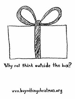 Buy nothing Christmas is an alternative approach to the holidays. There are various flavors, from the official Adbusters Buy Nothing project, to a Facebook group, to a documentary, and simple tips for inexpensive and creative gifts, to ideas for parents and kits for simplifying the holiday season.
Perhaps my favorite is the Canadian Buy nothing Christmas group, asks the question “What would Jesus buy?” with a humorous catalog of free things to give (includes the ever popular seaweed), advocacy, and even a well written FAQ. Check it out.
[Updated November 2017 – Thanks to Heather Bussing for suggesting #3]


 When
When