I’ll be updating this post with notes from each speaker – Rules: I will revise and update all day long, cleaning up links and sloppy grammar.
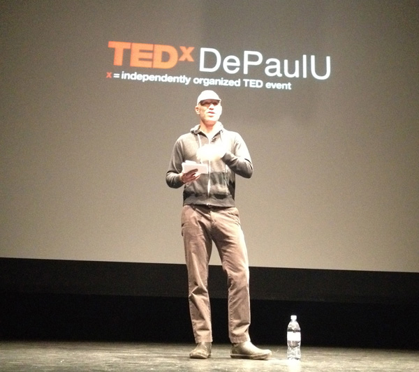
 This is now the edited version of my notes from TedXDePaul 2013, held Saturday April 6th at the Museum of Contemporary Art, hosted by Daniel Gurevich and Matt Helbig.
The day opened with brief comments from Daniel about how there are two kinds of people: creators and curators, which would be the two themes for the day. He spoke for just a minute, and then an unnamed warm up team from Second City Improv, Scott Goerhing and Kaitlyn Skully, came out. They were unexpected and excellent. Dan’s opening was by comparison short and cold, as commentary from hosts often is, but Goerhing and Skully charmed their way through introducing speakers, making safe jokes at the speakers expense (asking if I was behind the fashionable Birkin bag), warming up the crowd. An unexpectedly good choice of curation. They never outwore their welcome, and added warmth and humor to the entire day.
He briefly described his work and blog. He expressed that photography is a quiet act and its a surprise to go out and talk to large groups like this. He grew up by reading fashion magazines, which he thinks trained his eyes for how to see. At first I was concerned he was simply going to talk through his personal history, but listening to him explain why certain photographs were meaningful for him was fascinating. It’s hard to capture in notes here how much value there is in a generous expert honestly talking through work they admire.
When he moved to Brooklyn as a young man from Indiana, he didn’t know anyone. Walking on Atlantic avenue, he saw a postcard of a couple on a boat and it moved him. It had an emotional effect. The first real photographic images he bought. He talked through a series of images and what they meant to him. He likes to think his images start a story. Good photographs don’t tell you everything.
 Photographs lose their initial meaning over time. They are taken in one context for one reason, but live on, and take on meanings, often superficial ones, by those who come later who do not know the context.
It was hard to catch the names of all the photographers he mentioned. They included Bresson, Bruce Davidson, Helen Levitt, Lartigue, Slim Aarons, Edward Weston (whose diary he referenced) and several others.
“The truth of a photograph is less interesting than the romance… allowing the romance is sometimes the most interesting part [as a photographer]”
He told a story of following a young woman on a bicycle, while on a bicycle, trying to time it right to take a good picture. And he worked hard to find the right angle and exposure, while moving. And later he realized a detail he’d missed: she had a metal right leg. A powerful detail that was entirely circumstance.
He wonders what photograph wil mean with digital photography and tumblrs, and the digital natives who don’t know what photography used to mean as an expensive, physical object, rather than cheap, easy, fast digital photography. Images on the internet are so easy to share that it makes the images themselves mean something else. He thinks it’s fascinating, unlike photographers of the past, that modern photographers can capture in the present, and 5 and 100 years from now, what people in any moment though of a particular photograph.
Aye gave the history of his work as designer working with the CTA (Chicago Transportation Authority) and other projects.
Transportation is the interaction of people’s choice and government. Includng tensions. The CTA has anxiety and a history of animosity between transportation users and employers “we’d have a great service if [it] weren’t for all those people”. In this sense The CTA’s main focus is to logistical expertise. They’re similar to FedEx – except these packages contain people. But as a designer, Aye was interested in the experience of being inside those packages.
After 11 months leadership changed at CTA, support for a designer (or for Aye) diminished, and he was fired. Now he’s a professor and wants to use what he learned to teach designers are everyone from the challenges he encountered. He created GGS to answer the question how can we help? And they realized what they needed was a ‘new model for public engagement.’ A new way for people to access the information and services CTA(?) already have.
Initially he resisted crowd sourcing, but realized there was a role for all kinds of research, including the messy, unfiltered elements of involving many people. He used his frameworks from being a teacher to consider the entire problem different: the city is a classroom. Which led to a new term: public design team. “Everyone of you in this room has a slightly different perspective on transit” and the spirt was to be open about finding ways to incorporate many of those views into the process.
Which led to…. a mobile app. To help people navigate the city. They launched a public kick starter campaign, which was terrifying. They set a goal of $125k, but only got $23k. Which was devastating.”After crying myself to sleep… he realized they were free from all of the expectations.. it didn’t matter if they screwed up again since they’d failed so largely before”
“Succcess hides learning” he realized. And what he’d learned was the project was much to complicated. They needed to simplify.
They developed three principles:
- Give the team a role and a name. They came up with the title “Urban Agent” and people loved it. Volunteers could refer to themselves as “Agent #23”.
- Ask questions that respect your team. There are no stupid questions but there are some that are deeply flawed. Assignments should be clear and real “observe your commute and look for transit tools – what could they do differently?”. Because they asked in a particular way they prevented people from whining. There were 300+ submissions.
- Give the team tools so they can respond with solutions. “How can non designers help with design?” He believed the only prerequisite was to have motivation and an idea. 600 ideas were submitted, which were narrowed down to 70 app features. Then they went to wireframes. [but he didn’t explain what the final app is and how it did – if anyone has linkage leave a comment]
Marcy Capron, CEO of Polymathic
I had to prepare for my own talk and sadly didn’t take notes for Capron’s talk. If someone else took notes please leave a comment with a link.
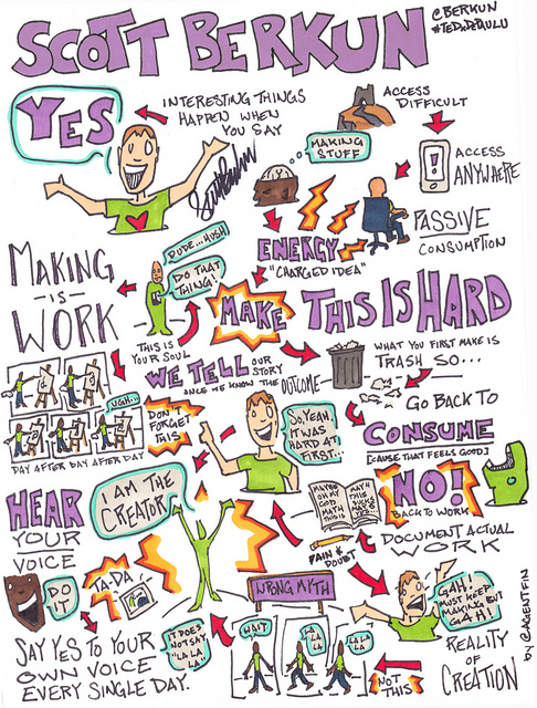
Scott Berkun (me), Saving Your Creative Soul
I talked about the wide gap between consuming information about creativity and actually making things yourself. To make good things demands connecting with yourself, your soul, and the voice inside you that you have to work to hear. I referred to the film The Mystery of Picasso.
A Sketchnote of my talk is here (made by Alexis Finch).
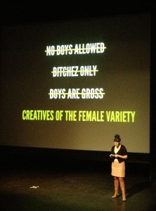 Elaine is an art director, involved with a group of female creatives called Quite Strong.
She opened by talking about advertising, and showed a short film by Gene Kilborn [killing us softly] about gender bias in ads:
- Ads sell more than products – values, perceptions, morals
- Cindy Crawford once said “I wish I looked like Cindy Crawford” – no one looks like they actually look
She studied women’s studies in school, and marketing and advertising and thought “what a bunch of assholes…[advertisers] ruining everything”. Apparently beer ads are known as being the most evil. But there is still room for good work: Budweiser did an add with the bottle cap as a crown. Compelling, simple and without any cultural issues.
She decided “I am going to change this industry from the inside”. On an early photo shoot she managed to hire a size 14 model, something unheard of – but they resized her in post production. She also worked on beer ads for Coors (w/Ice Cube).
She helped create Lustlist – a curated list of female talent they admire. Artists, directors, etc. to highlight their work and a place for advice for female creatives. In the beginning all they had was each other for confidence, but soon we were asked to speak at events. At the first of 2o speakers, 2.5 were women. Design conferences are better. But she noticed men speak differently and more egotistically, but that in some ways she admired that style: “hey what’s up, here’s my work, it’s cool, I get paid a lot of money for it… {mic drop}”. Women tend to focus too much on other people and the community rather than themselves.
6 out of 20 of top 20 are women on top ted talks. For the “Most Persuasive” top 20 list it was all men except one, where ironically the woman was speaking about women representing women in media. She joked it’s called TEDx, non TINAx or TabithaX.
With some colleagues she created the Moxie conference, with the tagline “Make that cheddar (money). Look good doing it.”
She was honest in saying “What merit did we have to throw a conference? We had no merit. But we wanted to practice what we preach” It was a success, and 40% of attendees were male, which they were proud of: their agenda wasn’t too big to include everyone willing to participate.
Question to ask when making work:
- Is this coming from a conscious place
- statement bigger than myself
- You have the power to vote with your $$, vote with interests, likes & shares
“it’s either you [in the TED audience] or the people posting youtube comments, and they’re not stopping any time soon”
Kadavy is a designer and talked primarily about design literacy. He offered that when people across the web get angry about something it’s the sign of something big. He told the story of the origins of ComicSans font. It goes back to 1994 during planning for Microsoft’s Windows 95 launch. Microsoft Bob, a product in development at the time, had a talking dog as part of the UI. Vincent Connare, a type designer at Microsoft recognized the font the dog talked in, Times Roman, was out of context and a mistake. A cartoon dog should talk in a cartoon font. He went and created Comic Sans font. But it turned out to be too late to change Bob. Comic sans shipped in Windows 95 anyway and has been (ab)used ever since.
Connare never intended the font to be used as it has. For every 1000 people who say CS should never be used, there’s one guy who uses it anyway and says “I don’t care what you think” and anyway it’s just a font. Computers have granted everyone the power to be designers for better and worse. Connare was a craftsman. He’s emabarassed that his career is associated with this font, used in ways he never anticipated. Each of us is a craftsperson and can make things for others to see.
More people search for “comic sans hate” every year. [I wondered if more people do more searches every year]
Guttenberg, who made Europe’s first movable type printing press, made it possible to take an idea from one brain and give it to something else. In other words printing and publishing networked people’s brains.
Two big obstacles:
- The more people there are making things, the harder it is [because of competition] to get it to people’s brain (A modern mobile phone is a network and a printing press)
- When making for others what you like and what they like won’t be the same
He created an unnamed site that failed and then started redditgifts without co-ordinating with reddit. He was a reddit user and knew their inside jokes. He’d also been involved in one of the early kickstarter campaigns, based on the Jetblue travel challenge, in 2009 (Fly for 30 days, up to 15 cities, for $600). Two people did it and blogged about it. This led to an idea for something related to reddit – gifting to strangers (aka secret santa).
Their first rule for people who signed up was: Don’t be a dick. Since this involved strangers, the internet and sending things, they feared people who send gag or mean things. They built a very simple website that didn’t do much. That first Christmas in 2009 4380 participants in 52 countries participated. It was awesome for him, but super scary for many reasons. Now that it worked, they’d need to build out the site to cover:
- proper signup
- a profile of likes / dislikes
- matching process (equivalent of pull names out of a hat, but smarter)
- A way to report you got and how much you spent
- if you get a gift – you post pictures
- Reminders system
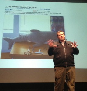 They wanted to make it easier to “friend stalk” participants so a stranger could learn enough about them to send a really good gift.
Beyond the tech challenge, wondered if people would abuse it and send garbage? it was scary and Exciting. The First gift sent was copy of the game Half Life 2. The next gift Dan mentioned was called Package required surgery (photo here)– they packed a set of gifts, based on research of that stranger, and stuffed them in a stuffed shark. “We put your present in the shark you are going to have to do surgery to get your gifts out”. The person who received it brought it full circle: and took photos as if it were real surgery. Other gifrst includes $1500 in cash. Hand paintings. Amazing – was famous on the web.
[He showed many great photos of gifts and the responses from the recipients. I’ll try to dig some up later online if I can]
They wondered Was it just Christmas? Or could we do this around a day of our own invention? They tried another day. Named: Arbitrary day.
2010 – signups quadrupled. Showed picture of crazy portraits (found their picture and painted them a portrait).
2011 – Jimmy Fallon participated as did Stephen Colbert. $1million in gifts to strangers were sent. Someone sent a case of live crabs to eat and the receiver posted as a joke “I got crabs from an internet stranger.” They did another version for U.S. troops and another that worked one-way (not reciprocated).
2012 – even bigger – $2 million, 127 countries
WHY? Is it working? Why does it grow? He saw a recent TED talk about using money to buy happiness, it can help but you have to spend it on strangers. That’s basically what redditgift is to him, this idea improved and amplified by the web.
He’s an artist in what is sometimes called Glitch art, where something that is commonly called ‘broken’, like a blinking street light, or a tv that only plays static, is recontextualized into another creation and used for another purpose. He believes glitches are powerful because they break us out of the context of being a consumer: What’s wrong? Is it my tv? my web connection? The software? We pay attention and the illusion the maker tried to create is broken. All systems are unstable and messy if you pay attention, just like we [as human beings] are.
Glitch safari: looking for glitches in different mediums and places. Referring to updating software: “My art sometimes breaks when things get fixed.” When stuff stops working the way I want [due to upgrades and such], it forces me to make new work.
His work is often called Brikolage, working with curating found objects. He looks at something like Word, the Microsoft application, is a collection of sounds, scripts, icons and code, and to him all of this is fair game. [And showed video of one of his works based on Word – I couldn’t find it but here’s a similar one called Windows Rainbows and Dinosaurs].
He referred to the book The Language of new media: “modularity is one of the modes of new media.”
Satromizer – iPhone app for glitching he made with a collaborator.
Glitches are more than a stunt: but a philosophy of creation and awareness. Glitches offer us a chance to see things we depend on and forget about differently. He invites us to take a moment when we encounter them and consider what it means.
Betsy Hoover, Online organizing directory for Obama Campaign
She asked the audience to think about a social problem that requires a community to solve.
She studied at Xavier and was interested in community building. Went door to door in Cincinnati to ask about what they liked and disliked about their neighborhood. She heard 6 people tell her they wanted a speed bump, to protect their children. They were surprised many people had the same issue. She brought it through the right government channels, and made it happen. And this inspired her to do even more.
She worked on the campaign, and after they won South Carolina Primary the campaign was broader, and she was interested in using online tools. Rather than go door to doo she found MYBO which was pivotal in the campaign.
She continued doing online community and found the switch from offline to on was very similar She never imagined the internet would be central to her work, but it’s not surprising now. These were people who cared and the task was to help them relate to each other: organizing.
Discovered subject lines with the most casual subjects did best. They were treating the recipients as people (She joked “Sorry for all the emails (not really) but thanks for all the action”).
In 5 weeks someone who joined rose form being an unknown local volunteer rose to play a key role in the Ohio campaign. [I think her point was the online tool created local engagement that would have been unlikely without it].
Always have to meet people where they are. Not on obama.com, but on reddit. Many people don’t self select to join a community. But Reddit was a risky place to be (as a president). 30k people registered in one day, their highest spike in the campaign until near the end.
Modern Americans are hard to reach by phone. They move, they don’t answer cell calls to numbers they don’t know. But 85% of unreachable people can be reached online, through facebook, through their friends. Friends as messengers is the most powerful way.
If you are an organizer, you are not the best representative to get the people you don’t have already. Your friends or subordinates might be, but you definitely are not.
The internet is not a holy grail: it’s just a tool. Use it to build relationships.
[He arrived late and apologized for being dressed casually: he was in a bike race. He was slated for 5:30 and luckily didn’t need to go on until 6:00, which he joked about a bit. He carried all this well and got laughs but it was disrespectful on principle]
His company started as a small coffee roaster, now has coffee bars across the U.S. and 1000 wholesaler accounts, and buy from 20 counties, paying above fair trade values.
What’s required to build a great brand?
- Conviction: you do what you say you’re going to do. Patagonia is a great example. That’s how you make brands that last.
- Unimpeachable quality: if you build brand well it will last forever. Four Seasons started as a motor inn in Toronto. When it moved into London it had to change to compete. They decided on unimpeachable quality as their goal. Every detail smacks of quality (Also mention Krug champagne).
- People see through lack of authenticity There are many inventa-companies (“we thought of this while out on a hike”). Levi’s embodies this. Gold rush history, 200 [it’s more like 130] years later the jeans have the same quality. Dockers however have lost their way. In coffee they see many other brands jump in and them jump out. They don’t commit completely, or aim to deceive customers about what they are.
- Innovation and evolution. JCrew launched as preppie brand when he was in college, but now have reinvented themselves. Went from preppie and sleepy to leading edge. The tiring part is, just when you’re getting sick of your brand, the public is just starting to get it, they’re chasing you and are behind you. You need to be patient, but always working on what’s next. There are brands that just fell asleep for 3 or 4 years [and don’t survive].
- Integrity. It took 18 years to have the success he has now, and deflects praise he gets from others (“Google started after we did”). If you are going to build a great company and brand you have to have the utmost integrity. It’s easy to do things that are cheap and low quality but it won’t last.
- Be deliberate. Where do you want the brand to go? Even successful companies lose their confidence and way. Apple is a good example for their patience and dedication to quality.
He talked about how bike races don’t need to talk or make excuses. Great brands also stand on their own, with little artifice [which didn’t jive to me with him being cavalier about being late].





 This is now the edited version of my notes from
  Photographs lose their initial meaning over time. They are taken in one context for one reason, but live on, and take on meanings, often superficial ones, by those who come later who do not know the context.
 Elaine is an art director, involved with a group of female creatives called
  They wanted to make it easier to “friend stalk” participants so a stranger could learn enough about them to send a really good gift.