I speak later today at UX Lisbon 2018, Here are my notes from the sessions so far, will update after each talk so hit refresh to get the latest. If you find any typos, broken links or other mistakes leave a comment and I’ll fix. Thanks.
1. Confusion, stupidity and Shame, Richard Banfield
Part One: Fight Club
We think that failure is the end of the lesson, but kids just keep doing stuff. It’s how they learn how to walk and talk, mostly by doing terribly, but it’s never a reason for them to stop trying. He wanted to remind us that’s the best way to learn. Fall seven times, get up eight times (which would make a great tattoo). But as adults we forget to get up.
The first rule of failure is to talk about failure. – Perry Hewitt
Adults primarily are embarrassed by failure, so they prevent learning and encouragement from happening. (The Flight Club reference is about secrets and the danger of keeping your feelings about failure a secret).
Identity / Responsibility
Missing a quote on quote slide, slide right. Your identity is not the design you create. Other people will simply ask “so what is s/he going to do next?” – the dramatic stakes of the result of a project are in our own minds. By owning a failure and saying “I made a mistake” you claim ownership of it and allows you to move on.
Part Two Most of us think we are responsible for our success, Privilege, genetics, timing, parents, friends, education, luck. These factors are more likely to explain why we are here than hard work. Go to Bangladesh and watch people work manual labor jobs to see real hard work. Tatoo: you are not special, get back to work
“Failure is yours, and success is your team’s” – Tess Cooper
When looking at a portfolio, he often asks candidates “so how did your team contribute to this?” and they respond with surprise, as the premise is “this is my portfolio”.
Movie: The Bear – “Most people lost in the world, they die of shame” – Charles Morse (Anthony Hopkins).
Book recommendation: Deep Survival
When you want to do something new and you talk about your idea, it polarizes people. Even if it’s a good idea. You should be prepared for résistance even if your idea is good. “A genius is a crazy person who turned out to be right” – Tim Minchin Designers have a personal investment in their ideas, they take negative feedback of an idea as personal. There are other models.
What problems:
- Excite you
- And are worth solving
- Are u willing to sacrifice for?
- And you will work on when it’s hard?
- And when other people hate your ideas?
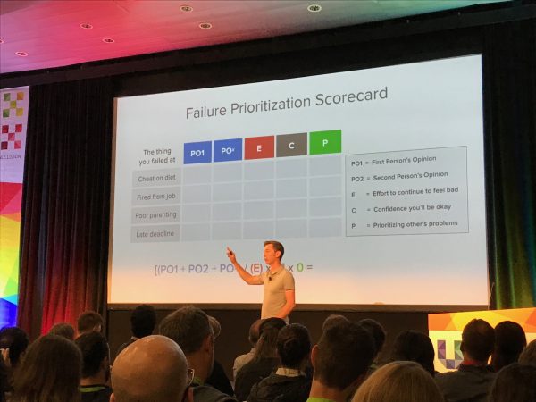
Book recommendation: The subtle art of not giving a f*ck
Epilogue
He told a story about having a grand new vision for his team, which he presented in a big presentation, but which didn’t go anywhere. “Hold a funeral for your best ideas. After you grieve, will you miss them?” – Paul Bellow His wife was diagnosed with breast cancer, and he immediately went into problem-solving mode, which is natural for designers. But in many situations problem solving is not the most useful place to start. Connecting with others and generating a context for help might be more important (which is hard for self-reliant people to prioritize first). Failure isn’t so bad when here’s someone there to catch you. (His wife is doing well now, as is his company).
2. Augmented Reality – Wait, What? (Or, Pokémon Gone),Boon Sheridan
In the time it takes to give this talk augmented reality has changed again. AR? VR? MR? Is similar to UX vs. UI. Endless debate because there are continuums that overlap. Pokemon Go. The old church he lives in was a Pokemon Go gym, which made for some interesting experiences and lots of media coverage. A wave of stories that explored augmented reality in ways it hadn’t been explored before. It was finally not just an academic tool, but a game ordinary people were actively using. 1983, Murder She Wrote (American TV show) had its star detective using a VR headset. The technology has gone through many hype cycles. Hardware has reached a point now that nearly everyone has a software and hardware to create and use AR experiences. It has finally been democratized. “Anything with a chip in it is ‘Smart'” – which lets us do some cool things, but also some silly things, like an app that encourages kids to brush their teeth (which involves the terrible idea of mounting your phone above your sink). Interesting concepts / prototypes:
- Google maps AR overlay – to help orientation (as most people wander in one direction until they see the dot move, and then they correct)
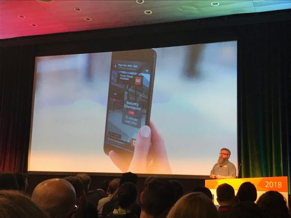
- Airport security – how to figure out which line to get in
- Lowe’s shopping – to help you find the right aisle for the thing you are looking for
- Hyundai’s AR car owner’s manual – the experience of using a car manual (“find 14.6.2”) is a frustrating one, especailly for procedural tasks that are easy when someone shows you directly (which AR can simulate well).
 How to get started with AR:
- You don’t need AR Tools to prototype – draft ideas on paper and low fidelity digital.
- Build for the already mobile friendly – early adopters and natural mobile device users are the easiest place to start
- Consider how you will measure success
- Narrow scenarios and embrace constraints – focus on smaller problems with clear wins – AR is an interface within an interface and if you don’t focus you’ll get overwhelmed as a designer (the amount of actual usable space to view the world is getting smaller and smaller)
- Prepare for lots of post-build testing. “half the time to build it and half the time to test it” – usability studies move to the front of the process.
- Consider the personal impact. AR means you are collecting tons of personal data (GPS locations, photos, etc.). And once data is collected it’s very hard to get rid it of, or control how it’s used (unless you have clear and useful poliies in place). Sometimes you have the wrong data, and it will hurt people in ways you can’t imagine.
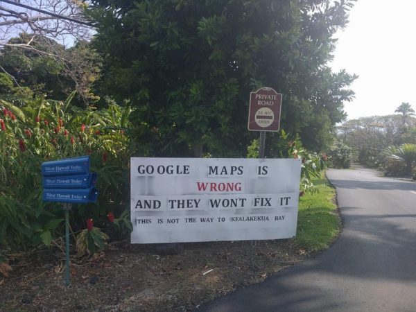 Original Reddit post with backstory
3. From UX Strategy to Digital Transformation, Jamie Levy
(I found this talk hard to follow so there are gaps in some places).
Her talk followed the story of how she came to write a book. In the 1990s she made software without all the processes and tools we use commonly today. By 2002 IA and interaction design developed methodologies that many design agencies followed, and she found herself with a job as a wireframe monkey.
This was eventually frustrating as she didn’t have much say in what the product would be. But then she worked on a discovery phase for the first time and she enjoyed working with stakeholders and customers directly. In 2010 she started an agency that only did discovery and strategy. She decided to write a book about strategy (which she admits was much harder and a longer process than she expected) and she studied many classic books on management and business strategy.
(She listed some definitions but went too fast to easily capture)
- Value Innovation:
- Validated user research: it’s not a product until you can both verify it’s utility and generate profit
- Killer UX Design: making something that’s absolutely frictionless (e.g. Don’t Make Me Think)
She referenced five techniques:
(I missed the first two as I wasn’t quite sure that this was going to be a core list or that it would have 5 points):
- Customer discovery: find people with problems, ask them how much they’d pay for it, to drive definition of value and services.
- Creating Solution Prototypes for Experiments
- Conducting Guerrilla User Research
Central to some of these techniques, and her overall approach, are detailed spreadsheets, but not much detail about how they are made or how to make them was offered.
She had a client who asked her to do a digital transformation, but she didn’t know much about it so she read more books (this was her favorite of the bunch).
Case study: Netflix vs. Blockbuster
This is a canonical story of the advantages of digital centered businesses vs. non-digital.
Business model differentials Netflix had:
- No late fees
- Easier access
- Wider choices
- Recommendations
Other differentials:
- Subscription model
- e-commerce website
- data assets and recommendation engine
- Warehouse and mail
- no retail costs
Digital transformation needs to be from the top down.
4. Speaking CEO: Business Fluency For Designers, Jess McMullin
He has been in UX since the mid-1990s but these days he does more management consulting. While he was working at Intuit, long ago, he had a chat with the founders of the company. They asked Jess what website he liked best. He said Amazon, which they didn’t like. And Jess tried to explain in design terms why it was good, but he didn’t have the vocabulary and lenses that they would likely understand.
Business Fluency
It’s very different to travel somewhere if you speak the language. Your comfort level is very different.
The CEO Design crit: you bring your design to an executive and they say “I don’t like green”, which signifies they don’t get it. But if I say “they don’t get it” you give away all your potential to possibly solve the problem.
The Design 180: to pivot away from what we know to focus on understanding the business.
Pivot Skills: designers have the ability to look at the world through different lenses, and business fluency should be one of them.
Three tools: Grid, Pyramid and Funnel
The Grid – what keeps senior leaders up at night? (Big 6)
- Money: how is it made and saved?
- People: how to hire and retain?
- Goals: what is our direction and how to track progress?
- Value: what do we deliver to customers vs. shareholder (which should be a venn-diagram, not either/or)
- Reputation: Protecting and building
- Risk: Managing and pro
Money is like oxygen: you need it to survive but it’s not the purpose of your life.
The Pyramid
The more you have to deal with, the more abstract the view you need to be able to have (from top of pyramid down: lead / manage / execute).
However: “the more important the decision, the less the person making it will know about it.” – Dave Gray
The insight is to talk to people at their level of abstraction, not your own.
- Triangle: connect people issue to projects and money.
- Slipstream: follow your idea behind larger but related projects
- Tether strategy: connect something on the ground to something very abstract
Hypothesis Funnel
There are now many (business) canvas tools (and the funnel is similar).
Funnel structures the translation between business and design.
Opportunity loop:
- What Customer behaviors are mentioned by the business?
- What insights do designers have about those behaviors or related needs?
- What is the desired business outcome and how can we measure?
- Where is the opportunity and point of leverage?
- (What are the sources of truth on the business or design side?)
What is our hypotheses for the customer experience?
- For people in situation X…
- We hypothesize that changing Y…
- Will make Z difference in business…
- Which can be measured or observed quant/qual Q
Advocacy, Inquiry, Empathy: we tend to spend 70% advocating, 20% inquiring and 10% empathizing with CEOs/stakeholders, but this should be inverted to be an effective advocate.
5. The Values are the Experience, Kim Goodwin
“How do I help my org value design more?”
This question is reasonable, but it might not be the right question. A better question is “How do I get my organization to value humans”. A small organization that values people can create great things, but a big team with many designers that don’t value people probably won’t.
Example: United airlines
They’ve been trying to revive their image for the last few years, but it hasn’t gone very well. Platitudes and ambitions are not enough when mistakes big and small are common.
They think “personalization” means changing the background, yet the site keeps pitching their credit card, even if you already have it.
User experience goes end to end. Choices engineers, customer support, baggage handlers, all contribute in their way to what the customer experiences, often in ways the design team can’t easily influence.
Even picking which metrics to use (Net Promoter Score) and how to apply them?
“When your values are clear, making decisions [on a team]become easier” – Roy Disney
When you work at Disney, you are trained to know that you are always on stage. You are part of the cast. It’s not a uniform, it’s a costume. All the employees know these values. And this extends across silos (she shared a story about how a bus driver at Disney heard a complaint about a room, asked what their room number was, and they called it in. Crossing silos in this way to help a customer is rare in most organizations).
Metrics-aware design is essential, but metric centric design is problematic. The disturbing stories about Facebook and Twitter recently reflect the dangers of allowing metrics to have too much power. If you’re human-centered, that means you focus on human needs (re. Maslow’s hierarchy).
No one intends to do harm (e.g. Facebook), but the true values of an organization are revealed in the underlying behavior that is common across an organization.
(She showed a series of examples of recent screenshots and anecdotes from Uber, Apple and Facebook, with commentary)
Kim currently works in the medical community and they have a more established ethical standard compared to the tech world. There are professional review boards whose job is to review behavior.
Nuremberg Code: ethical code for the medical community that are enforced to prevent abuse to people in the name of science.
Imagine if for products we had a code like:
- Is it of benefit? To people? Or mostly to the organization?
- Is it the only way?
- Is the risk proportional?
- What kinds of harm are possible?
- How can we minimize harm?
So why don’t we ask these questions? It’s hard, but imagine the impact if we did.
5 things you can do
- Don’t just drive the bus – get out of your silo
- Leverage existing values – what values do stakeholders refer to most often? How can human-centered design fit into those values? (She shared a story about safety being a core value in an organization: safety -> ergonomics -> UX)
- Challenge assumptions and requirements
- Agree on (and measures) real values – Desing principles are values in disguise! – “Our value is to put patients first, so why are some of our products hard to use?” – they discovered there are hidden values that aren’t stated but define choices. (e.g. “I value exercise, I just don’t have time to do it” really means you value TV more than going to the gym).
- Work to change values – this is hard and slow. Even with an executive mandate, it will take time (2-3 years). Requires commitment, but it is possible.
If you don’t honor a value when it’s hard, it’s not a value.
Design is the least important word in “human-centered design”.
6. Shaping Behavior, by Design, Chris Risdon
I had to miss this one.
She is a UX practitioner because she wants to make things better for humans. Over her career she has moved increasingly towards working for and with government institutions including Code for America and 18F.
In 2011 she drove with her daughter through Golden Gate Park while the lawn sprinkers were on when they weren’t needed. Her daughter said we have to do something. Cyd said sometimes there are some problems you can’t fix, which her daughter rejected. So Cyd found out about how SF city government had a twitter account that allowed people to submit issues. So she did and she got a message back informing her that the message was received and here was her issue #. She’d return later and the sprinkers were off, which was a powerful (user) experience. But she hadn’t thought about government as part of the UX/Design sphere influence?
Earlier in 2009 Cyd worked for a consultancy about tbe H1N1 flu pandemic, and she thought about that experience differently after the sprinker epiphany.
When does the government assist people? How can we make the citizen experience better? What important services does government provide?
- Public safety
- Infrastructure
- Regulations REcord keeping
- Dispute Resolution
- Assistance
The strength of the institutions around you has profound effects on your quality of life.
When Cyd was 19 she needed a rare book and she happened to find it, after much looking, in a university library. She was the first person to check out the book in decades and it made her realize the power of institutions to think long term in ways no other kind of organization can.
American has 50 states, 3144 counties, 19,354 cities and towns, all with different layers of influence and power.
The 2000 election in the U.S. was decided by the (poor) design of a ballot, known as the butterfly ballot.
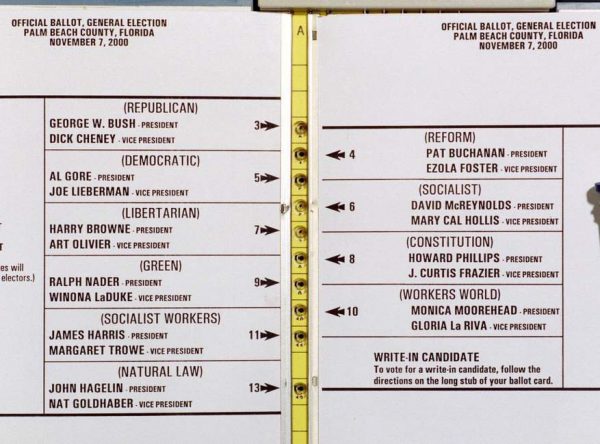
At a Code for America event, the founder (Jen Pulka) asked a designer why they decided to come. He said:
“I’m here because I believe government can be simple, beautiful and easy to use” – Scott Silverman
Thanks to Dana Chisnell, Cyd helped work on Election Tools, free resources to help elections be run
Cyd thinks the best institutional design on the web is Gov.UK.
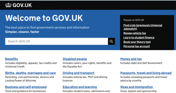
The U.S. has slowly made similar progress, one piece at a time. She showed the original mortgage disclosure form which contributed the sub-prime mortgage crisis of 2008, and the significantly improved redesign.
She joined Code for America in 2013 and worked on similar projects.
2014: Healthcare.gov disaster. The U.S. Government brought in USDS and 18F to help.
She expressed the complexity of working for institutions and that there can be overlapping contexts that define her service.
- I worked for President Trump.
- I worked in the Trump administration.
- I worked for the federal government.
- I worked for the American people.
Principles for civic design
- Respect for people’s time, dignity and abilities.
- Inviting, not just allowing, full participation.
- Government & citizens are on the same side and experience the same quality of ease of use.
Often the work is small and incrememanl, like improving forms ordinary citizens use (and providing the systems knowledge gained so it’s easier for other institutions to replicate this progress – she referenced the boston designer who did a massive project to improve their forms (reference needed))
Institutions need designers who:
- Work in long timeframes
- Follow principles over process
- Open their practice
- Make all the friends you can
How can you share your practice with the institutions you care about?




 How to get started with AR:



 [This is an excerpt from the book


